Off The Charts: Interview with Casey Haber, Visualization Engineer at Chartio
Posted by Matt David on March 13, 2020 Off The Charts
Casey Haber is a visualization engineer at Chartio, where he oversees visualizations and is overhauling our charting library to be more powerful and beautiful for customers. He introduced sparkline charts to Chartio customers back in November and continues to work on improving our visualizations that help our customers discover valuable insights.
Recently, Casey attended the Visualization and Data Analysis conference, where he presented and won Best Paper Award for the paper he wrote with his collaborator Robert Gove titled, “A Visualization Tool for Analyzing the Suitability of Software Libraries via Their Code Repositories”.
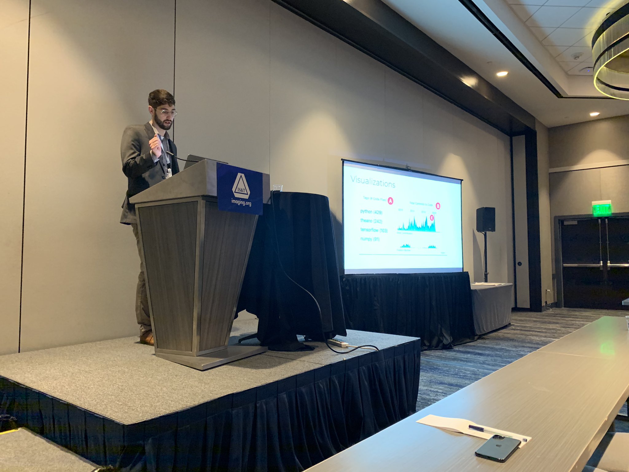
Casey presenting at the Visualization and Data Analysis conference.
In this edition of Off the Charts, we sat down with Casey to discuss his career and interests.
Tell us about your path to becoming a visualization engineer. How did you get involved with visualizing data?
I was originally a design major with a minor in computer science at University of San Francisco. While in computer science classes a few professors noticed my design skills and pushed me to get involved with the Visualization and Graphics Lab. Since the lab existed in the computer science department it showed me how coding can extend design. I was able to combine my background in design with programming skills to communicate information with data. (You can check out some of my projects on my personal website: http://cahaber.me.)
What is your favorite data visualization project you have created?
After graduating from college, l got the opportunity to get involved in government research with Two Six Labs, a contracting firm located in Virginia. It was a great experience especially because the government funded research I was a part of gave me the freedom to choose a topic I had more experience with and really do a deep dive on it. While exploring different topics, I noticed that people were constantly evaluating code repositories to see if they could be trusted to use in software development projects. So I decided to apply my data visualization background to make charts that’d indicate the health of repositories on Github.
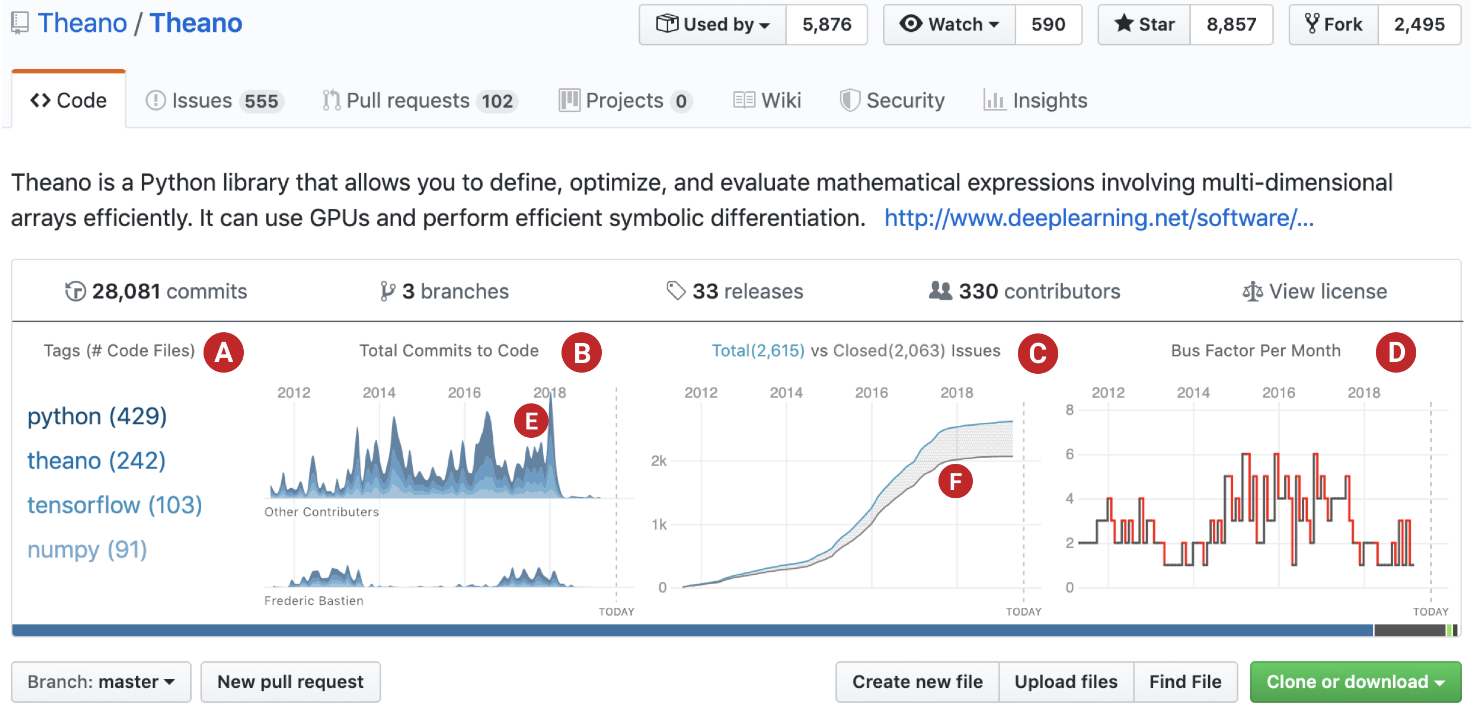
Here we can see several visualizations that help us determine the repositories health:
- Code change amount from top authors (B)
- Changes in code content (A,B)
- What technologies are being used? (A)
- How old is this project? (ABCD)
- Are they keeping up with issues? (C)
- Bus factor (D)
- Commits by language (E)
- Number of open vs closed issues (F)
If you are interested in learning more about the project, the research paper that summarizes my findings and designs is here: https://osf.io/j28ev/
Nowadays I am most excited about overhauling Chartio’s Visualization language to make more powerful, customizable, and beautiful graphs. (It will be released in the near future so stay tuned!)
What is a data visualization project that has been particularly inspiring to you?
One of my favorite projects is W.E.B. Du Boi’s Data Portraits: Visualizing Black Americans. It has emotionally powerful data visualizations that were completely novel at the time they were created.
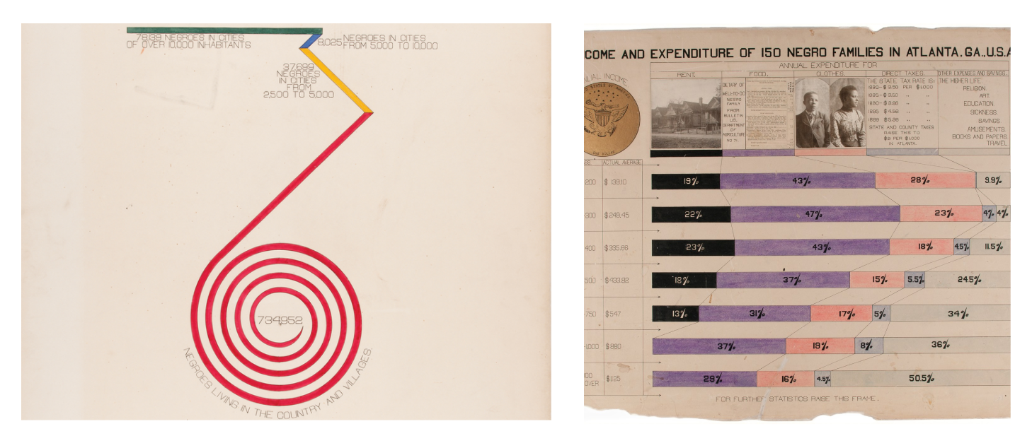
Visualization can help people understand trends in data that might not be obvious otherwise. Good design should not only convey trends, but should also make the reader connect to the data. These charts are stunning examples of being both informative and emotionally evocative.
What are some ways you keep ahead of the curve, education wise, when it comes to data visualization?
The Data Viz community on Twitter is always very welcoming and supportive. Everyone is nice, talented and willing to help out. For example, one time I reached out to FiveThirtyEight (@FiveThirtyEight) on Twitter to see if I can use one of their design patterns for my project on repository health, and they were so open about it.
Here are some Data Viz accounts that I recommend following:
- @sxywu - Design focused visualization practitioner at the highest level
- @Jasonforrestftw - Data visualization historian
- @flowingdata -Statistician who makes incredible tutorials and visualizations
- @kirkgoldsberry - Cutting edge basketball visualizations
- @Wattenberger - Provides awesome tutorials and code on how to use D3 with react
- @AlbertoCairo - Professor and visualization thought leader
I also attend d3 meetups and play around with new data visualization tools like Observable and Vega. I highly recommend anyone interested in data visualization to not be afraid to start creating things and reach out to other people in the industry. You learn best by doing, and there are tons of visualization experts and practitioners willing to help! Feel free to connect with me on Twitter @viz_case.
Related Content
-

Startups, Data and Fundraising - an Interview with Amanda Kattan
Amanda Kattan data and finance consultant -
Data for Good with Aziz Alghunaim, Co-founder and CTO of Tarjimly
Aziz Alghunaim Co-founder and CTO Tarjimly -

An Interview with Daniel Mill of The New York Times
Daniel Mill Director of Marketing Analytics The New York Times