As more business is being conducted online, there has been a similar increase in companies’ need to stand out in order to reach their customer bases. As a result, more online companies have been building content marketing into their overall marketing strategies.
Content marketing refers to the creation of educational and informational content that provides value to an audience of potential customers. This content is distinct from documentation for a product, and excludes direct advertising. Content marketing materials can take the form of blog posts, how-to articles, white papers, or even video. When properly put together, this content can bring in additional awareness from a target audience, and then convert that awareness into additional leads and customers.
In order to gauge the effectiveness of content, it is a good idea to create a data dashboard. With a properly-constructed dashboard, you can see what types of content are doing well in terms of views and conversions, where improvements can be made, and improve on your content marketing strategy.
Choosing metrics and goals to track
The first step to take when defining a dashboard is to identify the dashboard’s audience. Who will be accessing the dashboard, and what kinds of decisions will the dashboard need to support? From that first step, you can understand the questions that they will want the dashboard to answer; from those questions, you determine metrics that address those goals.
Here, we will highlight two different approaches that could be made with a content marketing dashboard. First, you might have a dashboard available for an executive audience, to evaluate the overall performance of the content. Second, a content writer or manager might need a dashboard to check the performance of individual pieces or smaller groups of content. Since these two groups want to understand content at different levels, they will need to track different metrics to answer their questions.
Executive Content Marketing Dashboard
For information of interest to executives, a high-level content marketing dashboard will likely be concerned with the overall pipeline from bringing in visitors all the way to converting them into paying customers. Is the content marketing strategy bringing in revenue, and should more be invested? How does that compare to other marketing channels? Are there parts of the content marketing funnel that are performing particularly well, or are there funnel opportunities for improvement?
Metrics at this level include the following:
- Total pageviews – Content marketing primarily seeks to expand the top of the funnel, bringing in additional eyes to the company. Counting the number of times content has been viewed is a good overall assessment of the content’s reach.
- Total visitors – Counting the number of unique visitors to the site can be another good overall activity metric. Both can be useful to track: getting more visitors means more potential customers, but getting more pageviews shows that the content is proving valuable to visitors.
- Total leads – Usually, content marketing will be accompanied by some kind of call to action, to get the visitor to take one step further into the user pipeline. A common goal for content is the generation of leads, where the visitor’s information is collected to sign them up for a newsletter or to allow them to download a useful guide or whitepaper. These leads can then be contacted with more direct marketing efforts.
- Visitors:leads conversion rate – Dividing the number of leads by the number of visitors gives this proportion. Knowing how well the content is converting visitors into leads can be a good indicator of its overall efficiency.
- Trials – For certain companies, the key action desired may instead be to get the visitor to sign up for a trial. This is often a goal for SaaS (software as a service) companies to get a potential customer to truly understand a product’s usefulness, and a major step towards converting them into a customer. As above, both the total number of trials and conversion rates from higher up the pipeline can be valuable indicators of performance and effectiveness.
- Wins (paying customers) – Regardless of intermediate steps, the ultimate goal is to get more customers. It is important to keep track of attribution, so that this counts up only the new customers that have been influenced by content at some point in their user journey.
- Total revenue (and other sales metrics) – It is also a good idea to accompany the count of new customers by other sales metrics, such as the total revenue obtained from them. Values like these provide a concrete measure of the content’s business value.
Content Marketing Manager Dashboard
If the main stakeholder is a content creator or manager, then the needs of the dashboard will need to expose more detail about specific categories of content or even individual content pieces. What kind of content should I create in order to generate more wins? Which individual pieces of content are converting visitors into customers? Which categories are converting well? Have recent changes to articles resulted in additional hits and conversions?
Metrics relevant to these questions include:
- Pipeline rate metrics – Many of the main pipeline components noted for the high-level overview are also applicable for individual content pieces. The rate metrics can be particularly valuable, since they can help identify the types of content that would be worth creating. It lets content with a low activity but high conversion rate stand up against other content with higher activity, but lower conversion rate.
- Qualified leads – An additional pipeline metric that might be of interest to this group is the idea of qualified leads or trials. When a visitor provides additional information when they become a lead or start a trial, that information may indicate their openness to being converted into a customer. Identifying qualified leads can provide a focus for additional marketing or sales efforts. In the context of a content marketing dashboard, tracking qualified leads can inform which content is resonating well with users whose personas are aligned with the company’s product.
- Average time on page – More detailed engagement metrics become more useful in a deeper investigation. For written content, the average time on page is one indicator that content is relevant and engaging for visitors.
- Bounce rate – The bounce rate reports the proportion of visitors that enter on a page on your site, but then leave without clicking on any additional pages. A high bounce rate can be dangerous, since it indicates that visitors aren’t engaged enough to stay on the site and potentially move further down the user pipeline.
- Average view percentage – Video content also has its own metrics to gauge user engagement. The higher the average view percentage, the more of a video the average viewer is sitting through.
- Social engagement metrics – Depending on the content strategy, it might be worth tracking engagement metrics on social media. Counting the number of re-links, likes, and comments on each post can show if a community is building around your content.
- Click-through rate – New content can be announced through a mailing list or through social media posts. Tracking the rate at which viewers actually click through to view your content can indicate if the messaging of your content is effective at bringing people in.
Useful chart types for visualizing metrics
When putting together a dashboard, it’s important to think about how the data will be shown to others. Picking the right chart for each metric can make a big difference in terms of whether the dashboard is successful in conveying information or not. A metric can be shown in multiple ways, depending on the type of role that it plays in the analysis.

High-level dashboards often cite metrics as raw numbers, showing metric values over a period of time. A single number directly reports key results that would be of interest to an executive viewer. For example, you might want to show the number of leads gained over the past month, or the number of leads gained in the quarter so far. An executive can use these numbers to get an idea of overall metric performance, especially with the addition of supplemental information.
For metrics measured over a fixed period (e.g. leads in the past month), you can add an indicator value to compare that period to the immediately preceding one. This can give a rough indicator of the recent trend in the metric. An executive may not have sufficient context to know if a number on its own is good or not, so the indicator can help them judge if the metric is moving in the right direction or not.
If the metric’s value accumulates over time (e.g. leads in the quarter so far), you can include a bullet chart with the numeric value. If there is a team objective or goal based on that metric, the bullet chart provides a clear indicator to an executive how close the metric is to that goal. Alternatively, you can calculate a trend for the metric, and include a bar with an expected final value at the end of the recording period.

To show the change in a metric over time, the standard chart type is the line chart. A line chart can let you know if the overall content trend is moving upwards, downwards, and if any changes or additions to the content are having their desired effects. The size of the time periods in the line chart may change depending on the purpose of the dashboard.
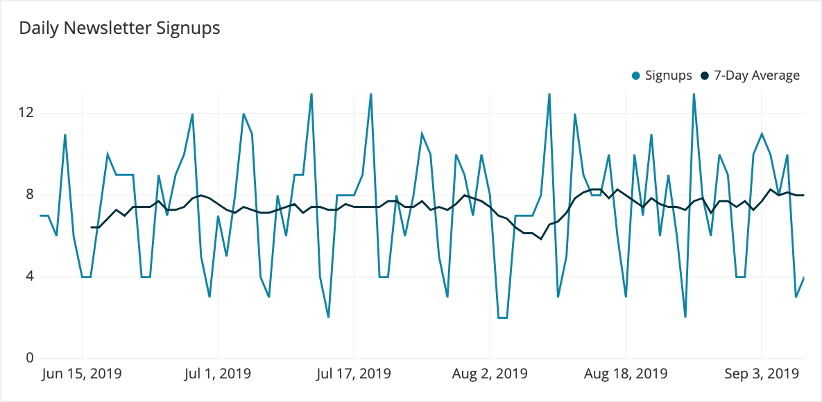
For example, a content manager dashboard may be used to check how search engine optimizations to content are being picked up by viewers. A daily reporting period means that any changes in the number of visitors are immediately observable. However, these values can be highly variable. Cyclic effects like the day of the week can create undulating patterns due to differences between weekdays and weekends. While this might be understandable for a writer or manager directly in contact with the content, these variations will not be useful for an executive who needs a higher-level view of the metric’s change.
For the executive’s view of change in visitors over time, a weekly average provides a more stable evaluation of the metric. This kind of time period is also generally useful for a manager’s dashboard as well due to smoothing out daily variation. In fact, it is often worth it to plot lines for both the daily results and a one-week rolling window in a single chart to get the best of both worlds.

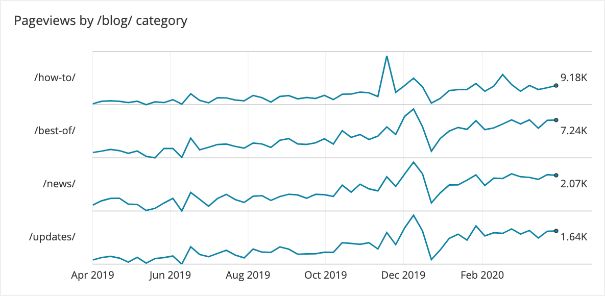
If a content manager wanted to compare different categories of content together, they could plot all of them on a single line chart, one line per category. However, this can get messy with more than five lines to plot. In cases like these, it’s a good idea to consider using sparklines to show the change over time. Although a sparkline reduces the ability to gauge the absolute change for each item plotted, the separation between lines makes it easy to see the relative trend.
Example content marketing dashboard

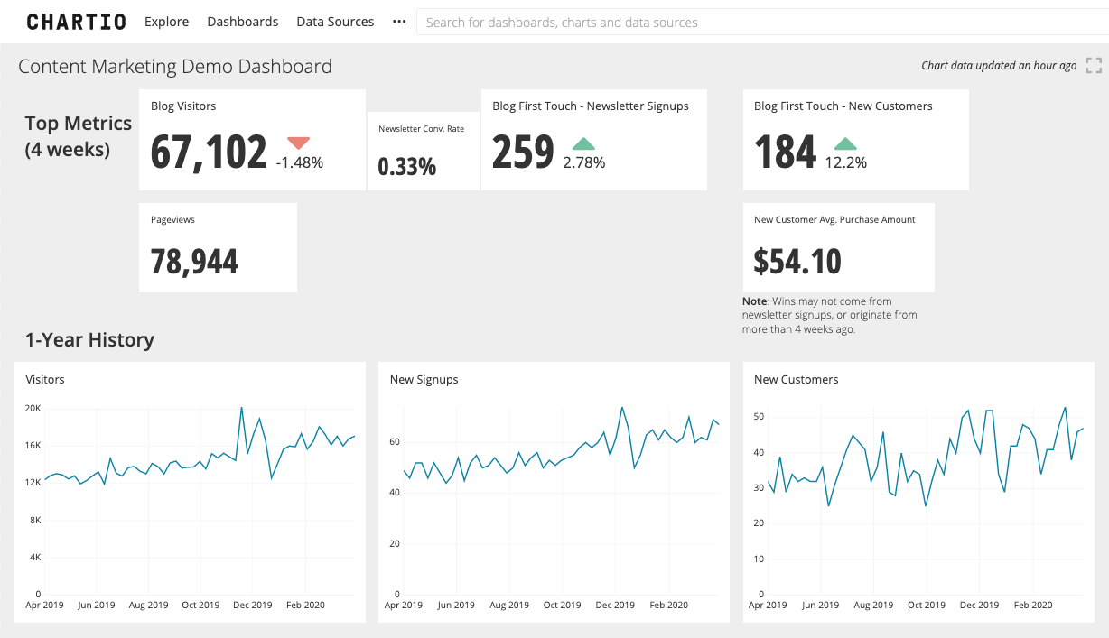
We bring everything from the article together in the example dashboard above, built using Chartio. This high-level executive dashboard reports the performance of written blog content for a fictional online store. In this case, the content is meant to drive signups for a newsletter, which in turn will generate more purchases through new product announcements and deals.
This dashboard has two main parts. The top part of the dashboard provides an at-a-glance overview of the overall content performance over the previous four weeks, from getting visitors to the website, to signing them up for a newsletter, and recording a purchase. Metrics are reported as numeric values, with indicators comparing their values to the previous month. While the number of visitors and newsletter signups don’t seem to have changed much from the previous month, there seems to be an increase in new customers.
The lower section of the dashboard expands these metrics into line charts, showing the change in metrics over an entire year. This provides a more nuanced perspective on the data. We can see that there were some small spikes in visitors in June and March, but a major spike in December. The trend for signups seems highly correlated with the change in visitors, but the trend in customers is a bit more noisy. While there does seem to be an overall upwards increase in all of the main content metrics, the increase implied by the indicator for new customers may not be the true effect.
While high-level dashboards like the example do not always provide actionable insights on their own, they do a good job of highlighting major shifts. This, can then inform further investigations and experiments, tracked with additional dashboards. In this case, the company may have already seen the December spike and put additional analysis effort into trying to capture which types of content or specific posts caused the observed shift.
Conclusion
Content marketing, like any other marketing tactic, requires good use of data in order to track its effectiveness. Content has the ability to provide a steady stream of product awareness and new users over a long period of time. A good content marketing dashboard can allow a team to answer their questions, whether they are about the overall contributions of content to a company’s revenue, or to make decisions on content to create or improve, and bring out the most from their content creation.
Chartio allows for companies to collect many data sources together, and quickly combine them into charts and dashboards to obtain actionable insights. Start a free trial with us now, and see how easy it can be to get insights into your data, no matter your role.