Chart Types for your Dashboard
Posted by on April 17, 2014 Education, Data Analytics
Understanding the chart types that are best for your data will allow you to get the most out of your dashboard. Charts can reveal outliers and interesting facts that may be otherwise hidden, and if you are using the wrong type of chart you may not unlock the insights you are looking for.
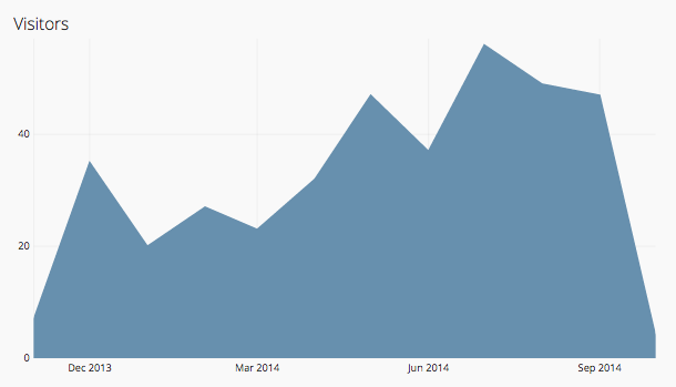
Area Chart
Area charts are helpful in visualizing multidimensional data, especially when stacked. These charts can emphasize the magnitude of change over time and draw attention to trends. Chartio has a Percent Area Chart option, which sets dataset values on a percent scale of 0 - 100, which can help magnify relative differences.
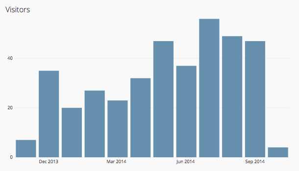
Bar Chart
Bar charts are great for discrete data, or to show the relationship between a part to a whole. Use a bar chart to show categories being compared or to make generalizations about the data quickly. You can visualize multidimensional data in Chartio with a stacked bar chart, grouped bar chart or percent bar chart.
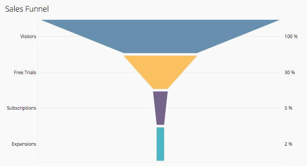
Funnel Chart
Funnel charts are often used to visualize optimizations, such as which stages most affect dropoff. Visualizing dropoffs help to show the severity and importance of each stage. These charts are often used to represent the progressive reduction of data, such as the stages in a sales process.
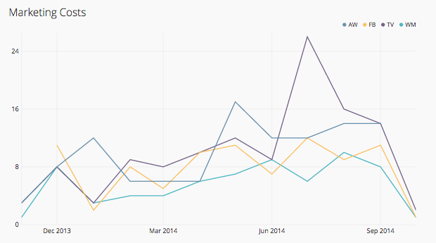
Line Chart
The line chart is powerful for conveying changes over time. Line charts should be used to connect data along an interval scale which will show how data changes at equal intervals of time. Typically the y-axis represents the dependent variable and the x-axis represents the independent variable.
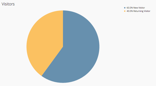
Pie Chart
We generally recommend using a bar chart instead of a pie chart, but they are quite popular and Chartio offers them in our interface. Pie charts can be effective in showing the contributions of data segments as a percentage of a whole.
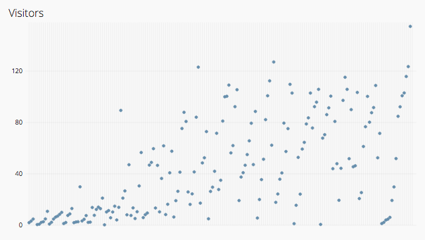
Scatter Plot
Scatter plots are used to find the relationship between two variables, often quantities. A scatter plot is often used when a variable exists that is below the control of the experimenter - to visualize how much one variable is affected by another. These graphs suggest various kinds of correlations between variables.
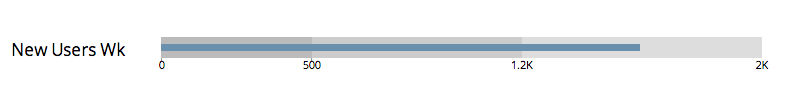
Bullet Graph
Bullet graphs are great for displaying single values within some quantitative context, such as a goal value. These can be used to compare a primary measure to one or more measures in the context of qualitative ranges of performance. Inside Chartio’s chart creator you can define up to three quantitative ranges for a bullet graph.
Single Value
Inside Chartio you can display data as a single value, such as a decimal, number or word. A single value chart can be helpful in emphasizing a particular data point and bringing attention to a value such as total revenue, growth or conversion.