Dynamic dimensions on your dashboard using Data Explorer
Using the Data Pipeline, it’s possible to dynamically change between dimensions on your dashboard. This allows dashboard viewers to select only the fields they’re interested in viewing. For this example, we’ll use the Dundersign Demo Data data source, which uses PostgreSQL syntax.
- On the dashboard, click Add Control from the sidebar and choose Dropdown from the options.
-
Switch to SQL Mode, type in the following, and click Run Query:
select 'Name'
union
select 'Plan'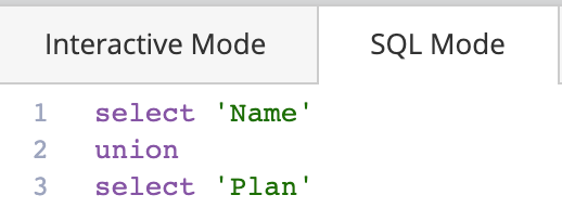
Note: If you have more than two dimensions, add additional UNION operators and SELECT statements with the additional dimension names. The aliases you set need to match the names exactly as they are in the table or chart.
-
Below the SQL editor, rename the Dashboard Control to something unique like
DIMENSION. Make sure that Multi-select is unselected. Add one of the dimension names as the Default Value (optional). We’ll useNameas our default value in this example. Click Save Chart when done.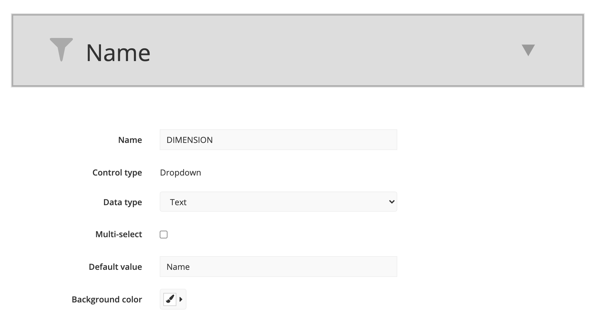
- If you’ve already created your table, choose to Edit it to add your new Dropdown as a filter. If you haven’t created a chart yet, create a new chart and add both dimensions and necessary measures to the chart.
-
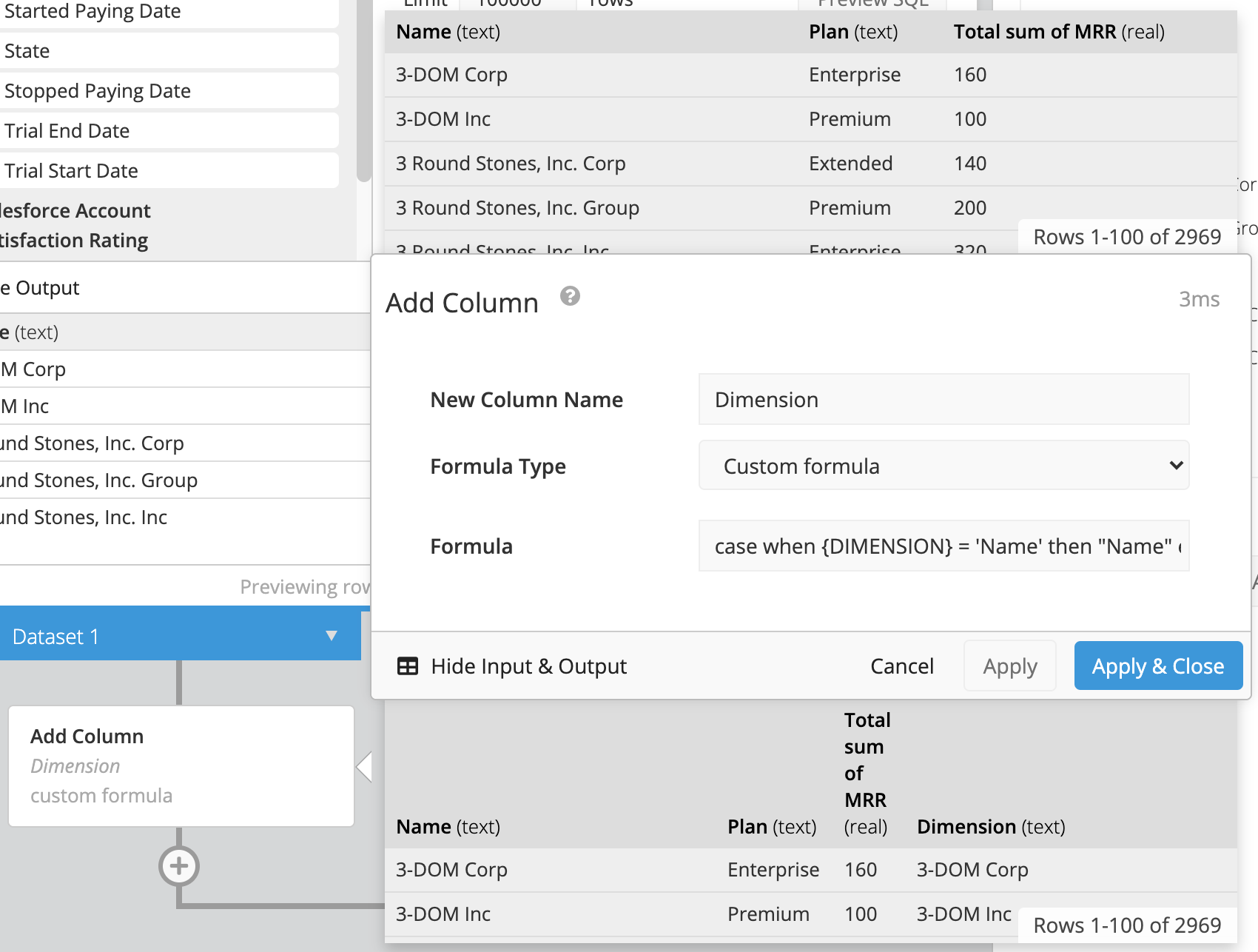
Once the initial columns are added, add a step in the Pipeline. For this example, click Add Column. Give your new column a name, select Custom formula as the Formula Type, and enter a CASE statement in the Formula field. Here’s the one we’ll use for our example:
case when {DIMENSION} = 'Name' then "Name" else "Plan" endNote: If you have more dimensions, add additional WHEN and THEN clauses to your CASE statement. Click Apply & Close to submit your changes.
-
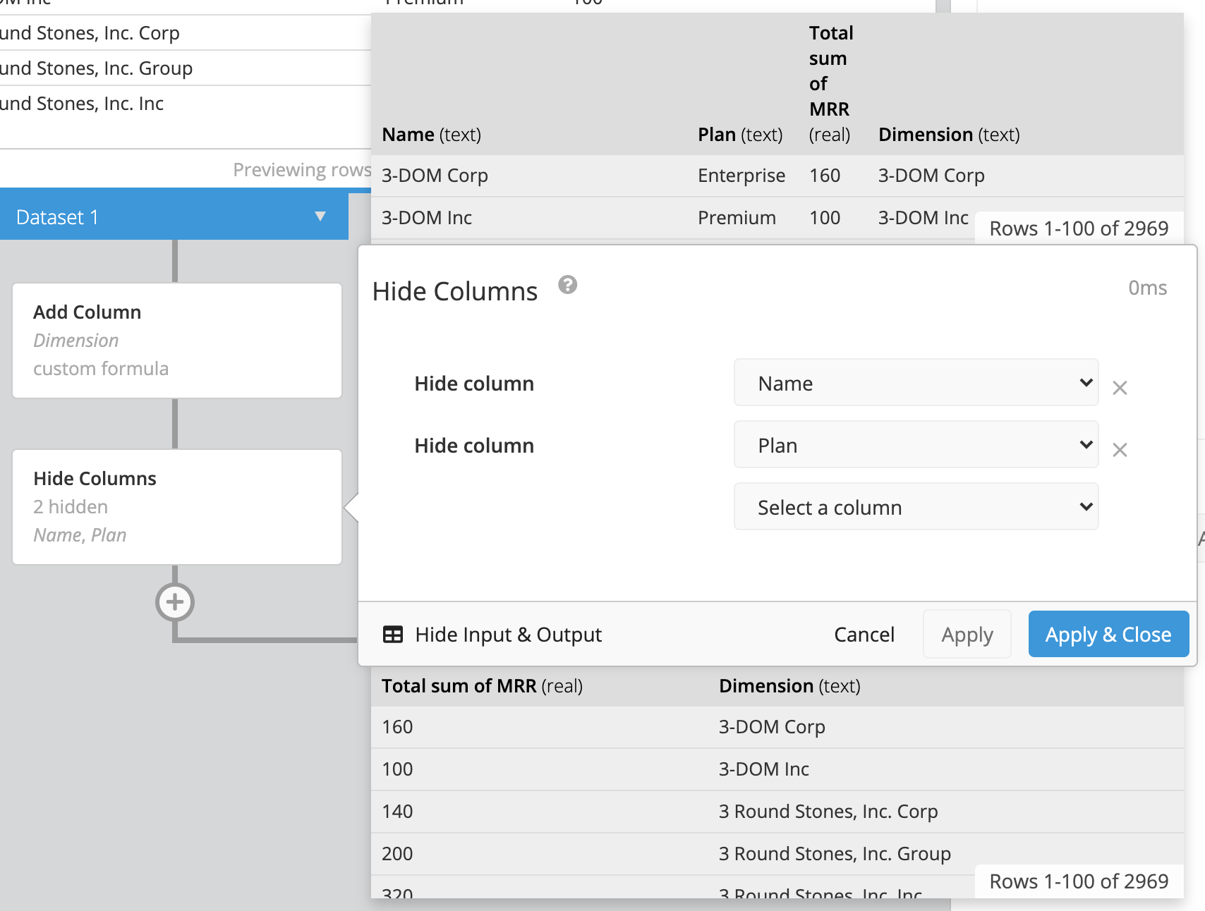
Add a Hide Columns step in the Pipeline to hide the Name and Plan columns in the final chart.
-
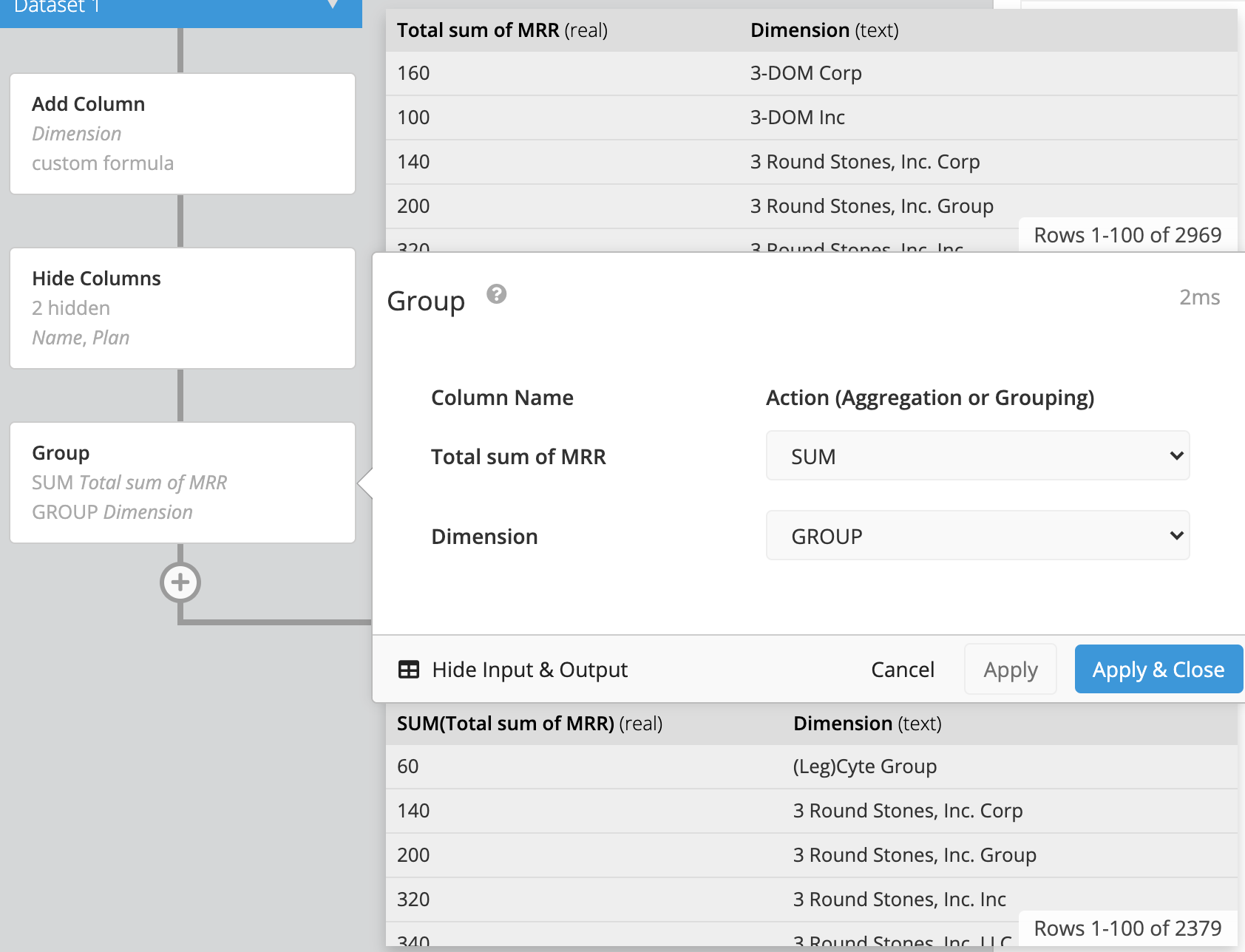
Add a Group step in the Pipeline. Set your Dimension columns to use the GROUP option and set your remaining measures column to use the SUM aggregation. Click Apply & Close.
- Add a Reorder Columns Pipeline step and reorder the new Dimension column to the top of the list so it becomes the leftmost column in your final result set. Rename the measures as desired.
-
Save the chart to your dashboard, then you’re done!