Drilldown example
A Drilldown can refer to a variety of operations, but it usually means moving from summary to detailed information. Create Drilldowns in dashboards to look deeper into your data and get down into particular data points; you could look at blog performance for specific blog post or dive into the activity of a specific blog post.
In this example, we’ll use our Dundersign Demo Data data source to create a chart showing the number of organizations created each month. We’ll have a Drilldown that selects for the number of created organizations per plan type and drills down into each day of that selected month for the selected plan type. This is useful when you see a spike of activity and want to drill down into a daily view of that specific plan type to figure out what happened.
In the Visual SQL interface
1. Create your Dashboard Controls
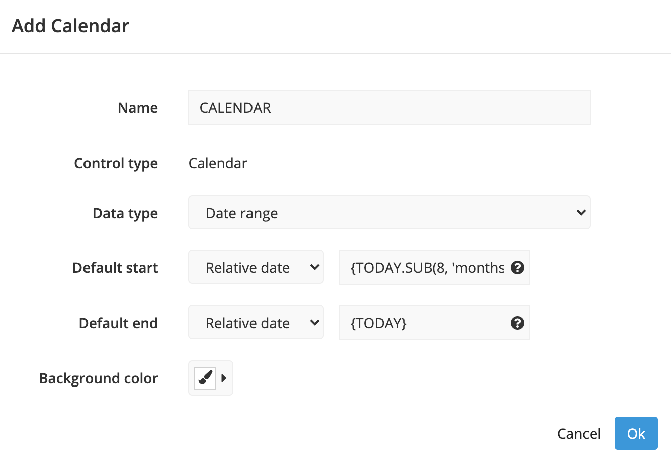
First, establish which Dashboard Controls you’ll use to create the dashboard. We want to drill down by time and plan type. Create a Calendar to filter by time, and a Dropdown to select the plan type.
Want to map a Hidden Variable to your Drilldown chart? Make sure to select Can Drilldown in the Hidden Variable’s settings so it’s available for Step 2.
-
Calendar
-
Dropdown
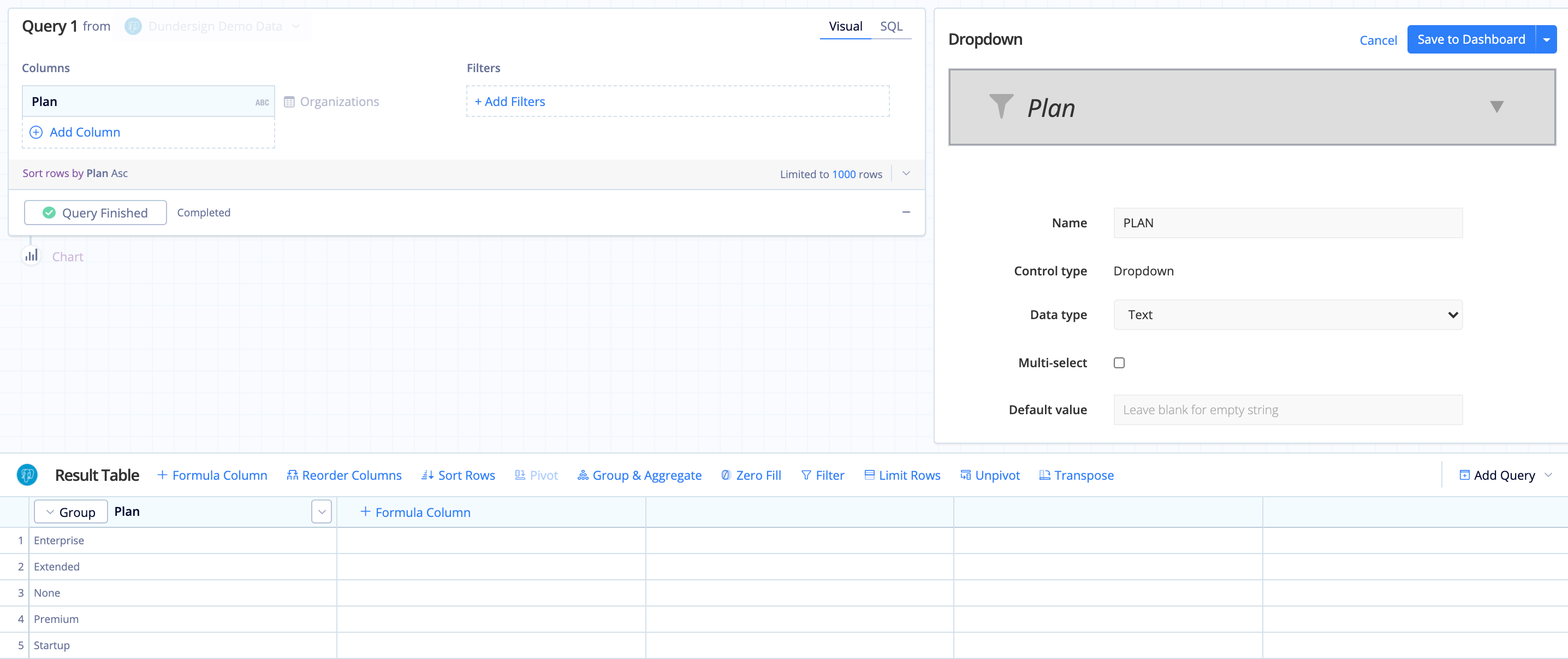
- From the Organizations table, add the Plan column to the Columns section of the Query then click Run Query.
- Give the Dropdown a name, like
PLAN. - Click Save to Dashboard and place it on your dashboard.
2. Create your Drilldown chart
Create a chart that shows the number of organizations by month and has a layer for each plan type. This will be the chart that we select a bar to drill down into and display more detail.
- From the Organizations table, add the Created Date, Plan, and Id columns to the Query. Change the time bucket for Created Date from Day to Month by selecting this from the column’s aggregation menu. Ensure the aggregation types are Group for Plan and Count of distinct for Id.
- Click Run Query.
- Make sure the order of columns in your result set is as follows (left to right): Created Date, Plan, Id. If they aren’t in this order, use a Reorder Columns Action to put the columns in the required order. Once your columns are in the correct order, add a Pivot Action, keeping the default settings for the sort order and aggregation (i.e., Ascending and SUM).
-
Select Bar for the chart type. You can optionally customize the Bar chart by opening the chart settings.
- Click the Gear icon in the chart preview pane to open the chart settings.
-
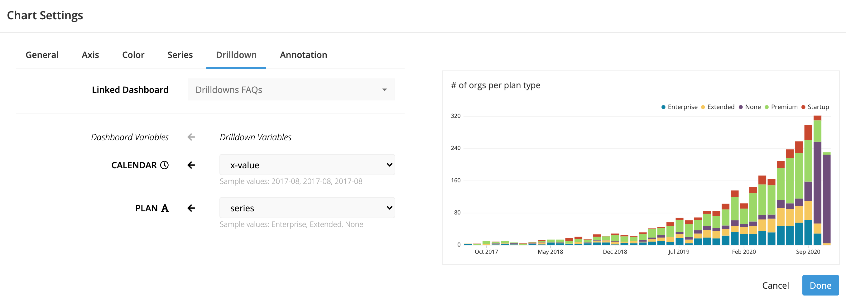
Navigate to the Drilldown tab.
For the Linked Dashboard, select the dashboard where your Dashboard Controls reside.
Map the Calendar to the x-axis of the chart (since the dates are displayed on the x-axis) and the Dropdown to the series.
- Click Done to save the chart settings.
3. Create another chart that shows the Drilldown results
Create another chart that shows the number of organizations created each day, filtered by the Plan and the date. This is the chart that will show the Drilldown results after selecting from the first chart. This chart won’t display any data yet since we haven’t selected a value for the Controls.
- Again, from the Organizations table, add the Created Date and Id columns to the Columns section of the Query.
- Add the Created Date column to the Filters section, select between and including as the filter operator, then use
{CALENDAR.START}and{CALENDAR.END}as the start and end dates, respectively. ReplaceCALENDARwith the name of your Calendar Control if you gave it a different name. - Also add the Plan column to the Filters section, select is one of as the filter operator, then type the name of your Dropdown wrapped in curly brackets as the filter value. In this example, we used
{PLAN}. - Click Run Query.
- Use Zero Fill to ensure each day is displayed in the chart.
- Even though it’s not showing any data yet, you can still choose your chart type. Select Bar for the chart type.

4. Test your Drilldown
Because the chart from Step 3 is already connected to the Calendar and Dropdown Controls, it’ll update automatically when those Control values are updated upon clicking an area of the Drilldown chart. Click on a bar from the Drilldown chart to make sure everything works!
In the Data Explorer interface
Check out our step-by-step video showing another example of setting up a Drilldown between two charts:
1. Create your Dashboard Controls
First, establish which Dashboard Controls you’ll use to create the dashboard. We want to drill down by time and plan type. Create a Calendar to filter by time, and a Dropdown to select the plan type.
Want to map a Hidden Variable to your Drilldown chart? Make sure to select Can Drilldown in the Hidden Variable’s settings so it’s available for Step 2.
-
Calendar

-
Dropdown
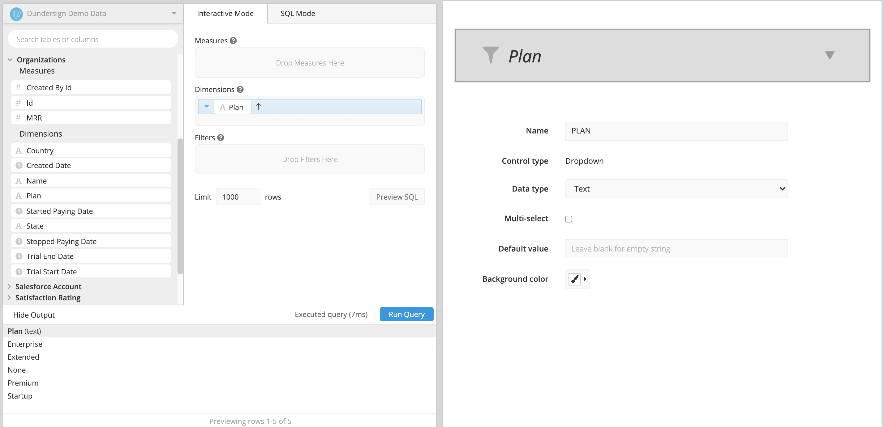
- From the Organizations table, add the Plan column to the Dimensions field then click Run Query.
- Give the Dropdown a name, like
PLAN. - Click Save Chart and place it on your dashboard.
2. Create your Drilldown chart
Create a chart that shows the number of organizations by month and has a layer for each plan type. This will be the chart that we select a bar to drill down into and display more detail.
- From the Orgaizations table, drag Id into the Measures field.
- Drag Created Date and Plan into the Dimensions field. Change Create Date’s time bucket to Month of.
-
In the Pipeline, click on +Add Transformation and choose Pivot Data. Keep the default settings for the sort order and aggregation (i.e., Ascending and SUM). Click Apply & Close.
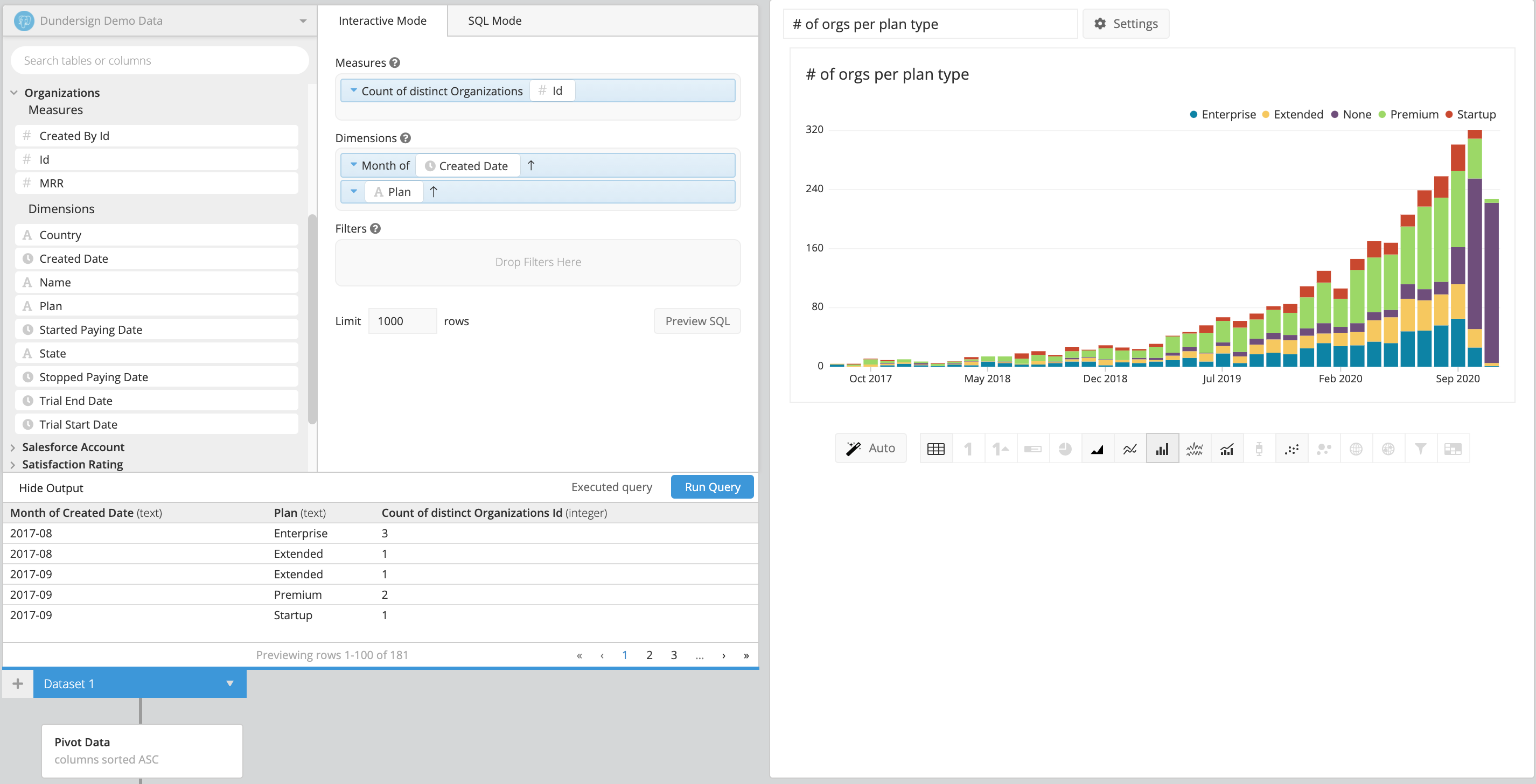
- Click Settings by the chart title to open the chart settings.
-
Navigate to the Drilldown tab.
For the Linked Dashboard, select the dashboard where your Dashboard Controls reside.
Map the Calendar to the x-axis of the chart (since the dates are displayed on the x-axis) and the Dropdown to the series.

- Click Done to save the chart settings.
3. Create another chart that shows the Drilldown results
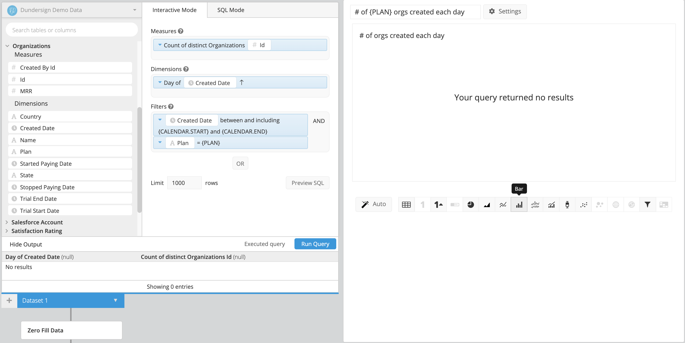
Create another chart that shows the number of organizations created each day, filtered by the Plan and the date. This is the chart that will show the Drilldown results after selecting from the first chart. This chart won’t display any data yet since we haven’t selected a value for the Controls.
- From the Organizations table, drag the Id column into the Measures field and Created Date into the Dimensions field.
- Add the Plan and Created Date columns into the Filters field. For Plan, select equals for the filter operator, then select your Dropdown for the filter value. For Created Date, change the range to between and including and use the dropdown menu to choose
{CALENDAR.START}and{CALENDAR.END}. - Click Run Query.
- Use Zero Fill to ensure each day is displayed in the chart.
-
Even though it’s not showing any data yet, you can still choose your chart type. Select Bar for the chart type.
4. Test your Drilldown
Because the chart from Step 3 is already connected to the Calendar and Dropdown Controls, it’ll update automatically when those Control values are updated upon clicking an area of the Drilldown chart. Click on a bar from the Drilldown chart to make sure everything works!