

A complete guide to pie charts
Posted by: Mike Yi
Despite often being maligned, the pie chart remains a very commonly-seen chart type. In this article, you will learn how to best use this frequently-misused chart type.
What is a pie chart?
A pie chart shows how a total amount is divided between levels of a categorical variable as a circle divided into radial slices. Each categorical value corresponds with a single slice of the circle, and the size of each slice (both in area and arc length) indicates what proportion of the whole each category level takes.
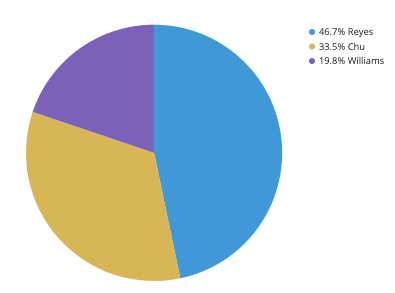
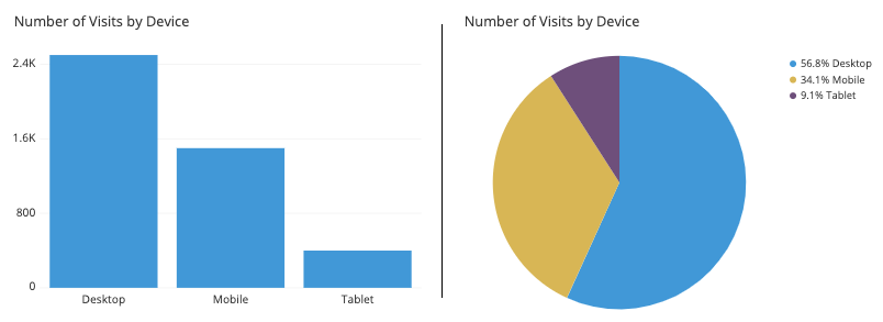
The pie chart above depicts the distribution of votes for a fictional election for a small city. We can see that Reyes, represented by the first blue slice, has just less than half of the votes. Chu (yellow) is in second, with about a third of the votes, while Williams (purple) is last, with about a fifth of the votes. The annotations in the upper right give us a more precise judgment of the proportions, but the pie chart tells the overarching story of where the votes fell.
When you should use a pie chart
Pie charts have a fairly narrow use-case that is encapsulated particularly well by its definition. In order to use a pie chart, you must have some kind of whole amount that is divided into a number of distinct parts. Your primary objective in a pie chart should be to compare each group’s contribution to the whole, as opposed to comparing groups to each other. If the above points are not satisfied, the pie chart is not appropriate, and a different plot type should be used instead.
The values that comprise a whole and the categories that divide the whole generally come in two major varieties. First of all, is when the ‘whole’ represents a total count. Examples of this include votes in an election divided by candidate, or number of transactions divided by user type (e.g. guest, new user, existing user).
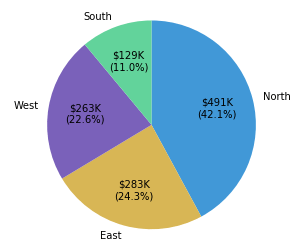
A second type of ‘whole’ is when the total is a sum over an actual data variable. For example, we might be interested not in the number of transactions, but the monetary total from all transactions. Dividing this total by an attribute like user type, age bracket, or location might provide insights as to where the business is most successful.
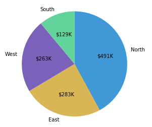
Example of data structure
REGION | TOTAL REVENUE | |
|---|---|---|
| North | 491 064.51 |
|
| East | 283 445.43 |
|
| South | 128 753.87 |
|
| West | 263 391.13 |
|
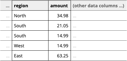
Data for a pie chart can be summarized in a table like the above, where the first column indicates a category, and the second the proportion, frequency, or amount of that category. Usually, the total does not need to be specified separately unless it is to be listed somewhere else on a generated figure. Alternatively, some tools can just work with the unaggregated data as in the below table, essentially performing the aggregation into the table above at time of pie chart creation.
Best practices for using a pie chart
Include annotations
It is actually very difficult to discern exact proportions from pie charts, outside of small fractions like 1/2 (50%), 1/3 (33%), and 1/4 (25%). Furthermore, if the slice values are meant to depict amounts rather than proportions, pie charts typically lack the tick marks to allow for estimation of values directly from slice sizes. It is for these reasons that annotations are a standard inclusion for pie charts.
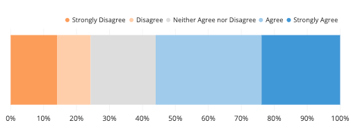
Consider the order of slices
A good order for slices can make it much easier for a reader to understand what the plot is saying. A typical ordering goes from the largest slice to the smallest slice, very useful when there are categories with very similar values. However, if the category levels have an inherent ordering, then plotting slices in that order is usually better.
As for choosing a start point, it’s a good idea to plot slices from a cardinally-oriented direction. Visualization tools will usually start from the right or from the top. While starting from the right has a mathematical basis regarding conventions on measuring angles, starting from the top feels more intuitive, since it matches how we read from top to bottom, and how we think about progression of time on a clock or watch face.
We do not sort by size here since the labels are meaningful.
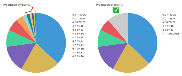
Limit the number of pie slices
Pie charts with a large number of slices can be difficult to read. It can be difficult to see the smallest slices, and it can be difficult to choose enough colors to make all of the slices distinct. Recommendations vary, but if you have more than about five categories, you might want to think about using a different chart type. As another option, you might consider lumping small slices into a single ‘other’ slice, colored in a neutral gray.
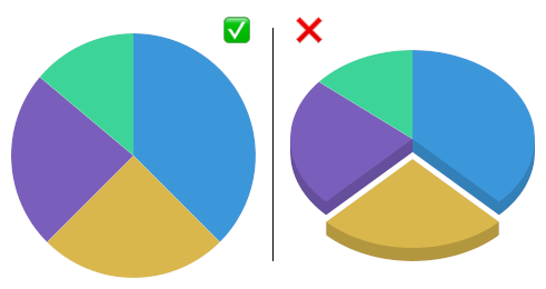
Avoid distorting effects
Reading a pie chart accurately requires that the slices’ areas, arc lengths, and angles all point to an accurate representation of the data. While avoiding 3-d effects is a good idea for any plot, it is especially important for pie charts. Squashing or stretching the circle or adding unnecessary depth can easily distort how large each slice compares to the whole.
Another distortion can come from the ‘exploded’ pie chart, where slices are pulled out from the center for emphasis. This emphasis comes with a cost, where the gaps can make it more difficult to actually gauge the part-to-whole comparison.
Common misuses
Fitting a pie to incompatible data
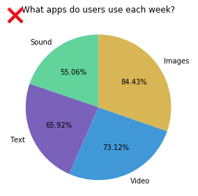
One of the most common mistakes with using a pie chart is to fit it to data that does not represent a parts-to-whole comparison. This confusion occurs most often when the values to be plotted are percentages or proportions, but don’t comprise a complete whole. The example below shows how frequently the people surveyed used each of four applications, but since many people used multiple apps, the proportions sum to much more than 100%.
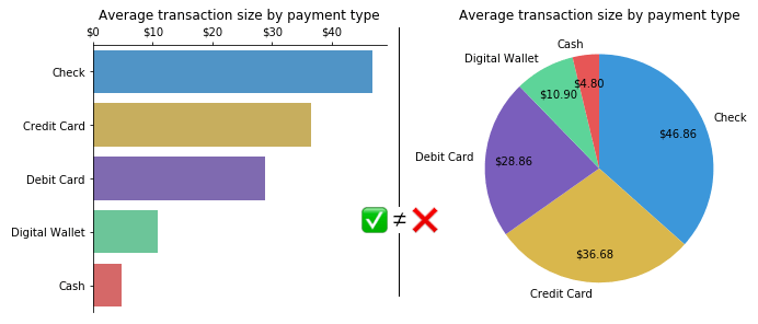
Another tricky case is if the values used for each group are a summary statistic that is not a total. The chart below was built on the average transaction amount for multiple transaction types. However, since it ignores how frequently each transaction type was used, it distorts how much revenue is coming in from each type. While checks have the highest average, they might also be fairly rare in use. In both cases, a bar chart is an appropriate chart type to use.
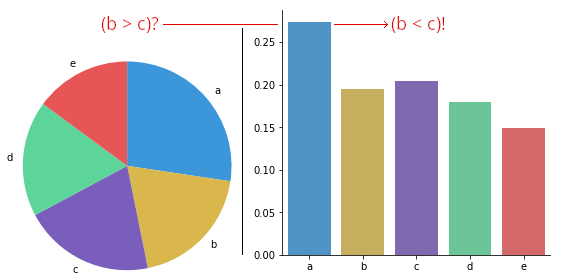
Using pie charts to compare groups to one another
If you want to make comparisons between groups rather than from each group to the whole, then you are better off with a different chart type. Even when sorting slices by size, it can be difficult to tell how different two slices are, especially when they move away from the start / end point. In the below example, you might assume that the second slice is larger than the third due to order, but the corresponding bar chart actually shows the opposite. The main thing that you can really say from the pie chart is that both slices are approximately the same proportions from the whole.
Comparing values across multiple pie charts
There may be cases where you will want to compare multiple pies to one another: for example, comparing user demographic distribution across multiple years. However, this runs into a similar issue as the previous section, where you want to compare groups to one another. Even worse, it’s a comparison between pies, so you can’t rely on the order of slices as easily for the comparison. Expressing the data using a different plot, like stacked bar chart, grouped bar chart, or line chart, is often a better choice when this kind of group-to-group comparison is desired. Like with actual pies, pie charts are best taken one at a time.
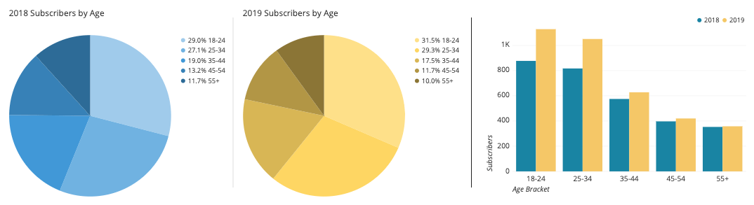
Comparison of the pies may imply a shrinking of the older age groups by proportion, but the grouped bar chart demonstrates a growth in the younger groups.
Common pie chart options
Absolute frequency vs. relative frequency
Pie charts can be labeled in terms of absolute values or by proportions. Labeling slices with absolute amounts and implying the proportions with the slice sizes is conventional, but consider the goals of your visualization carefully in order to decide on the best annotation style to use for your plot. In some cases, including both numbers in the annotations can be worth the additional text.
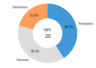
Doughnut plot
A doughnut plot (aka donut plot) is simply a pie chart with a central circle removed. For the most part, there aren’t significant differences in readability between a pie chart and donut chart, so the choice of a doughnut over a standard circle is mostly that of aesthetic. One small boon for the ring shape is that the central area can be used for additional information or to report statistics.
Related plots
Bar chart
The biggest competition for the pie chart comes from the bar chart. Most of the time, you won’t want to use a pie chart – rather, a bar chart will get across the points more compactly and clearly. Many of the issues with pie charts are solved through the use of a bar chart. However, bar charts do not immediately sell the part-to-whole comparison, which is pie chart’s major benefit.
Stacked bar chart
On the other hand, the stacked bar chart type can prove to be a strong rival to the pie chart in its ability to communicate a part-to-whole comparison. A single stacked bar can be thought of as a pie chart’s slices rolled out into a rectangular form. The rectangular form also makes it easier to compare categorical breakdowns across different groups. However, pie charts still have an advantage in familiarity and aesthetics, so they’re still worth having in mind for the part-to-whole comparison use case.
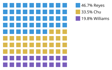
Waffle chart
Another alternative to the pie chart is the waffle chart, also known as a square chart or square pie. A waffle chart comprises 100 icons, typically squares laid out in a 10 x 10 grid. Each icon represents 1% of the data, and the icons are colored based on the categorical distribution of the data. While there will need to be some rounding of category amounts to fit the plot structure – never split icons in this plot – it can be a way of making the relative proportions for each category easier to read.
Visualization tools
Most visualization tools will be able to create pie charts, despite their limited use case. Donut charts are somewhat less common, but there aren’t a whole lot of cases where they’re truly needed over pie charts. Despite the fact that pie charts have fallen out of favor for most visualization needs, it is important to recognize that they are a common chart that people generally know how to read. Pie charts are still great at their ideal job: immediately selling a part-to-whole comparison objective.
The pie chart is one of many different chart types that can be used for visualizing data. Learn more from our articles on essential chart types, how to choose a type of data visualization, or by browsing the full collection of articles in the charts category.