Off the Charts: Data Science According to LinkedIn's Monica Rogati
Posted by on October 6, 2011 Off The Charts,
This past week, we sat down with Monica Rogati, one of the founding members of the LinkedIn Data Science team. Monica obtained her PhD in Computer Science from Carnegie Mellon, where she focused on text mining and applied machine learning. At LinkedIn, she is pioneering data driven products with multi-million dollar business impact, and is currently building mathematical models that power LinkedIn’s personalized recommendations.
Please note: because we weren’t able to record the conversation, this interview represents my recollection and paraphrasing of what Monica said. None of these quotes are direct.
Chartio: So how did you get into data science in the first place?
Rogati: Well, my background is in computer science. Specifically, It’s in applied machine learning and text mining. I joined LinkedIn to work on their various data projects and totally love it!
What are some of the cooler data projects you’ve worked on so far?
I helped build the recommendation engine that lets you know what jobs you might be interested in.
How hard was that to build?
It was definitely hard in the beginning because we had lower density of data. As more people joined, however, we got increasing insight into how the graph connects. We were then able to look at several things people have in common. More and more signals began to appear.
You gave a talk recently about the evolution of data science. Can you share some of your thoughts about how the profession has changed over the years?
In my talk, I show a slide with a 2008 wanted ad for a data scientist. The ad referred to them as “analytic scientists” and even specified that no technical skills were required for the job. The implication was these important skills, machine learning, using R for statistical analysis, etc. could be learned along the way. Broadly, they were looking for analytical and creative types with intellectual curiosity. Today, the job description hasn’t changed much except we now require much more by way of technical skills.
What kinds of technical skills?
It depends. For some roles, we put a lot of emphasis on data visualization, whereas in others we encourage fluency in text mining. Overall, the types of skills we’re looking for when hiring are analytical skills, technical skills and communication skills. It’s a tough combination to find.
**Where do you find your candidates?
**
I think academia is starting to catch on to the data science trend. But our data scientists come from a wide variety of backgrounds, including neurosurgery and particle physics.
What do you think the the data scientist will look like in 5 years?
Given data scientists didn’t exist 5 years ago, it’s hard to deduce a rate of growth in the job or field overall. But I can definitely say it’s a very high rate of change and the job will be quite different in some ways but the same in others. Roughly, it will still require intellectual curiosity and a fluency with data–the ability to manipulate and extract insights from it. But the lives of data scientists will become easier as the tooling and infrastructure improves and is indeed democratized.
Where will the tooling improve?
Well, data software is in its infancy. There is a ton of work happening on the bleeding edge. It still takes a really long time to manipulate data. Take Pig and Hadoop, for example. All of these will become smoother and easier and enable machines to do really well what machines do well and humans to excel and focus on their strengths.
Speaking of machines versus humans, what part of the process–the data analysis process–can be automated?
That’s the holy grail. A lot of what data analysts are doing is still at the “pen and paper stage,” figuratively speaking. The tools are slow and clunky. Over time, the friction in the tooling will be eliminated. For example, to look at the top of a distribution in pig with grouping requires 5 pig commands. That’s not friendly to really exploring the data. Maybe there’s another tool you can use for exploratory data analysis. Maybe it’s hive or something that hasn’t yet been invented.
I suppose an even more ambitious goal goes beyond just improving the tooling to really democratizing data science and expanding it to a whole new segment of users. Is that a reasonable goal or more of a pipe dream?
I don’t think it’s a pipe dream. There must be a framework where people can collaborate on data analysis. Obviously, tools can be dangerous if used inappropriately. This is even more true in the case of data. You can easily draw the wrong conclusions. In many cases, it’s quite tempting to draw the wrong conclusion. Collaboration in this regard might reduce the amount of errors by putting more eyes on the same piece of data. But you will need the human element for a really long time to even just know what questions to ask.
Can you elaborate on that last point?
Take for example the question of what industries are “hot” given an analysis of the data LinkedIn possesses. First, you have to define what “hot” means. Let’s walk through the way a data scientist might reason (this process is adapted from a presentation I gave at Strata, available at http://slidesha.re/o7JKfX).
Take 1: What industries have the highest YOY growth? This is an attractive first attempt, but it can be misleading in that it might only represent LinkedIn’s penetration in any given industry.
Take 2: People list start dates on their profiles. So why don’t we look at what industry people are flowing into in a given year? This can also be misleading because it ignores churn.
Take 3: A better question would be, what is the net inflow (which takes into account churn)? This is better, but it ignores seasonality (more interns in the summer and fewer teachers, for example).
Take 4: So let’s take seasonality into effect now. Again, better, but if we run the actual data, it looks like metals, dairy and mining are the “hottest industries.” This somehow seems wrong. We can adjust this to exclude industries below a certain size.
Take 5: And finally, what about bad data? We have to remove spammer accounts, the longtail of individuals who list 200 positions on their profile, etc.
So let’s see what this filtered YOY growth looks like.
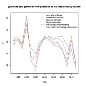
This is not too informative as it seems to track with broader economic conditions. To make this more useful, let’s normalize the data and look at differences between industries., as well as select just a few to focus on.
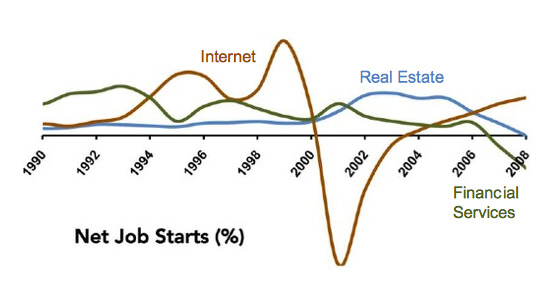
This is much better and certainly reveals an interesting view of the internet, real estate and financial services industries.
Interesting indeed.
Thank you so much, Dr. Rogati, for sharing your time and observations with Chartio. We appreciate your thoughtful insights into the world of data science!