Choose the Right Data Visualization For The Job With Our New eBook
Posted by on March 2, 2020 Chartio
Data visualizations are a key component of the data analysis process. With the right chart, thousands or millions of data points can be summarized in a way that viewers can quickly understand the underlying data. However, gaining an intuition of which chart to use in each circumstance can take time and practice.
Here at Chartio, we have written a number of articles on chart types, describing what different types of chart show and best practices for building them. Among these articles are two overview articles on common chart types and different ways charts can be used to visualize data.
Those two articles have served as a basis for our new downloadable eBook, How to Choose the Right Data Visualization. If you need to summarize your data using a visualization but aren’t sure what type of visualization to use, this book will serve as a quick guideline for chart types to try. The chart types have been divided into seven major categories based on visualization role:
- showing change over time
- showing a part-to-whole composition
- depicting flows and processes
- looking at how data is distributed
- comparing values between groups
- observing relationships between variables
- looking at geographical data
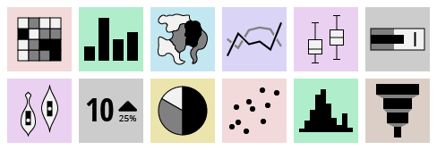
One additional category notes the role of raw numbers in visualizing data. Within each category are listings for applicable chart types, including an iconic representation of the chart type and a short description of how it encodes data. Some charts appear in multiple categories, with different text for each use case.

Each chart is also accompanied by a symbol inspired by marked ski runs, showing how common or essential each chart type is. Chart types marked with a ‘basic’ symbol will be the most frequently seen in data visualization use cases. Meanwhile, ‘advanced’ chart types will have specialized use cases or will need to be built by hand.

In total, the book covers more than fifty different chart types at all levels of commonality. The book also includes a few supplemental chapters, including a printable diagram with a reference for the most common chart types used for dashboards and reports. This guide is built to be a balanced reference, providing more detail than a web article, while still being streamlined in scope and size. We hope that this book helps you build your visualization toolkit and provide inspiration for more creative or unusual visualization tasks.
Be prepared with the right chart type for each visualization task and download our data visualization book today.
