Off the Charts: Visual Storytelling at The Urban Institute
Posted by natasha on May 27, 2014 Off The Charts
We were super excited when we got the opportunity to interview Daniel Wolfe of the Urban Institute as part of our Off the Charts series. The Urban Institute carries out economic and social policy research, collects data, and educates the public on key domestic issues. Daniel Wolfe works with the Urban Institute creating interactives, animations and illustrations.
I really enjoyed the data narrative you contributed to at the Urban Institute, Our Changing City. Can you tell us more about the project and the visualization that went into it?
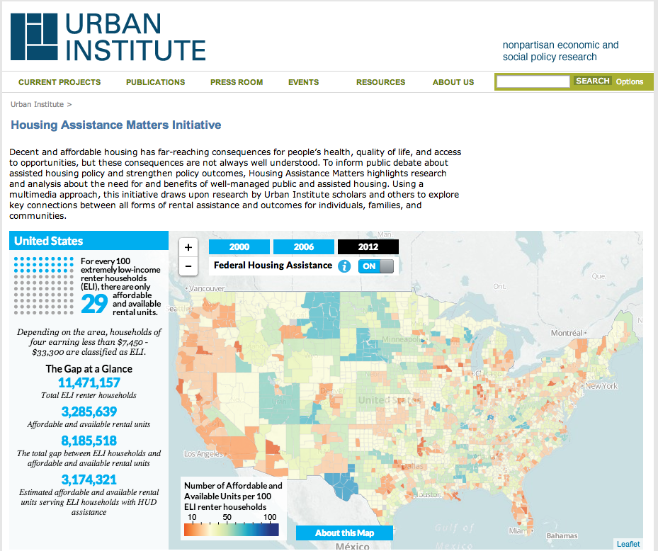
That’s so nice to hear! I’m glad you enjoyed the narrative. Peter Tatian, who’s a senior fellow here at Urban and one of the chief architects of this initiative known as Neighborhood Info DC, has been doing this traveling lecture for years on the history and the changing demographics of the District of Columbia. He wanted to figure out a way to share these data more broadly, beyond just giving small presentations here and there.
Our Changing City was kind of a gamble, to be honest. The risk was that we’re dealing with publicly available data. Theoretically, anyone could make similar visuals or analysis, so we have to differentiate ourselves. We used publicly available census data, and pretty old data at that (four-and- a-half years old). You would think that four year old data is old news.
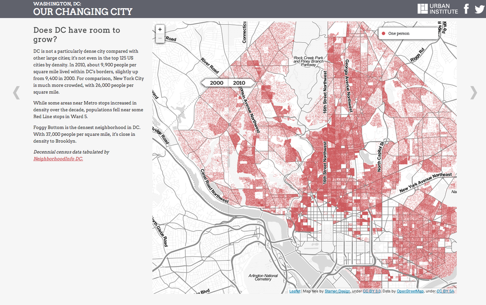
What we found - and what’s retrospectively obvious now - is that people find Excel spreadsheets boring. Any person can find race and age demographics) but it’s an exhaustive process manipulating that information. When we launched Our Changing Cities, day one we had traffic in the tens of thousands. We found that people wanted this story, they just lacked the means to make it accessible.
What we found - and what’s retrospectively obvious now - is that people find Excel spreadsheets boring.
Can you tell us more about how the Urban Institute tackles data?
The Urban Institute was founded over 40 years ago to understand the problems facing America’s cities and assess the programs of the War on Poverty. Out of that administrative initiative came this lovely place that houses hundreds of researchers that today look at nearly all facets of American social and economic policy. Research Fellows work in tandem with directors to examine any sort of hypothesis using qualitative and quantitative research methods.
For example, one of my favorite researchers, Meredith Dank, does work on human trafficking and vulnerable populations internationally. She recently authored the first report on estimating the size of the underground commercial sex economy (UCSE) in American cities. Meredith did an exhaustive estimation through hundreds of interviews across the country with convicted pimps, traffickers, sex workers, child pornographers, and law enforcement. Stakeholders and offenders were interviewed about the structure of the UCSE, the profits generated through the UCSE, networking within the UCSE, and changes in the UCSE over time. Her work represents some of the multi-method approaches (in both quantitative and qualitative ways) that the Urban Institutes collects and tackles data.
Meredith’s work also lent itself to some digital storytelling.
As a graphic designer, why are you so interested in visualizing social work?
After graduating college, I was writing and producing a play with a friend of mine, while I did service work for Habitat for Humanity in my hometown of Baltimore. The general premise of that sort of work is that you bring people of different walks of life together to help fight the good fight for affordable housing, while learning about the challenges firsthand from the family whose home you’re helping to build.
What was hard about this process is that a lot of the time, when a volunteer is done, they don’t go back to that community and the issues of the neighborhood remain out-of-sight and out-of-mind for them. That led me to the desire to reach audiences on these issues of social equity where they couldn’t avoid it. That begins with illustrating comparative advantage–why and how sacrifice is possible to make the world better. That’s when I realized I could merge my abilities in design with my passion for storytelling.
Tell us how you got interested and started doing data-driven work?
Data-driven work is something I’ve learned in my role at Urban. It’s funny, my brother’s the analytical math guy and when he heard I’d be working here, his heart stopped, “You know you’re gonna have to work with Excel sheets, right?” he told me, baffled (I hadn’t opened an Excel sheet since maybe a fifth grade science project). But it’s fine, I told him, that’s what Google and older brothers are for.
It was certainly a steep learning curve, but my default problem-solving skill is conversation. When I don’t know something, I seek out those who do and I just ask questions and listen. The Urban Institute’s a great place for that. It’s really a repository of geniuses in their field. So for the first few months at Urban, I was inviting myself into people’s offices and trying to get in plain language the projects they were most passionate about, and I worked from there.
You call yourself a visual storyteller. Can you tell us more about that?
There are certainly a lot phrases floating out there right now in the design and data community. The two I encounter the most are data scientist and visual storyteller. And I believe it’s because it’s such an open territory that people are figuring out their own tools and approaches to data visualizations that traditional terms just don’t fit or feel right. When I want a short conversation, I say: “graphic designer.” But what “visual storyteller” gets at is this feeling that I’m from the ground up taking a typically unapproachable topic, understanding it, and then translating it into an engaging medium for audiences.
But what “visual storyteller” gets at is this feeling that I’m from the ground up taking a typically unapproachable topic, understanding it, and then translating it into an engaging medium for audiences.
I noticed you have contributed to data narratives in many different forms - infographics, interactive visualization, white-board videos, and illustrations. What is your favorite medium and why do you enjoy it?
Oh man, doodling is my passion. If I could work strictly in doodle-driven stories, that would be heavenly. I guess that’s why the whiteboard videos came about, but that’s a pretty difficult medium to work in. Something is definitely lost when I move from pen and paper to dry-erase marker and whiteboard. Currently, I’m trying to get a firm handle on animation work so that I can better transition my doodling into info-animation type work.
What are your go-to tools for your work?
Pen, paper, camera phone, and Adobe Illustrator. I feel like with those I can get a lot done. Almost all of my work still begins with conceptual work on paper. Ideas come out more freely that way for me. OH! And WTMD.ORG. It’s a Baltimore radio station. Without that, nothing gets done.
Finally, what advice would you give to other designers concerning data driven work?
One of the best pieces of advice comes from a friend of mine, Tom MacWright at Mapbox: Give yourself projects. There’s a daunting body of work out there, but you’ll never contribute to it if you don’t just start giving yourself work first. Learning how to code is a necessary task for many designers today, and you might as well use all those great and free resources out there, like CodeAcademy.
Some of the most memorable visuals I’ve seen, come from an earnest point of view. Honesty, like in all storytelling, is the most effective communications tool at your disposal.
There’s a daunting body of work out there, but you’ll never contribute to it if you don’t just start giving yourself work first.
Related Content
-

Startups, Data and Fundraising - an Interview with Amanda Kattan
Amanda Kattan data and finance consultant -
Data for Good with Aziz Alghunaim, Co-founder and CTO of Tarjimly
Aziz Alghunaim Co-founder and CTO Tarjimly -

An Interview with Daniel Mill of The New York Times
Daniel Mill Director of Marketing Analytics The New York Times