Off The Charts: An Interview with Kim Rees of Periscopic
Posted by dave on February 3, 2012 Off The Charts
We spoke with Kim Rees and gained her perspective on the debates and trends in the field of data visualization. If you’d like to hear more from Kim you can follow her on Twitter, and be sure to check out our other Off the Charts interviews.
Can you tell us a bit about yourself? What drew you into the field of data visualization?
I have a BA in Computer Science from NYU. I started programming in physical computing and then migrated to web/internet programming in 1995. Around 2004, I found a site called the Glass Engine, which was created at IBM.
It completely changed my thinking about how to display information and how to interact with data. Its interface is used as both input and output which creates an elegant and succinct way of browsing the catalog of music. All the data is viewable on-screen at once. At the time, browsing a large body of work usually meant a tiny window of data with filters and sorting mechanisms. The Glass Engine shattered that simplistic browsing method brilliantly.
Did you find inspiration besides Glass Engine?
Quite a lot! Back in 2004, I started researching data visualization and discovered Ben Fry, Martin Wattenberg, Stamen, PNNL, Marcos Weskamp, and a handful of other great talents. So I convinced my business partner, Dino Citraro, that we should switch gears from traditional web development and focus solely on data visualization. We re-branded and headed down the wonderful path of data visualization.
It’s like the ‘Wild West’ of dataviz, where Stephen Few is the obstinate sheriff and David McCandless is the defiant outlaw.
That’s quite a trajectory! Now that you’re fully immersed in the field, where do you see the world of data visualization as it exists today?
Data visualization is at a very exciting point. In the past two years, we’ve seen a very clear shift in the lay person’s knowledge. The New York Times, The Guardian, GOOD magazine, and Fast Company have brought data visualization to the breakfast table. And the large agencies are scrambling to set up data visualization arms to accommodate the demands of clients.
And on the theoretical side, there are daily debates across the blogosphere, pitting the visualization pundits like Stephen Few, Tufte, and Robert Kosara against the aesthetes like Jer Thorp, Pitch Interactive, and David McCandless. It’s like the ‘Wild West’ of dataviz, where Stephen Few is the obstinate sheriff and David McCandless is the defiant outlaw.
What kinds of debates are these?
The ones I find most substantive and noteworthy are ones that address the specifics of design, such as debating the merits of a particular dataviz or chart. There are often many subtleties to discuss and it’s great to hear such a variety of perspectives. I enjoy the push and pull from various sides, as they analyze a visual or an interaction; it can help me form an opinion, validate my viewpoint, or completely change my thinking.
That said, theoretical discussions are interesting and a good brain workout, but they are often polarizing or maligning. They can sometimes be overly abstract, which makes them far removed from the daily practice and work of dataviz practitioners. It gets overly heated because many practitioners are really pushing their designs and creative ideas outside the comfort level of the academics.
Do you find that your opinions align more closely with the academic side or those ‘defiant outlaws’?
I think we should be embracing those that push the envelope rather than condemning them simply because some data might be ‘better’ as a bar chart. I wonder if Florence Nightingale, William Playfair, and John Snow received similar criticism from their peers for their respective innovations in data visualization.
I think we should be embracing those that push the envelope rather than condemning them simply because some data might be ‘better’ as a bar chart.
The flurry of online debate speaks to a larger trend where data visualization is becoming quite popularized. What are your thoughts about dataviz in popular culture?
I think visualization is becoming more commonplace and unfortunately, one of the side effects of that is that people without much practical or theoretical knowledge are creating data visualizations. It’s seen as a new trendy field, so everyone wants to be doing it. However, a general understanding of statistics and numerical representation is requisite, and too many new practitioners don’t possess that.
How do you see this popular trend playing out?
Within the next few years, I think we’ll see a general weeding out in data visualization. The designers who have knowledge, skill, and expertise will survive, and we’ll start to again see a higher percentage of quality data visualization that is both beautiful and useful.
Thanks for your time Kim! Before you go, would you be willing to walk us through a couple of samples of your work?
Sure! Here’s work we did for the Economist:
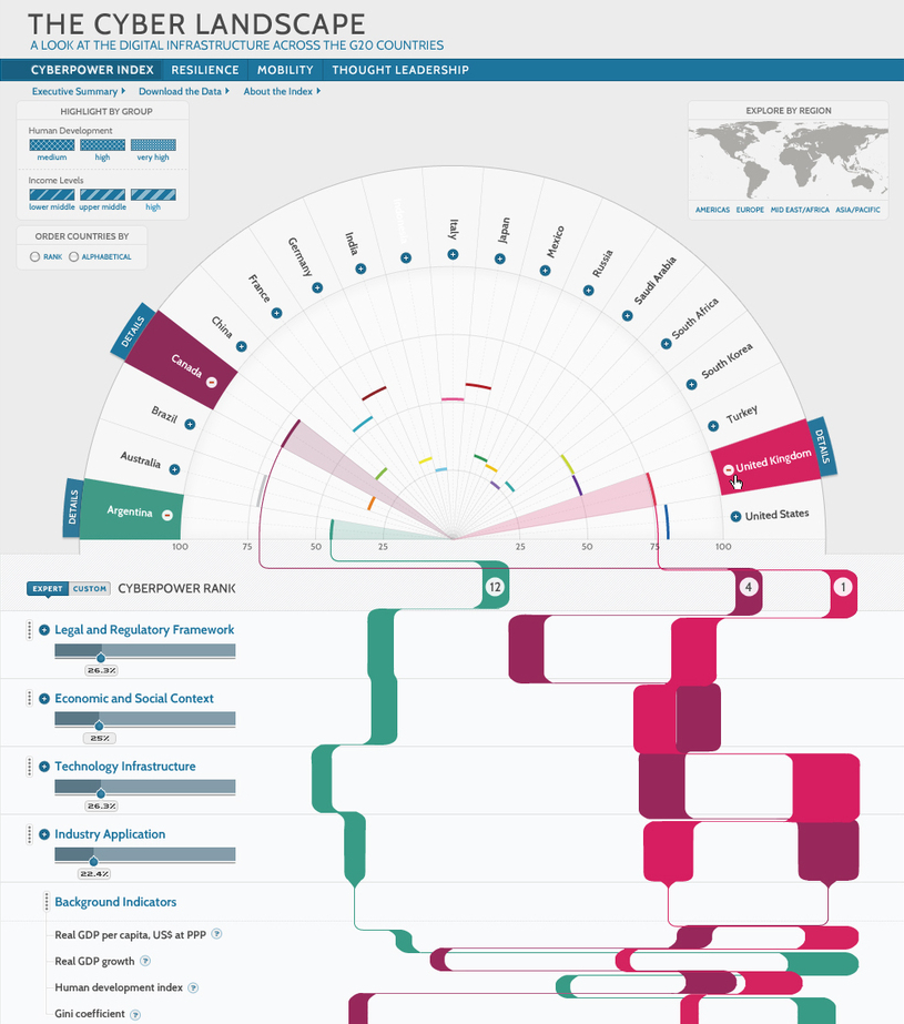
Our work on this project was modified by the client before they developed it. We were asked to design an interactive data visualization for a cyber security index they created, with the challenge being to show a hierarchy of scores for the G-20 nations countries. After a few iterations, we presented this version, which depicts the countries along an arc at the top of the page. The score for each country is shown in the arc (as a percentage). This score mark is then connected to the chart below it, which shows a ‘stream’ for each country. The streams continue through the country grading criteria, allowing people to see the nuances of proficiency, and how it all sums up to the final ranking. Visitors can expand and contract the grading criteria to reveal additional information.
Here’s our work on the current state of Salmon (the fish):
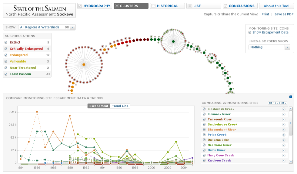
This was a very extensive project, containing multiple nested visualizations. This screen shot shows the ‘cluster view’ which diagrams the populations of sockeye salmon.
The small dots represent stations where the fish were monitored allowing visitors to quickly see connections between those that are closely monitored, and those that are not. There are numerous controls on the screen to filter the results as well as change the size and colors based on different variables. This is a public visualization that is being used by the scientific community as a research tool.
And finally, we designed the William and Flora Hewlett Foundation Grant Explorer:
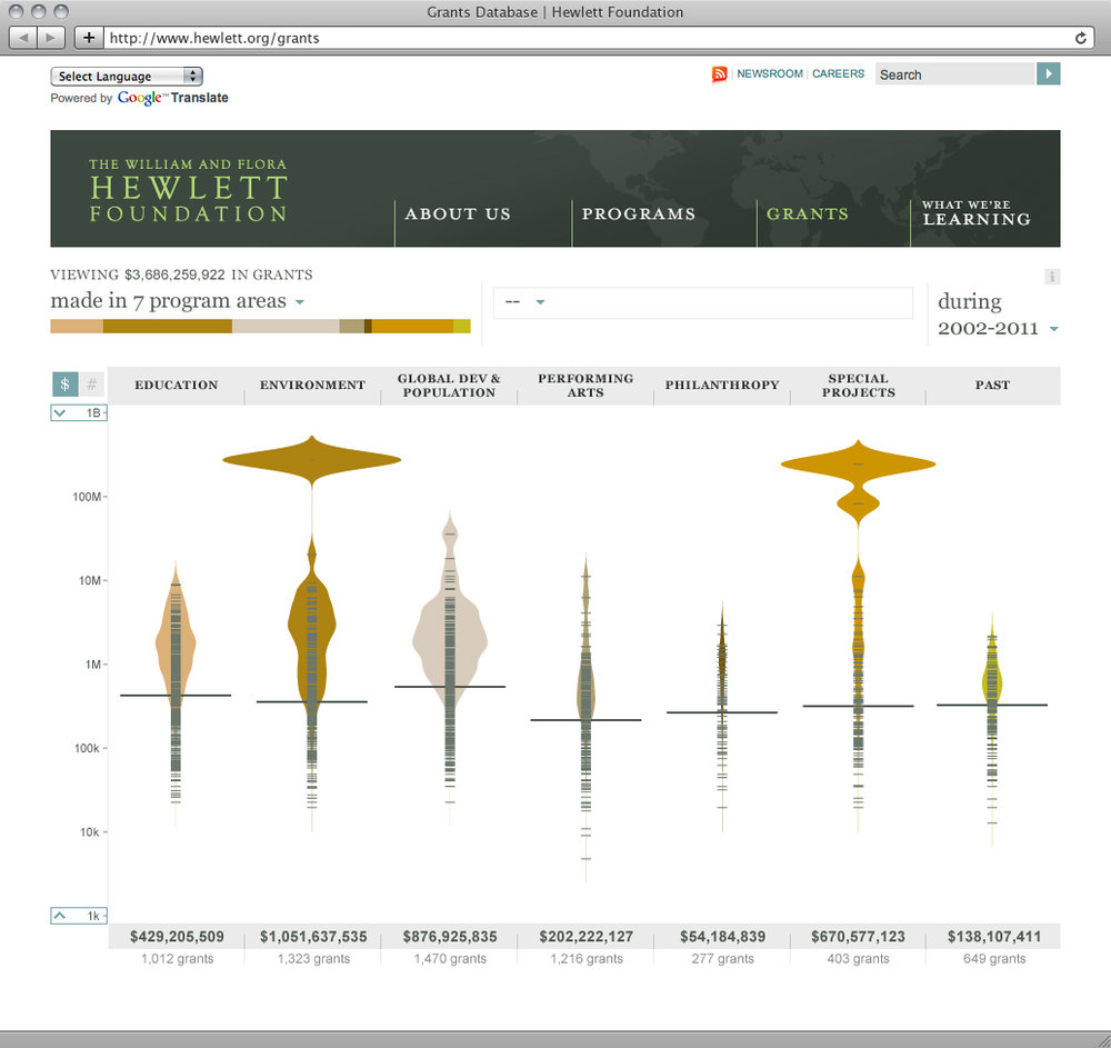
The Hewlett Foundation will be launching this visualization in March. This tool will be used to explore the more than 6,000 grants that have been made by the foundation over the last 10 years. It was designed to help visitors get a sense for the total grant allocation within program categories, geographic regions, or type of support, as well as compare between those variables. The beanplots show the volume of grants by dollar amount. The wider the bean, the more money was awarded at that dollar level. We’re only in the design phase, and already the images have been eye-opening for the client as they see their data in a new way that helps them better understand their impact around the world.
Related Content
-

Startups, Data and Fundraising - an Interview with Amanda Kattan
Amanda Kattan data and finance consultant -

Data for Good with Aziz Alghunaim, Co-founder and CTO of Tarjimly
Aziz Alghunaim Co-founder and CTO Tarjimly -

An Interview with Daniel Mill of The New York Times
Daniel Mill Director of Marketing Analytics The New York Times