What 90,000 Dashboards Tell Us About Dashboard Creation
Posted by on March 1, 2018 Dashboards, Data, Education, Data Analytics, Chartio
Use cases for data visualization are as diverse as the people building the charts and dashboards. There are a myriad of potential answers to questions like “Is this the right number of charts?” or “What’s the right chart type?”, and attempting to come to a general consensus on how many charts or what types of charts to use in a dashboard tends to ignore the use case.
Striking a balance between too many and not enough charts on a dashboard and what are meaningful types of visualizations might not be an exact science. So, we decided to answer the question of “What works best?” by digging through data.
We will share with you how Chartio users strike that balance between number of charts and different chart types for making intelligent business decisions and what choices lead to better dashboard adoption.
The Data and Our Assumptions
We queried an anonymized representative sample of Chartio customers’ dashboard, chart, chart type and view count statistics to study this very spectrum and to uncover sweet spots. Chartio’s customer base is a mix of experienced data analysts as well as line-of-business professionals without any data science background.
To find what the majority of our customers do, we set forth a few parameters around the data:
-
We analyzed a sample size of over 915,000 active charts on over 90,000 active dashboards and we used that information to start our analysis.
-
We eliminated any non-data visualization dashboard elements, like environment variables or text boxes.
-
We set a timeframe for our data sample for dashboards created since February 27, 2017 in order to keep our study to current trends.
Two companies: one that delivers groceries and another that’s an online education platform may seem to be two different points on the same spectrum in terms of use cases, but in terms of data visualization, they’re not. While deliveries per month is different in definition from students per month, in the world of dashboards and charts, they’re generalized as similar in principle.
It is because of that that we can make some generalizations and find where the representative majority of dashboards fall on the count or type of Charts per Dashboard line.
Our generalizations are based on what our customers are doing in order to find what is a majority representation or a sweet spot. We determined sweet spots not only by count of created charts and dashboards, but also by number of views each chart and dashboard gets. We believe this majority can be representative of the widest selection of possible use cases and thus a useful assumption of what are widely accepted best practices.
This is What we Were Curious About
-
How many charts do people put on dashboards?
-
How many different chart types do people use on their dashboards?
-
What types of charts get created and viewed the most?
How Many Charts do People Put on Dashboards?
The most frequent chart count per dashboard is 1.
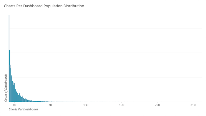
The population curve of Chart per Dashboard count follows a power law, or a functional relationship between two quantities. Not just when arrayed in rank but in ascending order of Charts per Dashboard as well. The curve follows an almost ideal curve as it climbs up the chart to dashboard count on the x-axis. It is not perfect, there are some deviations from a perfect curve as it might follow in rank. For example, 10 Charts per Dashboard has about 12% more than nine, and 24 has about 28% more than 23. But for the most part as you can see in the chart above, the curve when ordered by Chart per Dashboard has a definite head and a long tail.
The most frequent count is one Chart per Dashboard. This accounts for approximately 17% of the population. There are two common practices at work here that are likely causing this number to be so high:
-
One is reporting, or using a dashboard with a single Table Chart to generate reports for downstream consumption.
-
The other is the notion of “parking dashboards” or “scratch dashboards” which people use to create a single chart and store it, or park it, for later use on a different dashboard.
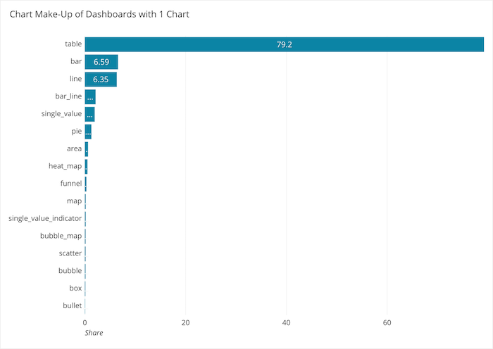
Since over 79% of the dashboards with a single chart are made up of Table Charts, it is a safe assumption to say that parking and reporting are at work here and for that reason, dashboards with a single chart count will be eliminated from further analysis.
On the other end of the population curve, there are outliers on the high end. Because there is such a long and heavy tail, we should eliminate outliers from consideration. To do that, we will add a line to the chart above that shows each chart to dashboard count’s share of the total.
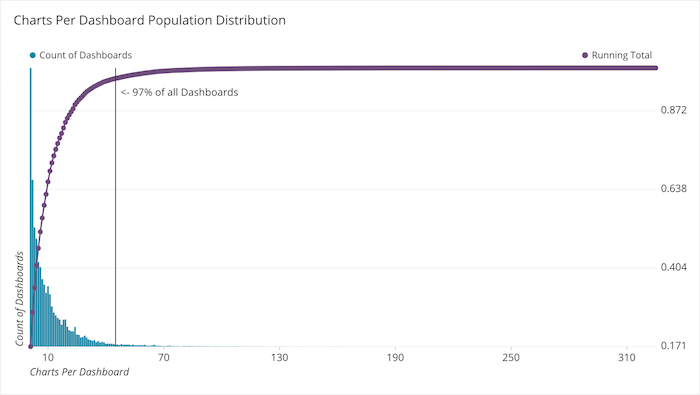
When we have that line we can find the Chart to Dashboard ratio counts that account for less than 3% of the population.
Once we eliminate those counts the population narrows our count down to less than 50 charts per dashboard.
How Many Charts do Popular Dashboards Have?
If high viewership defines popularity, the most popular chart to dashboard count is between 5 and 20 charts.
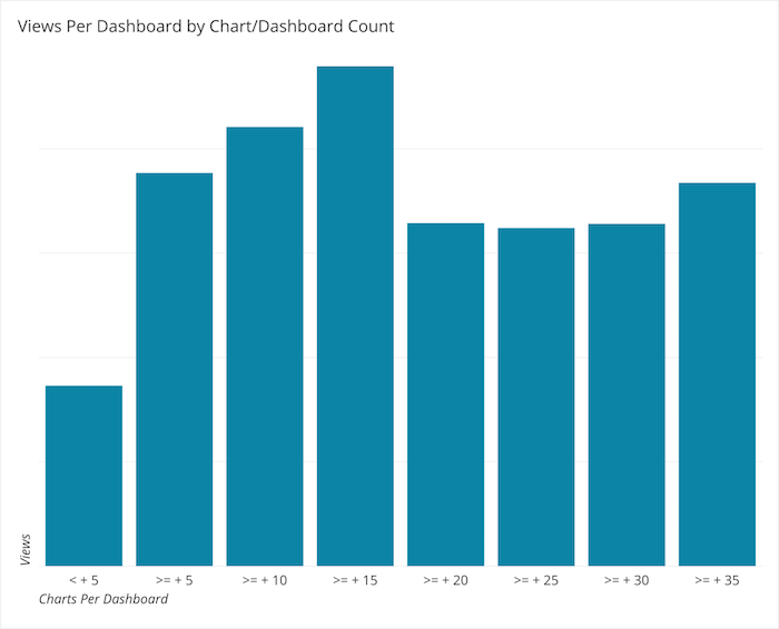
Analysis of the above chart shows that dashboards that are between five and 20 Charts per Dashboard get viewed the most with a peak in the 15-20 Charts per Dashboard bucket. There is also a distinct curve upwards after 35 Charts per Dashboard.
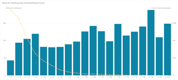
If we let this count go out further it continues to grow. This is interesting to note because the curves of dashboard count and views per dashboard are inverse of each other that far out. As the chart count end gets higher, the population falls to almost none. The Average Views per Dashboard goes up, but because the number of dashboards at that Chart to Dashboard ratio is so small, this can be considered outliers and not representative of the population. Now knowing that there is a grouping of counts per dashboard that tend to get the most views, we can do further analysis of how these charts are broken down by chart type.
This begs two additional questions:
-
What are the most created chart types per dashboard?
-
What are the most viewed chart types per dashboard?
What are the Most Created Chart Types per Dashboard?
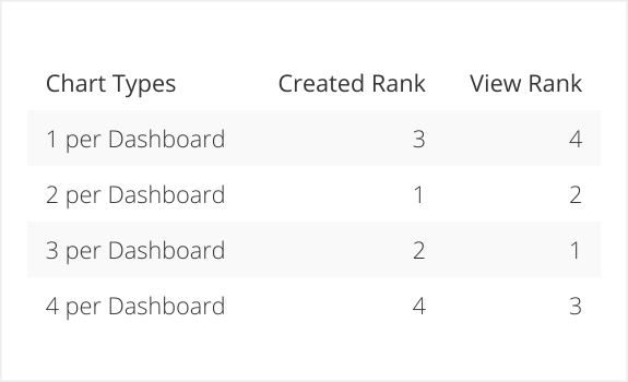
Dashboards with two chart types are created most frequently.
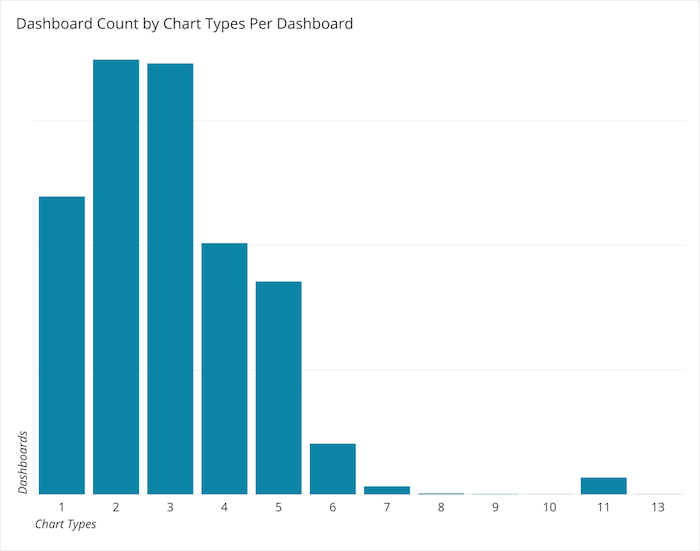
The most frequent chart type to dashboard count is two, with three following close behind. We can conclude that our users like to Keep It Simple.
Overall, two chart types per dashboard is made 26% of the time, three chart types 25% and four chart types 15%. Dashboards with one chart type are made 17% of the time. Approximately 82% of all dashboards have a variety of chart types between two and six chart types.
What are the Most Viewed Chart Types per Dashboard?
People love to see three chart types.
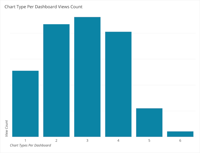
When considering count of different Charts per Dashboard for most viewed dashboards, the ranks are slightly different. In terms of chart creation, two chart types per dashboard ranks first, but is in second place in terms of most frequently viewed. Likewise, one chart type per dashboard falls from third most frequently created to fourth most frequently viewed.
comparing different chart types
Putting one chart type per dashboard is not a very popularly viewed mix. Viewers prefer variety, but don’t need you to over do it.
Specifically, What Charts are Created and Viewed the Most?
Tables get created; Bar Lines, Bubbles, Bullets and Single Values get seen.
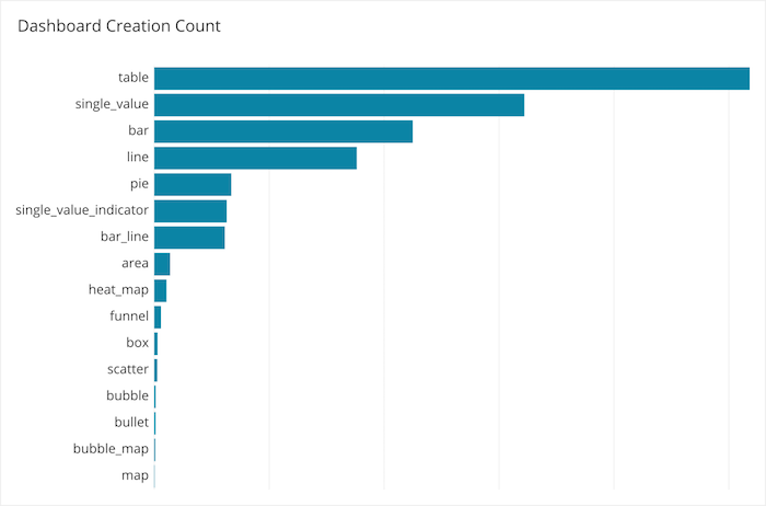
Dashboards with Tables get created the most. By far.
Single Value Charts are created the second most, and they’re only built 68% as often as Tables.
Creators of dashboards are putting Tables on dashboards a lot. An argument could be made that Table Charts are not charts, instead charts are the graphical representation of a table, and you might be interested in listening to such an argument. This type of argument will likely rage on for many days, months or years to come. That doesn’t change the fact that it’s possible and even likely that Tables fit into many use cases when visualizing data. With that, Tables are a very frequent chart type according to our sample data.
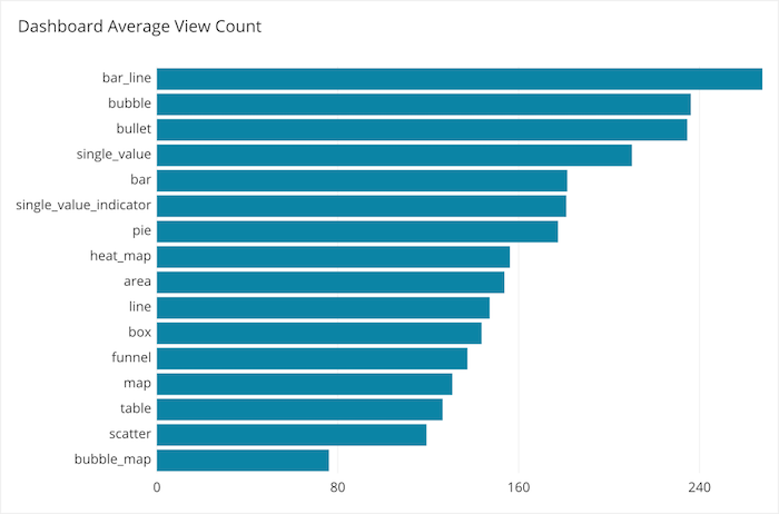
On the other hand, what do people like to look at? They love to look at Bar/Line Charts. The five most viewed chart types are:
-
Bar/Line
-
Bubble
-
Bullet
-
Single Value
-
Bar
It makes sense that Bar/Lines are used a lot, you can get a lot of information from a Bar/Line Chart in a short amount of time. Bubble Charts are really good for comparing relative size.
Also, it would seem as though people want to know a KPI’s current measure and they want to know it now. Bullet Charts are great for showing how a KPI is doing as compared against a goal or another barometer, and are great substitutions for odometer, speedometer or gauge charts. Single Value Charts are the ultimate go to when you want to know “how do we stand?” and you want to know that right now.
What Do We Know Now?
So it seems, based on dashboard adoption, that an optimal amount of information to present on a dashboard is somewhere between 15 and 20 charts. We also know that when using the right amount of charts, there is a sweet spot for variety. Dashboards that use two different chart types get created most frequently and dashboards that use three chart types get the most views. Also, the most viewed dashboards tend to include Bar/Line Charts, Bubble Charts, Bullet Charts and Single Values.
Ultimately, as we said, the use cases for dashboards are as diverse as the people creating them. But, if you are trying to maximize viewer insights, these are a few data points that can help guide you to build your best dashboard yet.


