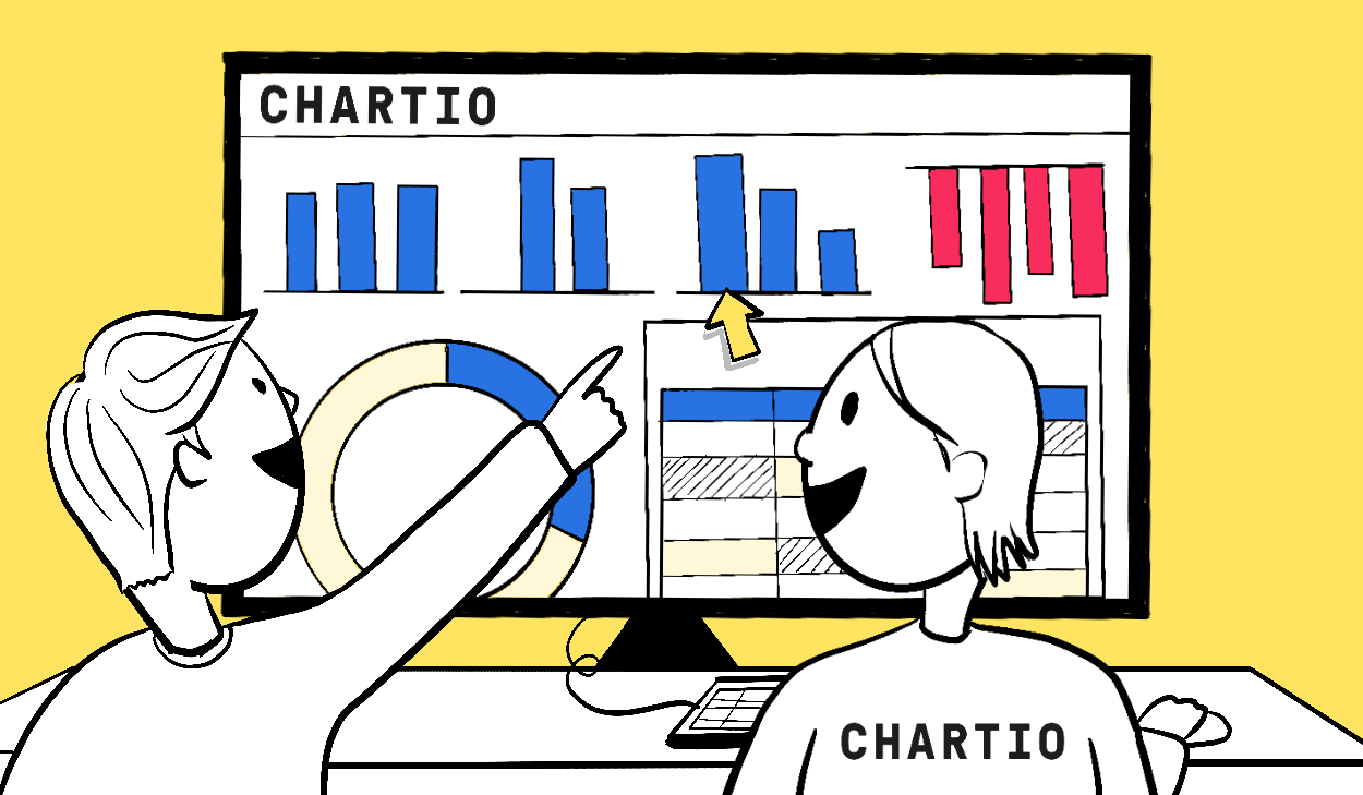
First I’d like to announce that we at Chartio have made a new years resolution to blog more (weekly), especially about the features we frequently roll out. Its really easy to get excited and just jump into working on the next set of features and functionality after releasing one, but we’re going to do a better job of taking the time in between to let you know about it. What’s the point of the feature after all if only a few people know its there?! Or, if a feature is released in the woods without a soul around, does it exist?
We’ve spent a lot of time building a really extendable and clean javascript framework by leveraging a lot of really powerful tools and libraries. This has enabled some incredibly rapid development. That’s all to say that we’re excited about having a great 2011! So if you have any feature requests, bug reports or questions, please be sure to send us a note at support@chartio.com and you’ll likely see your request featured on one of these posts in short order.
The big announcement today though is our release of date/time focus charts! It turns out that a large fraction of the graphs our users are interested in have to do with a timeline of user events. Its been nice to plot these as line, scatter, percent or bar graphs, but its been a bit of a pain to play around with the date range and focus on specific time periods.

So we’ve created a specific chart that makes that all easier. The new chart has a context bar at the bottom that shows you a small version of your entire date range of data. This context bar lets you to create a focus window, or slide an existing window to select the date range you’d like to focus on.
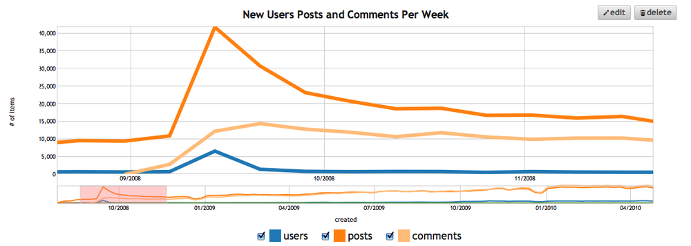
The chart takes your selected date range and zooms in on that data, presenting it in the larger focus frame. The chart is a modified version of this protovis example and takes a lot of inspiration from the google finance charts. We think its the best way to navigate through your time series chart, and it’s now automatically chosen as the default chart type for any graph you create with a date field as the X axis.
Stay tuned for what we release next week! And of course be sure to leave us feedback or requests in the comments or send us a note at support@chartio.com. We really do read all of them!