Some of the most vital metrics for a SaaS company to track surround the amount of incoming revenue received from paid accounts. In this article, you will learn how to calculate, visualize, and interpret metrics like monthly recurring revenue (MRR) and annual recurring revenue (ARR). Tracking MRR and ARR are an important start for understanding where a company is growing or starting to lose out on paid users.
What is recurring revenue?
SaaS companies tend to be built in having accounts that make use of the company’s product on a continual or recurring basis. In contrast to traditional products, where the buyer makes a one-time purchase for use of the product, the user of a SaaS product will make regular payments in order to maintain their product use.
Recurring revenue is a measure of how much money a company brings in from their subscribing customers, usually calculated on a monthly basis (MRR), or an annual basis (ARR). Each user contributes an amount to the recurring revenue based on how large their subscription price is for each period.
Here are a few visual examples of how different users contribute to an MRR calculation:
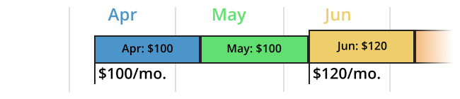
For this user, they start by contributing $100 to MRR in each of April and May. When they upgrade their subscription, their contribution becomes $120.

When a user cancels their subscription, their MRR contribution is dropped in the month their next payment would have occurred.
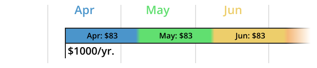
Subscriptions that do not match the recording period should be scaled to match that period. An annual subscription amount should be divided by twelve and allocated to each month of that contract. Conversely, a monthly payment should be multiplied by twelve when included as part of an ARR calculation.
Additional recurring revenue metrics
There are some sub-categories of recurring revenue that are also worth calculating:
- New MRR – Revenue generated by newly added accounts. In the above examples, all three would be counted in April’s new MRR subtotal, but not in any other month.
- Expansion MRR – Also known as add-on MRR, this is the revenue increase from existing accounts. The first user, for example, would add $20 to June’s expansion MRR tally.
- Churn MRR – Revenue lost from users that downgraded their subscriptions, or outright cancelled. Sometimes, contraction MRR (losses from downgrades) are tracked separately from full churn. The second user would represent a -$100 churn for June.
- Net New MRR – Sum of the previous three sub-measures; alternatively, the change in MRR from month to month. This is a useful measure for assessing how much your revenue is growing, or hopefully not contracting, and is usually a more useful metric to look at than total MRR. If the churn is greater in magnitude than the new and expansion gains, then that’s a major sign for further investigation!
We used Chartio for these visualizations. Chartio is a self-service business intelligence solution that enables everyone (not just data scientists) to connect to, analyze and understand their data. You can use Chartio for your data analytics.
You may sometimes see MRR defined as starting from the previous month’s MRR, then adding in the contributions of the above subdivisions. However, the end result doesn’t actually change anything, and the result should be the same as if you computed MRR straight from every user’s contribution. You can see this for June above: starting from May’s MRR of $283, we add an expansion MRR of $20 and subtract a churn MRR of $100, resulting in an overall MRR $203. This is the same as just adding the $120 and $83 from the two remaining users.
The reason why you might compute MRR this way is mostly that of perspective. In contrast to the straightforward definition of MRR, this alternative definition emphasizes the month-to-month changes in revenue.
MRR and ARR each have different use cases. The most common metric you’ll likely use is MRR, even if accounts follow an annual subscription timeframe. If you only track ARR, then it will take a long time before even two useful data points can be generated. MRR is much more useful for tracking a company’s revenue trajectory. It updates frequently enough that change can be tracked at a regular pace, while not being so short that random noise becomes a larger factor. ARR is still useful on a larger scale, for longer-term planning and strategy, so it fits better in a report rather than a dashboard.
Calculating recurring revenue
As an example of how MRR is computed, here’s a general overview adapted from how MRR is tracked here at Chartio.


Two basic tables above hold information about accounts and their subscriptions.
In the plans table, we can see information about paid plans, like how long the subscription period will be, and how much a plan costs. When a new plan is created, a new row is added to this table; in some cases, this may be necessary for each new account if there are additional attributes associated with each account’s needs.
When a new paid account is created, a row is added to the accounts table with a plan_id noting the terms of their plan. If an existing account changes their plan, an appropriate change in the plan_id is made, including any new addition to the plans table. (When an account stops their subscription, the plan_id becomes null.) Linking the two tables together on the plan_ids allows for the computation of the total MRR at the current time.
A separate table is needed to track changes over time, not just the total MRR.

When a subscription change occurs, a new line is added to the mrr_history table listing the account’s new MRR and its change to the overall total. The sum of deltas by month generate the Net MRR. Based on the comparison of the values in the account_mrr and delta columns, each row can be allocated to one of the Net MRR subcategories: new, expansion, or churn. For example, a row depicting a new account will have a delta equal to its account_mrr.
Visualizing recurring revenue
Visualizations are a vital part of using metrics, as a way of quickly tracking change in them over time. Here are two ways that you can track measures surrounding MRR.

The above plot shows the trend of MRR over time as a line plot, accompanied with a single-digit statistic showing the current MRR. This provides a good overview of how the organization’s revenue is growing.
We can see from the plot that the total MRR seems to increase at a roughly linear rate. There are a couple of bumps in the line, however, a small one in June and July 2021, and between August and December 2022. We might want to investigate these points further. To start, we can break down the specific month-to-month gains, by creating a chart to look at the Net New MRR.
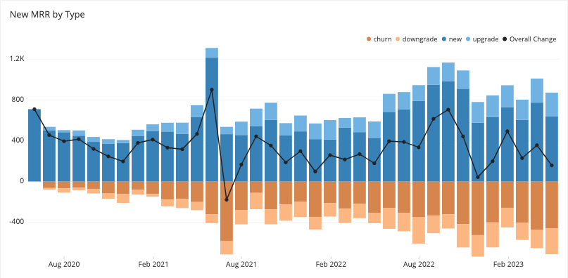
This will probably be the main reference plot when it comes to tracking recurring revenue. The stacked bars alongside with color choices help separate positive changes from negative ones. Net MRR is plotted as an additional line so that the reader does not need to estimate the difference themselves, and is plotted on the same y-axis limits.
A major spike in June 2021 – and the relatively high churn in July – provide an account for the first bump in the previous plot. It also looks like there was a good increase in new accounts from June to November 2022 before moving back to a new baseline. However, there doesn’t seem to be an appreciable change in the net new MRR, as churn and downgrades have also increased.
While the plots provide an excellent overview, it is important to note that the plots do not make any statements why the observed trends have occurred. Was there some kind of marketing campaign that drove more trials? Did a news story bring in additional traffic? The metrics reported by these plots are only a starting point, and it requires additional research and statistics to hypothesize why the observed trends came about.
The visualizations in this last section were created using Chartio. Chartio is a self-service business intelligence solution that enables everyone (not just data scientists) to connect to, analyze, and understand their data.