Changing the makeup of a relational table and summarizing it is the basic definition of a pivot table. Any one of a number of potential operations can be used to summarize a set of data. One could sum related rows under a common column, or find their average, or even find their median. This is a pretty straight forward venture in Excel, and is also quite easy using SQL. We will walk through the steps to show just how easy it can be in SQL and how Chartio has made that pivoting step even easier in our interactive mode.
Some data source types have a pivot like function built in and some do not. This can add to some confusion especially with the differences in syntax. For the purposes of this article we are going to show how to do this in PostgreSQL and Amazon Redshift in the absence of a pivot function.
Creating the Pivot table in SQL can be done be applying a similar column request in the SELECT statement. In our example we will be using the Chartio Demo Source and studying how Marketing Spend is allocated across a number of programs. There are a few steps in completing this SQL Mode that must be taken, and some of the drawbacks of this methodology will become apparent. Let’s first go over the process, step by step.
Pivoting with “Data Pivot” Pipeline Step
Step 1: First, build your query. Easy enough in Chartio’s Data Explorer. I want to find out how spend is allocated by program month over month, we know that I need to put the Month and Description in the Dimensions box and the Spend or Cost in the Measures box. Then run the query.
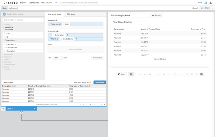
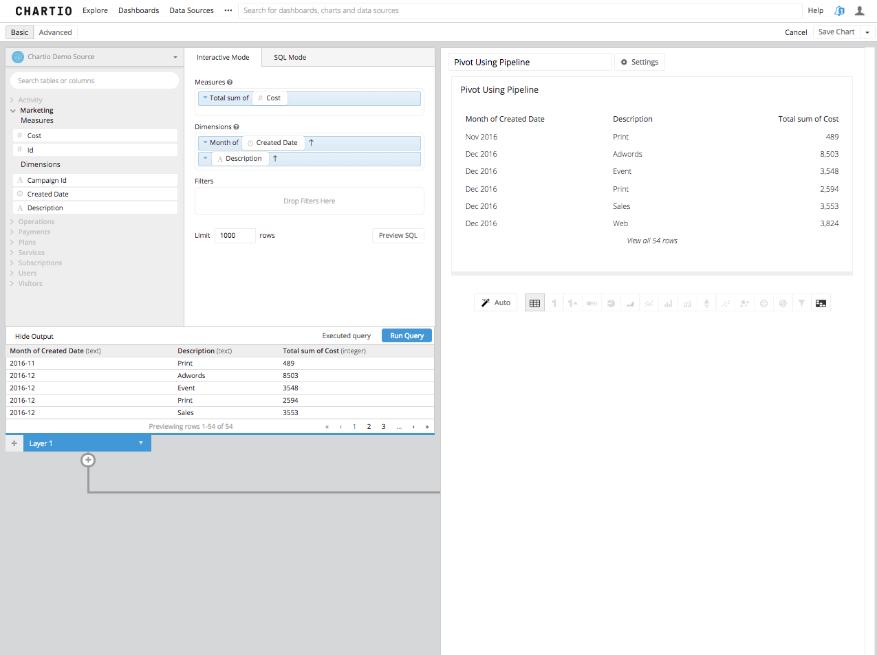
Step 2: Then, we need to determine which column you want to be the pivot, or which column you want to be the new column headers that some amount of data is summarized underneath. You must make that column the second column in your table. Re-arrange that column in the dimensions box to be second, or use a reorder columns step in the Data Pipeline.
Step 3: Now by adding a Pivot Data Step in the Data Pipeline, you will see the Second Column turned into the remaining columns headers and the third column summarized in the aggregation you’ve chosen, beneath those new columns headers.
Using Chartio’s Interactive Mode and Data Pipeline, it is a pretty straight forward process in creating the pivoted table and then visualizing it. Create the Query, Arrange it to Pivot, Pivot and Visualize. You will see after reading the SQL Mode Method below, the interactive process afforded to you in Chartio makes intricate SQL principles a little more attainable.
Pivoting in SQL Mode
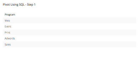
Step 1: We must first understand how many columns we are going to need to create in order to complete this pivot table. To do that we need to know how many marketing programs we have and what they are called. We can do that by writing this simple PostgreSQL syntax query:
SELECT
"Marketing"."description" as "Program"

FROM
"public"."marketing" AS "Marketing"

GROUP BY
"Marketing"."description"
This results in a table that looks like this:
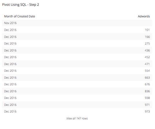
Step 2: Now that we know how many columns we will need, in this case 5, and what they are called we can set up the next query we will need. Knowing that, we want to know how the marketing spend by program is broken down by month so we can create the query we want by putting in the first column as the Month of Marketing Spend Created Date. Then we will want to find out what each marketing program costs per month, for example “Adwords” and if the Marketing Description is anything else you want it to be NULL. This case statement will look something like this:
SELECT
TO_CHAR("Marketing"."created_date", 'YYYY-MM') AS "Month of Created Date"
, CASE WHEN "Marketing"."description" = 'Adwords' THEN "Marketing"."cost" ELSE NULL END as "Adwords"

FROM
"public"."marketing" AS "Marketing"

GROUP BY
"Month of Created Date"
,"Adwords"

ORDER BY
"Month of Created Date" AS
This results in a table that looks like this:
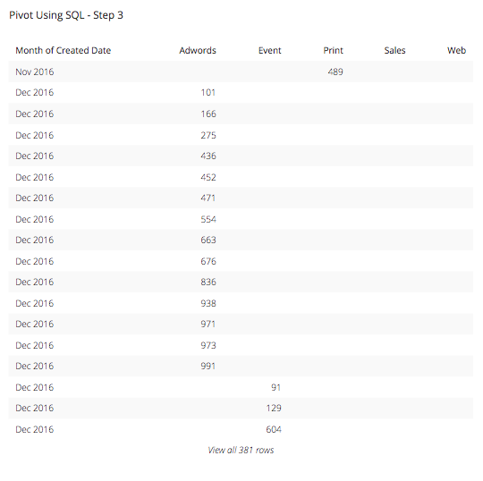
Step 3: Since we want to know this for all of the 5 types of programs we have in our marketing efforts, we will want to replicate this CASE statement for all 5 of the programs: Adwords, Event, Print Sales, and Web. The new select statement for our query will look like this:
SELECT
TO_CHAR("Marketing"."created_date", 'YYYY-MM') AS "Month of Created Date"
, CASE WHEN "Marketing"."description" = 'Adwords' THEN "Marketing"."cost" ELSE NULL END as "Adwords"
, CASE WHEN "Marketing"."description" = 'Event' THEN "Marketing"."cost" ELSE NULL END as "Event"
, CASE WHEN "Marketing"."description" = 'Print' THEN "Marketing"."cost" ELSE NULL END as "Print"
, CASE WHEN "Marketing"."description" = 'Sales' THEN "Marketing"."cost" ELSE NULL END as "Sales"
, CASE WHEN "Marketing"."description" = 'Web' THEN "Marketing"."cost" ELSE NULL END as "Web"

FROM
"public"."marketing" AS "Marketing"

GROUP BY
"Month of Created Date"
,"Adwords"
,"Event"
,"Print"
,"Sales"
,"Web"

ORDER BY
"Month of Created Date" ASC
This results in a table that looks like this:
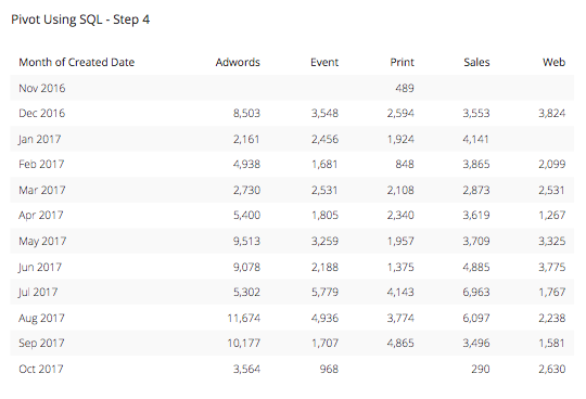
Step 4: We are on the right path but we are not quite there yet. Since the whole point of this table is to summarize this data into a more usable and presentable format, we want to add a summarization or aggregation function to the CASE statement columns in order to give our viewers the most summarized view into this data as possible. In this case, let’s use a SUM function and add it to the beginning of each column after the Month column. Our query will now look something like this:
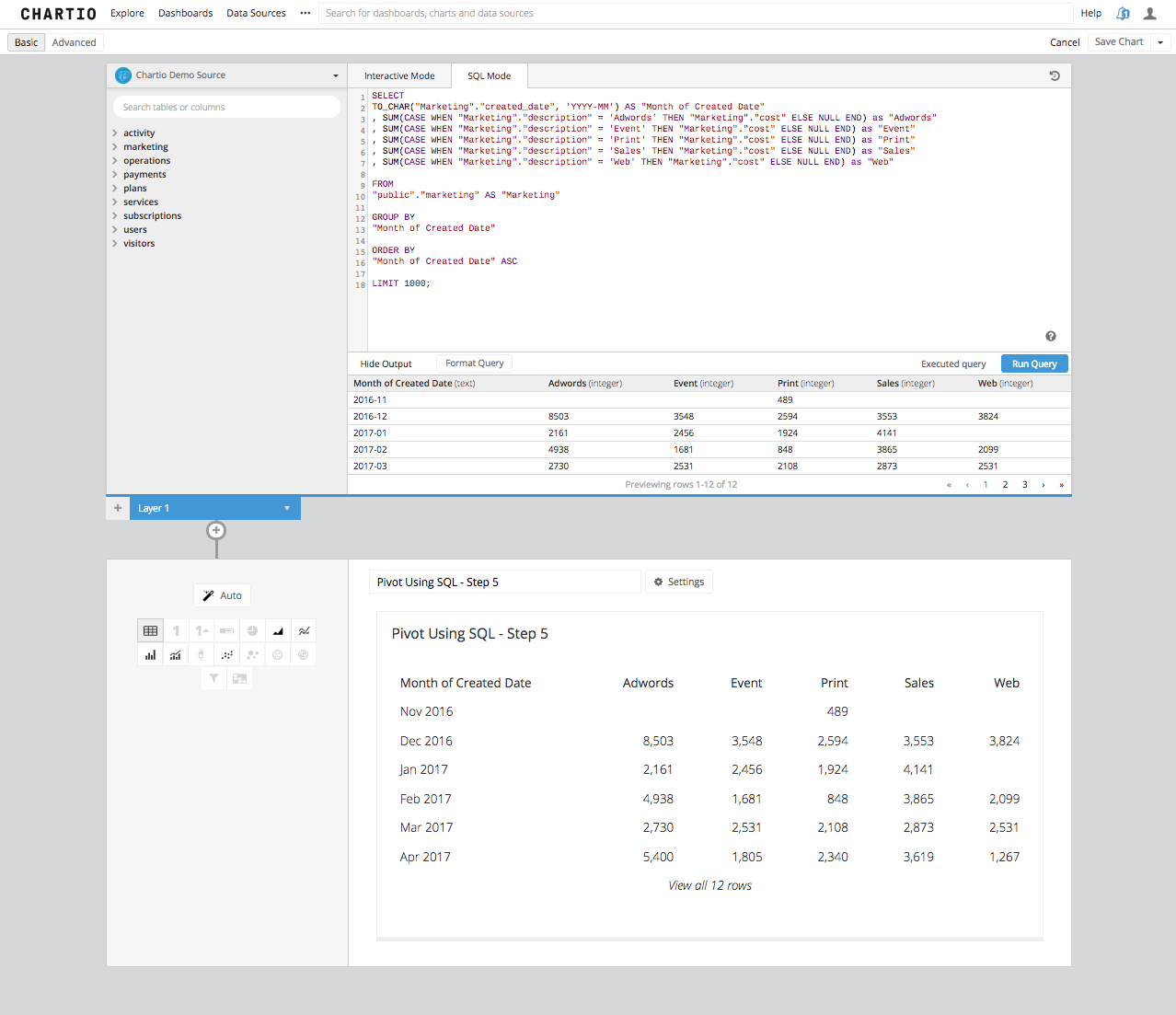
SELECT
TO_CHAR("Marketing"."created_date", 'YYYY-MM') AS "Month of Created Date"
, SUM(CASE WHEN "Marketing"."description" = 'Adwords' THEN "Marketing"."cost" ELSE NULL END) as "Adwords"
, SUM(CASE WHEN "Marketing"."description" = 'Event' THEN "Marketing"."cost" ELSE NULL END) as "Event"
, SUM(CASE WHEN "Marketing"."description" = 'Print' THEN "Marketing"."cost" ELSE NULL END) as "Print"
, SUM(CASE WHEN "Marketing"."description" = 'Sales' THEN "Marketing"."cost" ELSE NULL END) as "Sales"
, SUM(CASE WHEN "Marketing"."description" = 'Web' THEN "Marketing"."cost" ELSE NULL END) as "Web"

FROM
"public"."marketing" AS "Marketing"

GROUP BY
"Month of Created Date"

ORDER BY
"Month of Created Date" ASC
This results in a table that looks like this:
Step 5: We are almost home. This table is EXACTLY what we are looking for here, but you come to Chartio for data visualization and tables are not data visualization. If we go back into edit the chart data you can see that when we select a Bar Chart, the table turns into a beautiful stacked bar chart and shows not only a great view into the marketing spend, but also precisely the same chart we created above using the simple Data Pipeline step of “Pivot Data” already built into Chartio and waiting for you in the Data Explorer.
As you can now see that the SQL Mode process is a bit more cumbersome. Another drawback here is if the numbers of columns is variable, say for example if it were a growing date span that would need to be pivoted. In SQL Mode you would need to come back to the query to change the number of columns, by adding or restricting the date span. In Interactive Mode, Chartio will be reactionary to a growing number of potential columns as the chart changes either over time or due to your users interacting with the dashboard through variables.
While there are more options to do this in SQL Mode for a PostgreSQL Syntax Source like Redshift or PostgreSQL, using crosstab for example, these steps can get convoluted and require a good amount of SQL knowledge and that just doesn’t meet our requirements of democratizing the data.