Get More Out of Your NPS by Linking Customer Behavior
Posted by on March 31, 2015 Data, Data Analytics
This is the first part of a two post series, read part two on Chartio’s Net Promotor Score Best Practices.
How happy are your customers? What can you do to make them happier?
It’s harder to answer those simple questions than you might expect. We recently decided to survey our happiest and least happy customers to find out how to improve Chartio and monitor our progress.
Once we did that, we linked users’ responses to their actual behavior on our site. And we were surprised by what we learned.
Net Promoter Score is a Simple, Powerful Benchmark of Customer Satisfaction
After some investigation, we settled on using a Net Promoter Score to measure customer satisfaction. This is a common methodology that has some big advantages: it’s well understood, useful for benchmarking because it’s commonly used, easy to administer, simple to read, and so easy for your customers you’ll get a high response rate.
We’ll talk more about how we implemented NPS using Promoter.io in a future post. Subscribe to Chartio’s blog to be notified when we post it. For now we’ll just say we asked our users “How likely are you to recommend our company to a friend or colleague on a scale of 0 to 10?”
Best Practice: User Behavior Provides New Insights into NPS
But, this being Chartio, I wanted to join the NPS information with our customer data and show it on our marketing dashboards. So, I uploaded respondents’ email addresses and satisfaction scores as a CSV file.
Then, I pulled the each user’s email address, signup date, support tickets, and activity - plus their organization name and Monthly Recurring Revenue from Chartio’s administrative database.
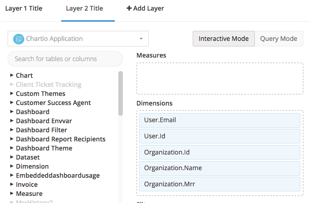
We matched the email addresses of our NPS respondents with user and and organization information in our application database.
What We Learned About Our Customers’ Satisfaction, and what We’re Doing Next
About 20% of our customers responded to our satisfaction survey. We’re working to increase that response, but we need to keep in mind that this is a less than representative sample of our users.
We have a lot of happy users, and we know how to improve Chartio for those who are not ready to recommend us. A significant number of our customers are very happy to recommend Chartio to a friend or colleague. And our best leads and easiest sales come come from referrals from happy customers. At the same time, there are enough customers who did not give us a high score that we need to concentrate on making them happier. We’ve collected specific, brief feedback from those customer who are unhappy. We’re taking steps to improve our score based on that feedback.
Unhappy customers are less likely to ask for support. Users who are more willing to recommend Chartio file more support tickets than those who like us less. The good lesson here is that our support team seems to be doing a good job of keeping our customers happy. But it’s also a warning that unhappy customers may be quiet about their unhappiness. We need to find other ways to reach out to them.
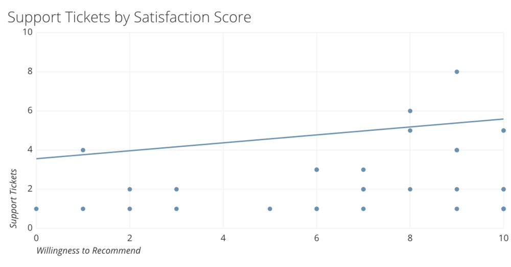
The correlation shown by the linear regression line is weak, but there is a slight increase in the number of support tickets as customer satisfaction increases. Note the small number of responses are due to the fact that not all respondents have requested support.
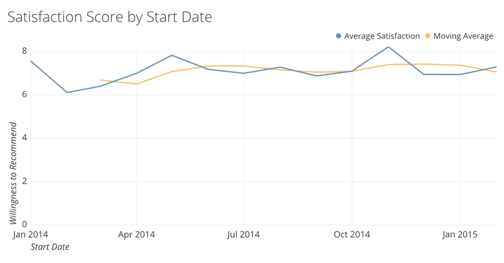
Our newest users are as happy as our earliest users. Chartio has changed a lot in the last twelve months, but users who started using Chartio at the beginning of 2014 are about as happy as those who joined us last month. There is no honeymoon period when users’ dreams of what they can do with the product exceed its actual capabilities. Any improvements we add are likely to increase the satisfaction of both our newest users and veterans who knew us as a minimum viable product.
Our largest and our smallest customers are equally happy with Chartio. As organization revenue increases, their average satisfaction stays about the same. This is interesting because our larger customers are likelier to have wider variety of users. They’re not all analysts.
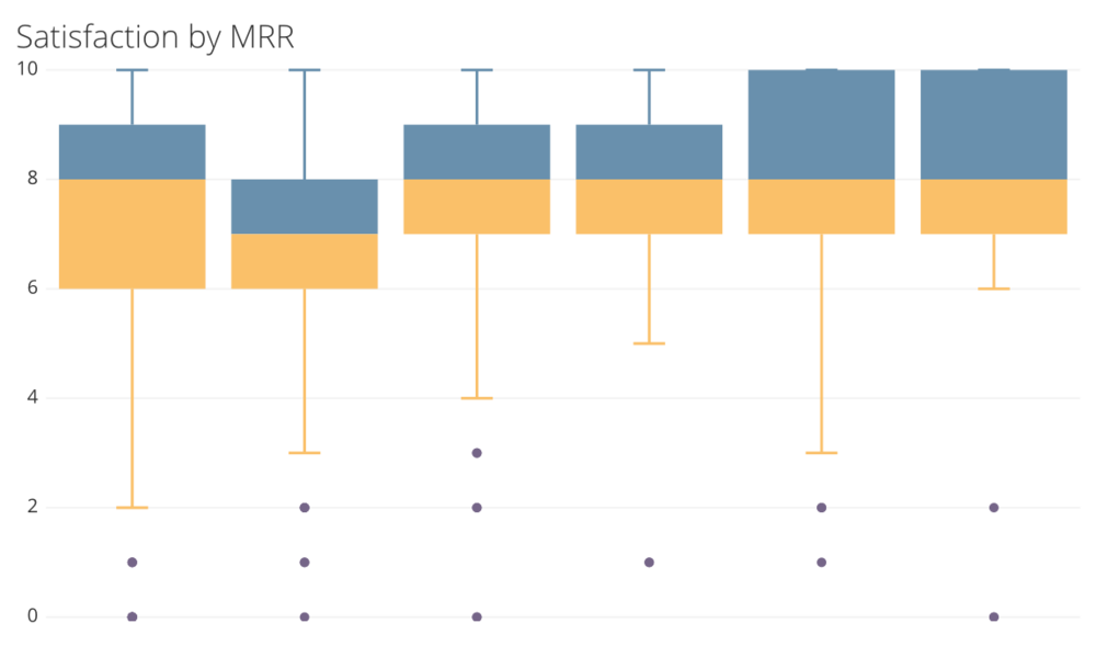
Average satisfaction by organizational revenue. We divided the data into six revenue groups. The dots are outliers. Note: Only a small percentage of any organization’s employees returned their surveys.
Most of our revenue comes from happy customers. Our average satisfaction scores by organization don’t reflect that entire organization’s experience because we have only surveyed less than 20% of our users. But we need to identify individual unhappy users, and resolve their pain points. Until we’ve spent some time working with them individually, we won’t know if users in smaller organizations have different pain points than those in larger organizations.
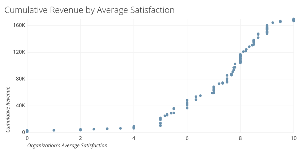
The vertical axis is the cumulative revenue represented by all lower satisfaction scores.
Usage doesn’t affect satisfaction. We were surprised to find that the amount or type of usage didn’t affect satisfaction. Chartio is committed to increasing the number of users and chart creators in our customer organizations. But those measures are either not related or lightly related to satisfaction. For example, we found no relation to the between the percentage of an organization’s employees using Chartio and average satisfaction. We’ve concluded that classic product issues (e.g. performance, availability, support) are more important to satisfaction than the way Chartio is used in the organization.
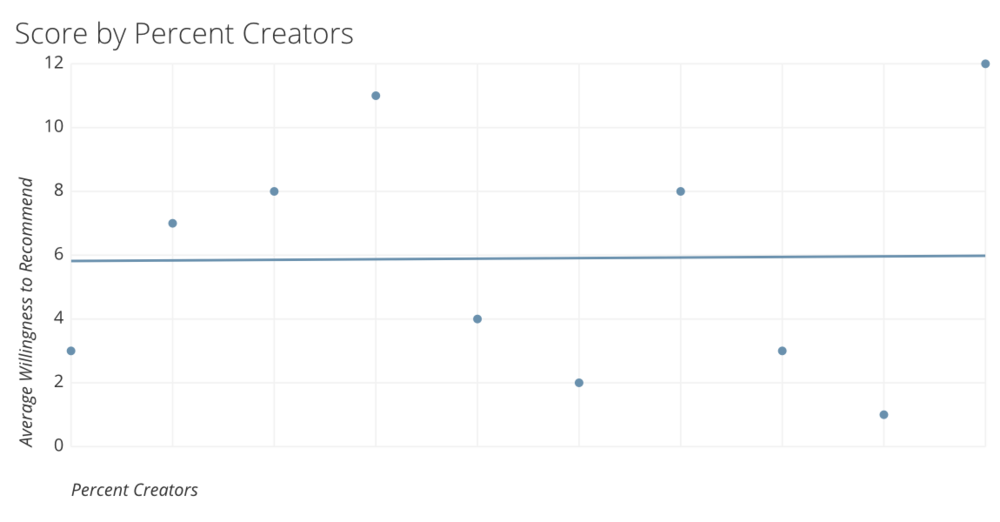
The percentage of chart creators in an organization isn’t related to the average willingness to recommend Chartio.
What We Learned About Doing NPS at Chartio
NPS is an easy way to measure and benchmark user satisfaction. It’s easy to criticize the simplicity of NPS as a measure of user satisfaction. But because it’s so simple, you know exactly what your target is, how to get there, and how to measure your progress. We’re excited about the potential of NPS as a tool for improving our product and customer service.
It’s hard to find industry benchmark data. Those sources who have NPS data for comparable companies (such as business-to-business SAAS companies) are charging for that information. We haven’t been able to find good public data on typical Net Promoter Scores by industry.
Open-ended feedback adds value to the NPS process. We were not only able to identify the degree of dissatisfaction among our users, but we have a good idea what the problems are and how to solve them.
Frequent surveys will help us chart our course. We conducted surveys of a two thirds of our customers in February and March, and in April we will have surveyed our entire custom base. It may take more than a month for our current initiatives to yield results in customer satisfaction, but we now have a common benchmark for customer satisfaction. We’re also enthusiastic about surveying our entire customer base every quarter.
A good NPS tool makes a difference. We were very happy with the way Promoter.io worked for this. They kept the process simple, and helped us maximize our response rate.
Classic product issues (e.g. performance, availability, support) are the most important drivers of satisfaction. These factors have a greater impact on satisfaction than the way Chartio is used in the organization.
