Building and Deploying a Product Dashboard in 1 Sprint
Posted by on May 11, 2020 Chartio
This is a guest post by Adam Roderick, founder of Datateer, which helps companies develop and implement successful data strategies.
First off, let’s be honest with ourselves. If building out a great dashboard in one sprint were easy, then we wouldn’t need a blog post like this! Forget about the one sprint goal for a moment—it would be nice if building a great dashboard were easy, period.
So we really have two goals here: build a great dashboard, and do it quickly. The process below will help you get there.
Audience
Simon Sinek says the best way to communicate is to start with why. I say when thinking about communicating with data, start with who. Clearly defining your target audience for your dashboard will make the rest of this process much easier.
Get input from your sales, marketing, and product teams. Align your definition of the audience you’re targeting with however your business characterizes it: they may use persona, title, role, or any number of ways. You can find plenty of opinions on the “right” way to do this; save this battle for another day. Use the terminology your business is already comfortable with.
Often you’ll find there are a number of potential audiences for your product dashboard, with no clear priority. Who should the first audience be? Start with this: who signs the check to buy your company’s product or service? As Jason Lemkin recently pointed out, the executive who is buying your product rarely interacts directly with your product. This buyer-user divide is a very common and recognized problem. En vogue advice is to make your product overwhelmingly good for your users. But ignoring the strategic decision maker, even if they are not a direct user of your product, is a bad idea. A dashboard designed just for them is the best way to give them a meaningful interaction with your product or service—and help them directly see your value.
It will be tempting to try to satisfy two or even three audiences. Select only one if you want to stay on your one-sprint schedule.
Questions
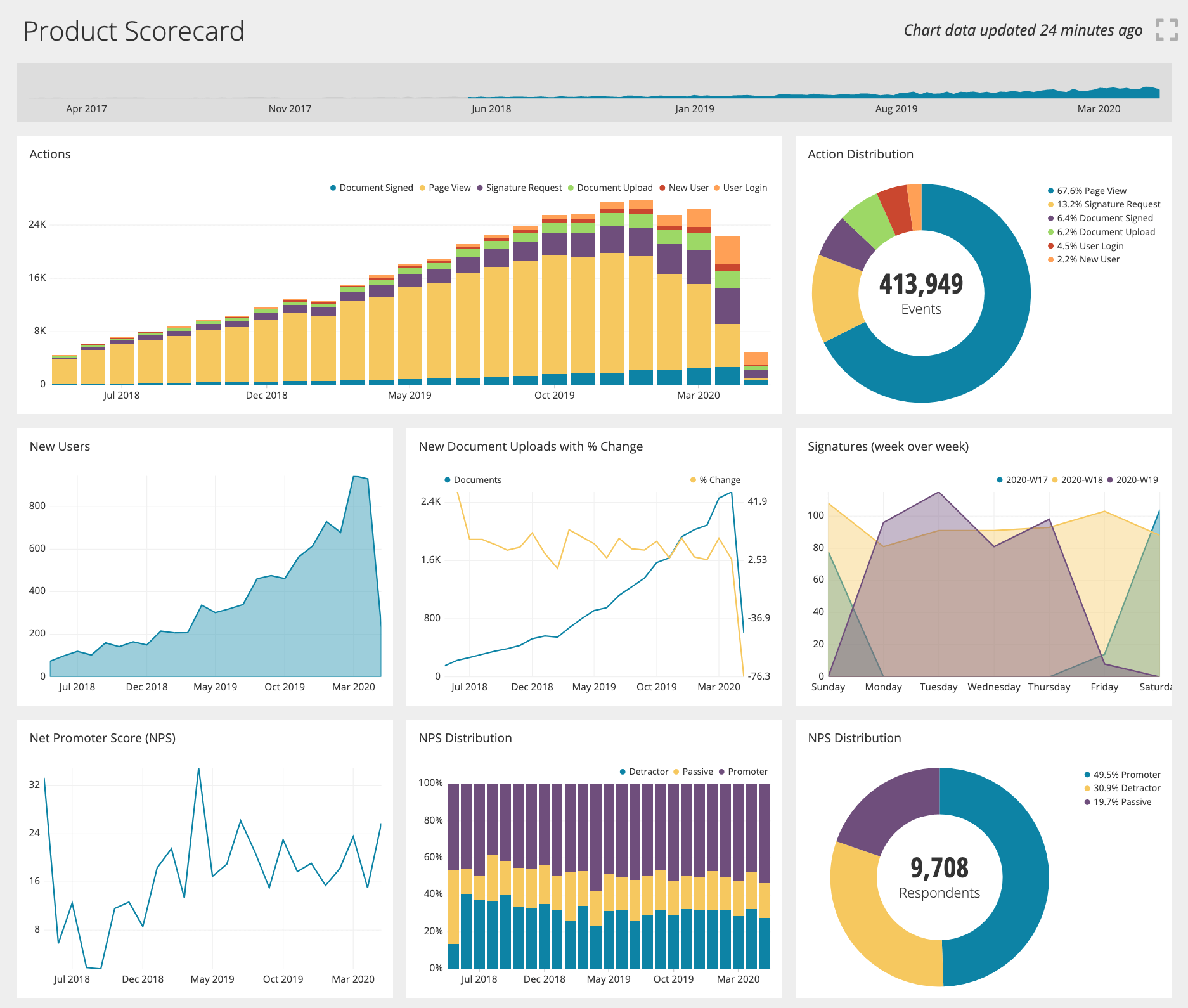
Identifying a small number of questions—ideally one question—will help you keep scope tight enough to deliver in one sprint. This may seem counterintuitive—dashboards are supposed to be full of charts and graphs, right? That is a myth. An effective analytics dashboard is one that is true to its purpose and focused on something specific. Brent Dykes is a good person to read to learn more about data storytelling.
After you identify a question and start to analyze it, you’ll see different ways to answer the question. The charts, graphs, and other elements of your dashboard will result from the different perspectives.
Your customer success or account management teams know what reports or data customers tend to ask for. In fact, they’re probably already producing ad hoc reports for their customers. These teams exist to make the business relationship and product usage successful. If customers are asking for visibility into the product and its usage, these teams will know about it.
A different but still valid approach is to talk with members of the sales team. They’ll know exactly how customers speak when the buyer feels your product’s value prop is slipping. They’ll say things like, “If only the buyer could see, by doing X we actually are providing a lot of value to them!” That right there is a question to answer! Or you can ask them what they wish they could show to the buyer to prove that the product is bringing value.
Make a list of questions, then prioritize them. Do this in 2 brainstorming sessions over 2 days, with some time for individual analysis and thought in between.
Delivery method
After you create this killer dashboard, how are you going to deliver it to the audience? You have more ways to get insights out to your audience than you may think.
Embedding analytics in a web or mobile app is a natural place to start. You might consider emailing reports as an alternative—or in addition—to an embedded dashboard. Email is more likely to get audience engagement, but it’s harder to track the usage of a report attached to an email, and impossible to make interactive.
Or, you might put this dashboard into the hands of your sales or account management team to give them a reason to engage with their buyers. Buyers will be much happier to receive these strategic insights than they would be hearing from the sales folks only when it’s time to renew!
Hopefully, deciding on your delivery strategy won’t take you any time at all. If you’re struggling with it, just pick the method that has the least friction from a business perspective. BI products like Chartio usually support all these methods.
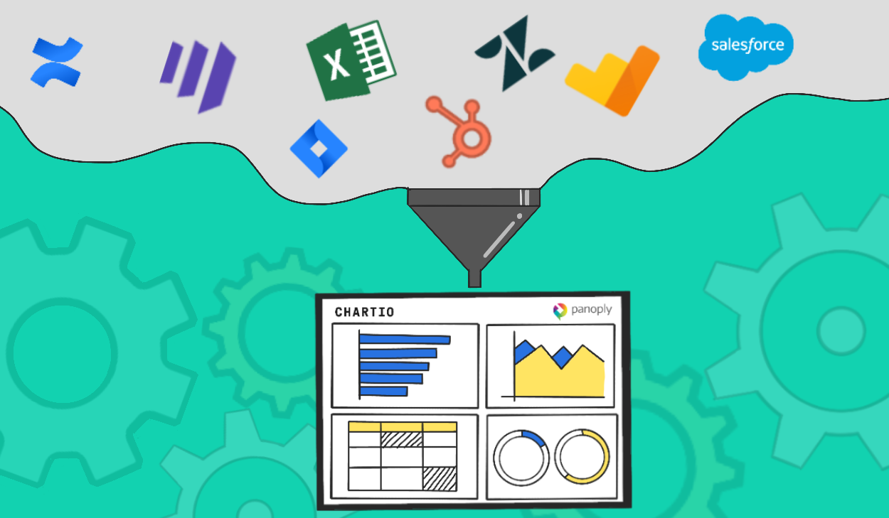
Data availability and suitability
Data availability is a tough issue, and not one that you can solve through a few conversations. Usually, this step will put some constraints on which questions you can feasibly answer. On the positive side, all of these roadblocks can be overcome eventually—especially once you show how valuable your new dashboard is!
Do you have the data you need to answer the question(s)?
If the data you need is not available, or not suitable to answer the questions at the top of your list, you may need to table some of your best ideas until you can get the data you need to answer them.
Sometimes you may be able to partially answer a question, based on the data available. For example, maybe you have a question, “What is the ROI to the customer from using our product?” And maybe you cannot calculate ROI, but you can calculate the number of hours saved. This approximates an answer to the question.
Is it in a place you can access it?
Engineering teams may not be okay with you connecting directly to the application database. They put a lot of energy into optimizing their databases to be fast and accurate for the application’s needs. Allowing a dashboard direct access to read the application database might be too risky for them to approve.
Take benchmarking, for example—comparing your customer to a broader set of data, such as other customers in their industry. This could put a real burden on a database, which may not be designed to support such a load.
Or, you may have an operational system hosted by a vendor that does not provide an API or any way to export data—even though it is your data! This is becoming less common, but is still likely. I have seen some creative ways around this, such as a manual copy/paste exercise every morning by interns. Not recommended, but sometimes necessity trumps elegance.
Are you allowed to use the data how you want?
Back to our benchmarking example. Do your customers allow you to commingle their data with that of other customers, even if you anonymize or aggregate it? Does your corporate data policy allow it? Is there any personally identifiable information (PII), or data covered by HIPAA or GDPR or CCPA? Are you sure?
If you are denied using data the way you want, you will have to decide whether to table any metrics that depend on that data. Unfortunately these issues are part of the growing pains that come with increasing your data maturity.
In the end, the suitability of your data might put some constraints on what you can do with it. Getting an understanding of your data can be a deep rabbit hole. Time permitting, start this task on day 1.
Design and build
Design the visualizations
What if you’re not a data visualization expert? Out-of-the-box charts and graphs will take you a long way. Some BI products like Chartio even go as far as to guide you to visualizations that are appropriate for the data you have. Nice!
Sites like Data Viz Project help non-experts get enough knowledge to make informed choices.
And honestly if you have read this far, you probably have enough experience to make good choices here. Chartio’s Data School has a great ebook to get deeper into this subject. But you might want to start reading that before your sprint starts!
Spending up to 2 days on designing the dashboard is time well spent.
Don’t forget the filters and groups
“Can you show me that by region?” “Could I see just the marketing department?” “Let’s break that out by role.”
Questions like these indicate the need for grouping or filtering. First, always include a date picker or filter. You’ll need that 99% of the time when dealing with business data. Second, keep it simple. More than a few parameters on a dashboard indicate the dashboard is trying to do too much.
By now, you’ll have the target audience identified, a list of questions they need answered, and an understanding of what data is available.
Implement 25%, then iterate
You may come out of the preparation exercises with a ton of ideas. That may translate into several possible dashboards, with many visualizations on each. At this stage, I suggest implementing one of your best ideas and shopping it around. Showing it to the people who informed your planning is good—showing it to members of your target audience is way better!
Final thoughts
Data can be big, complex, and technical, so it’s easy to lose sight of the fundamentals. This causes churn and wasted time, and will keep you from your goal of a one-sprint dashboard.
The other anti-pattern is to jump right in and start implementing the dashboard. This feels like progress at first but will fizzle quickly By planning out the dashboard’s audience, the questions they need answered, data availability, and thinking through design, your implementation will be focused and quick.
If you then iterate quickly to get a few rounds of feedback, you’ll be able to stay on track to not only get your dashboard done quickly, but to produce a quality product as well!
About the author
Adam Roderick is the founder of Datateer. He has specialized in software product development and data engineering since high school, creating millions of dollars in value and serving companies from startups to the largest company in the world. In addition to running Datateer, Adam is a hobby farmer, runner, outdoorsman, husband, and father to 5 amazing daughters, and volunteers his time to make his local community stronger.
About Datateer
Your data can be one of your most valuable assets. Datateer partners with you in your journey from ground zero to data hero, with a customizable data platform and high-touch service. Datateer’s Managed Data Platform is a service to organize your data, analyze it, and deliver insights to people who need them. Your business has valuable data, and Datateer helps you unlock that value. Whether you want to deliver insights to your customers and partners, or need to be more efficient in your operations, Datateer can help.