Today we are excited to include Bullet Graphs to our family of supported chart types. Bullet graphs are ideal for viewing a single value in some extra quantitative context and are an improved replacement for the gauge and meter charts cluttering many other Business Intelligence products today.
Bullet Graph specification from Stephen Few’s Bullet Graph Design Spec
An Example
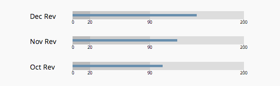
Perhaps the easiest way to explain bullet graphs is with an example. Lets say that you and your team want to keep an eye on your year to date (YTD) revenue.
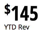
Simply putting that value on a dashboard is helpful, but the standalone value offers no information about whether it is considered good or not.
If you chose a bullet graph to plot the revenue, you can define and plot the value against a set of quantitative ranges.
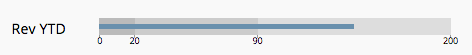
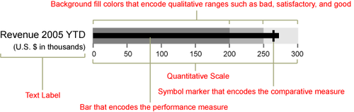
In the figure above for example, a bad range is set for $0 to $20, good is from $20 to $90, and great is between $90 and $200. The ranges are indicated by different shades of grey in the backround.
Now those viewing the chart will instantly know that the revenue displayed above is in the range considered great by the expectations set.
Creating
Bullet graphs are made with the same querying and chart building interface as the other charts. On the chart creator you’ll now notice an additonal chart type option for bullets.

Like Single Value charts, Bullet graphs require just a single measure to be returned from your data query. If you feed the chart with more than a single value you will be notified of the error.
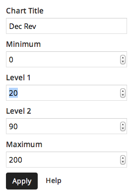
Three quantitative ranges are allowed to be plotted and are manually configured in the Chart Settings. The fields to adjust are Minimum, Level 1, Level 2 and Maximum.
For more information, check out the bullet graph documentation or send us a note.