Chart Types
By default, Chartio displays your chart’s data as a Table chart. This lets you keep working on your query and preview your full data before selecting a chart type. You can select a bold chart option to preview your data in this format at any time.
If a chart icon is grayed out, the data queried is incompatible with this chart type. To see the data format required for each chart type, click its chart type icon.
If you’re unsure of the best way to display your data, click the Wand icon, which is our Auto chart feature, at the beginning of our chart icons list and Chartio will auto-select the best-fitting chart type for your data.
| In the Visual SQL interface |
|---|
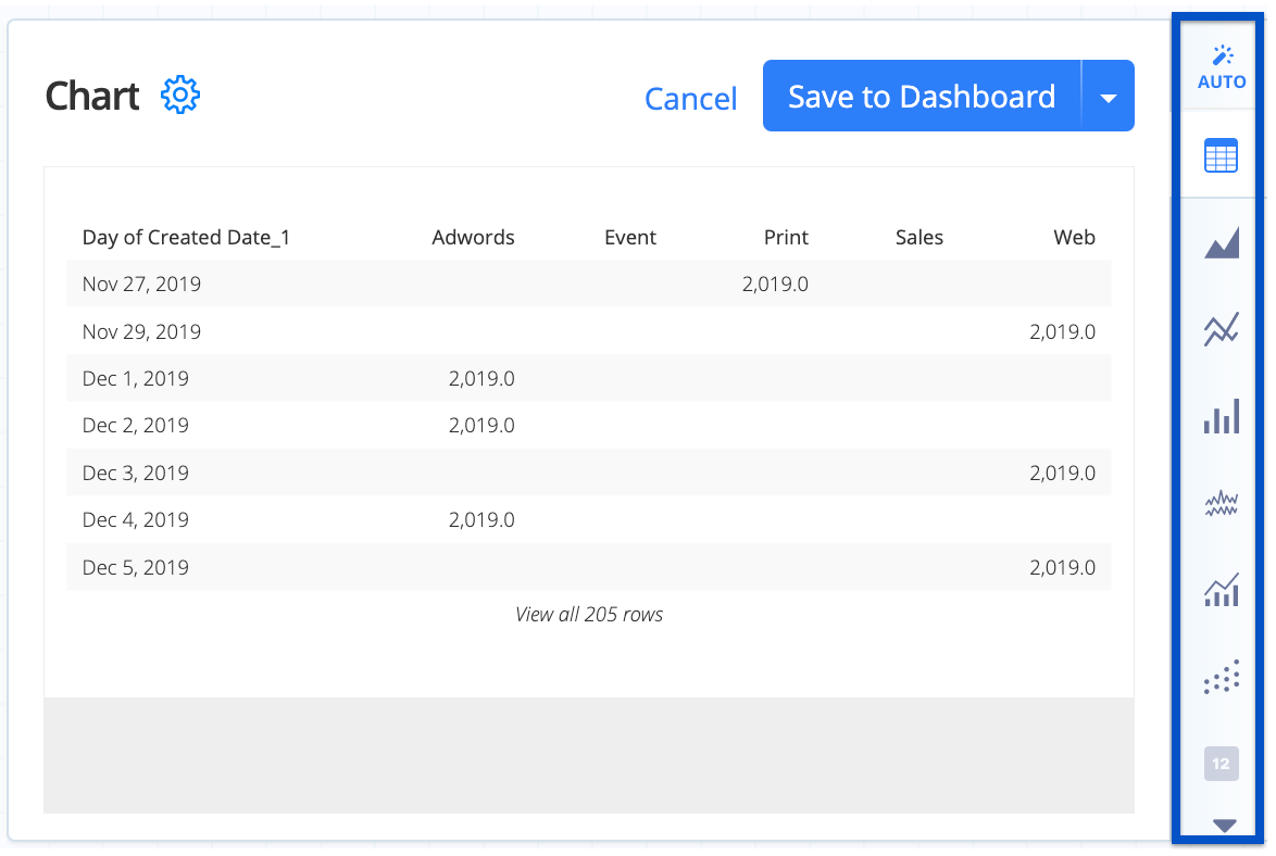 |
| In the Data Explorer interface |
|---|
 |
| Area | Bar | Bar Line | Box Plot |
| Bubble Map | Bubble | Bullet | Funnel |
| Heat Map | Line | Map | Pie |
| Scatter Plot | Single Value | Single Value Indicator | Sparkline |
| Table |
Area

An Area chart can add depth to your line chart, especially multidimensional data. You can also select a Percent Area chart, which can help magnify relative differences.
Check out Area Chart Settings for more details on how to customize your Area chart.
Required result set format: Two or more columns. The second through the last columns must be numeric. If your chart has two grouped columns and one aggregated column, add a Pivot Data step in the Pipeline.
Sample table format:
| Date | Count |
|---|---|
| 2020-01 | 1 |
| 2020-02 | 3 |
| … | … |
For more information on usage and best practices for area charts, check out our guide to area charts.
Bar

Bar charts are mainly used to visualize discontinuous (or discrete) data or to show the relationship between a part to a whole. For multidimensional data, you can choose a Stacked Bar chart, Grouped Bar chart, or Percent Bar chart.
To show value labels on bars, open Chart Settings > Series and select the Value labels checkbox.
Check out Bar Chart Settings for more details on how to customize your Bar chart.
Plotting dates on a Bar chart
Unlike charts meant to show continuous data, such as Line and Scatter Plot charts, Bar charts don’t sort dates or fill in missing date values. This is because Bar charts are generally used to display discrete data points. When using a Bar chart, sort and/or zero-fill your dates in the Pipeline as needed.
Required result set format:
Two or more columns. The second through the last columns must be numeric. If your chart has two grouped columns and one aggregated column, add a Pivot Data step in the Pipeline.
Sample table format:
| Date | Count |
|---|---|
| 2020-01 | 1 |
| 2020-02 | 3 |
| … | … |
For more information on how to best make use of bar charts, check out our guide to standard bar charts, guide to stacked bar charts, or guide to grouped bar charts.
Bar Line

Bar Line charts use a bar and a line to visualize a result set with both a continuous and a categorical metric. They can be especially handy for comparing values against a goal line, or comparing a group of values against an average.
Bar Line charts have a dual Y-axis by default, where all bars share the left y-axis and all lines share the right y-axis. You can switch to a single Y-axis from within the Chart Settings.
The first column in your query results maps to the X-axis, and the last column maps to the line. Any columns in between will map to one or more bars.
Tip! If you need more than one line in your Bar Line chart, change the value for Last X columns as lines in your Chart Settings > Series as needed.
Check out Bar Line Chart Settings for more details on how to customize your Bar Line chart.
Required result set format:
Three or more columns. The second through the last columns must be numeric. If your chart has two grouped columns and one aggregated column, add a Pivot Data step in the Pipeline.
Sample table format:
| Month | Temperature (F) | Rainfall (inches) |
|---|---|---|
| Jan | 51.1 | 4.4 |
| Feb | 54.3 | 3 |
| … | … | … |
Box Plot

Box Plot charts are useful for visualizing the distribution of data based on the following five groupings: lower quartile, upper quartile, minimum, maximum, and median. It is similar to a histogram but is usually better for showing several simultaneous comparisons such as data grouped by month, etc.
Check out Box Plot Chart Settings for more details on how to customize your Box Plot chart.
Required result set format:
One or two columns. The second column must be numeric.
Sample table format:
| Month | Cost |
|---|---|
| 2019-01 | 76 |
| 2019-02 | 101 |
| 2019-03 | 101 |
| … | … |
For more information on the uses and best practices, check out our tutorial on box plots.
Bubble Map

Bubble Maps are similar to Bubble Plots and Scatter Plots but can accept latitude and longitude values. You can choose between the following map options: US, Europe, Africa, Australia/New Zealand, and World.
Check out Bubble Map Chart Settings for more details on how to customize your Bubble Map chart.
Required result set format: Three to five columns in the following order:
- label
- latitude
- longitude
- value (optional)
- group (optional)
- Columns 2 through 4 must be numeric,
- column 2 must have values between -90 and 90,
- column 3 must have values between -180 and 180, and
- column 4 can’t be negative.
Similar to Bubble charts, column 4 will be the bubble’s quantity (radius), and column 5 will be a category, which groups the bubbles with separate colors.
Note: If there are multiple rows for the same location, the value displayed in the tooltip will be the last value for that location in the result set. To show the minimum or maximum value in the tooltip, sort the values in the result set in descending or ascending order, respectively, either in the query or using the Sort Rows Action (Visual SQL) or Sort Rows step (Data Explorer).
Sample table format:
| City | Latitude | Longitude | Users | Category |
|---|---|---|---|---|
| Aberdeen | 45.4647 | -98.4865 | 15 | Group 1 |
| Abu Dhabi | 24.4667 | 54.3667 | 23 | Group 2 |
| … | … | … | … | … |
Bubble

Bubble Plots are similar to Scatter Plot charts but support three value series instead of two. The first column maps to the x-axis, the second column maps to the y-axis, and the third column becomes the area of the bubble.
Add an optional fourth and/or fifth column: a fourth column will be the bubble’s label, and a fifth column will be a category (and group the bubbles with separate colors.)
Max bubble size Set the Max bubble size in Chart Settings > Series.
Check out Bubble Chart Settings for more details on how to customize your Bubble chart.
Required result set format:
Three and five columns. Columns 2 and 3 must be numeric, and column 3 can’t be negative.
If there are five columns, column 1 must be a date or a number, column 4 will be the bubble’s label, and column 5 will be a category, which groups the bubbles with separate colors.
Sample table format:
| Age | Height (ft) | Weight (lbs) | Name | Team |
|---|---|---|---|---|
| 16 | 5.6 | 134 | Tom | Cats |
| 23 | 6 | 186 | Jerry | Mice |
| … | … | … | … | … |
Bullet

Bullet graphs are ideal for displaying single values within some quantitative context, such as a goal value. You can define a maximum of three quantitative ranges in your Chart Settings.
Check out Bullet Chart Settings for more details on how to customize your Bullet chart.
Required result set format:
One column with one row. The value must be numeric.
Sample table format:
| Visitors |
|---|
| 20000 |
Funnel

Funnel charts are often used to visualize optimizations, specifically to see which stages most affect drop-off. Visualizing the drop-offs helps to show the severity and importance of each stage.
Check out Funnel Chart Settings for more details on how to customize your Funnel chart.
Required result set format:
Two columns. The second column must be numeric and non-negative.
Sample table format:
| Stage | Users |
|---|---|
| Free Trial | 80392 |
| Subscribe | 13902 |
| Upgrade | 429 |
| … | … |
Heat Map

Heat Maps display quantitative data as variations in color. Representing values as colors provides slightly less precision but can allow you to display more data in a smaller area.
To sort the axis values, open Chart Settings > Axis.
Check out Heat Map Chart Settings for more details on how to customize your Heat Map chart.
Required result set format:
Exactly three columns. Last column must be numeric.
Sample table format:
| Office | Quarter | Sales |
|---|---|---|
| San Francisco | Q1 | 100 |
| Oakland | Q1 | 200 |
| San Francisco | Q2 | 250 |
| … | … | … |
Line

Line charts are particularly powerful for conveying changes over time. Generally, line graphs should be used to connect data along an interval scale (i.e., a continuous range of quantitative values that are divided into equal intervals (e.g., time)).
Check out Line Chart Settings for more details on how to customize your Line chart.
Required result set format:
Two or more columns. The second through last columns must be numeric. If your chart has two grouped columns and one aggregated column, add a Pivot Data step in the Pipeline.
Sample table format:
| Date | Count |
|---|---|
| 2020-01 | 1 |
| 2020-02 | 3 |
| … | … |
For more information on usage and best practices for line charts, check out our guide to line charts.
Map

Map charts are great for visualizing location data. When you choose the Map chart, Chartio automatically guesses which map you want. You can manually adjust this setting if needed.
Location input types accepted:
- ISO alpha-2
- ISO alpha-3
- Name (full country or state name)
- State code (US/Australia state abbreviations)
Available maps:
- World map by country
- US map by state
- Europe by country
- Africa by country
- Australia by state & New Zealand (state abbreviations only)
Check out Map Chart Settings for more details on how to customize your Map chart.
Required result set format:
Two columns. The first column should be a location in a recognized format, and the second column must be numeric.
Sample table format:
| Location | Value |
|---|---|
| Alabama | 58 |
| Alaska | 48 |
| … | … |
Pie

Pie charts can be effective in showing the contributions of data segments as a percentage of a whole.
To display your Pie Chart as a Donut chart, select Donut chart in the Chart Settings. Show the total in the center of a Donut chart by selecting Show total in the center. Format the tooltip values and center total using the Label format setting.
Check out Pie Chart Settings for more details on how to customize your Pie chart.
Required result set format:
Two columns. The second column must be numeric and non-negative.
Sample table format:
| Visitor Type | Visitors |
|---|---|
| New Visitor | 75 |
| Returning Visitor | 50 |
| … | … |
For more information on usage and best practices for pie charts, check out our guide to pie charts.
Scatter Plot

Scatter Plots are typically employed to find the relationship between two variables, often quantities.
Select Linear regression in the Chart Settings to add a line of best fit to your Scatter Plot.
Check out Scatter Plot Chart Settings for more details on how to customize your Scatter Plot chart.
Required result set format:
Two or more columns. The second through the last column must be numeric.
Sample table format:
| Age | Height (ft) |
|---|---|
| 16 | 5.6 |
| 23 | 6 |
| … | … |
For more information on usage and best practices, check out our guide to scatter plots.
Single Value

The Single Value Chart displays one value of any data type.
Check out Single Value Chart Settings for more details on how to customize your Single Value chart.
Required result set format:
One column with one row.
Sample table format:
| Visitors |
|---|
| 20000 |
Conditional formatting in Single Value charts
Change the text color of your Single Value chart when certain conditions are met. Open Chart Settings > Conditions and click +Add New Conditional Rule.
This feature is compatible with any data type: numeric, date, or text.
Single Value Indicator

The Single Value Indicator chart is similar to the Single Value chart, except it allows you to compare your Single Value against another value. It adds an up or down arrow next to the single value and shows the percent change based on the comparison value.
To change arrow colors, open Chart Settings > Color and select Indicator arrow colors.
Check out Single Value Indicator Chart Settings for more details on how to customize your Single Value Indicator chart.
Required result set format:
Two columns and one row. Both columns must be numeric. The first column is displayed on your chart, and the second column is the value being compared against. Note: If you need to put your values in separate datasets, use Cross Join as the merge type.
Sample table format:
| Revenue | Comparison |
|---|---|
| 13,632 | 12,922 |
Sparkline

Sparklines are useful to show trends in a series of values. They can easily highlight increases, decreases, or cycles and can be used to compare multiple items.
To display your Sparkline chart with area, open Chart Settings > Series and select Show area of sparklines. Show the dots in the line by selecting Show dots.
Check out Sparkline Chart Settings for more details on how to customize your Sparkline chart.
Required result set format:
Two or more columns. The second through the last column must be numeric. If your chart has two grouped columns and one aggregated column, add a Pivot Data step in the Pipeline.
Sample table format:
| Date | Stock Value | Total Sales | New Customers |
|---|---|---|---|
| 2019-01 | 32.3 | 4000 | 24 |
| 2019-02 | 33.1 | 1400 | 5 |
| … | … | … | … |
Table

Tables show the data returned from your data source in a mostly raw format. They can accept an unlimited number of grouped and aggregated columns.
Table chart features
- URLs are automatically formatted as hyperlinks;
- Format column values (text color, style, date or numeric format);
- To hide a Table’s column(s) on the dashboard but use the hidden column(s) in Drilldowns and chart exports, hide the column in the Chart Settings;
- Show a totals row and set custom aggregations for each column.
Check out Table Chart Settings for more details on how to customize your Table chart.
Required result set format:
No formatting restrictions.