Data Explorer
Quick Start
For a crash course in building a chart, check out our Quick Start Guide.
Explore
Have a quick query you want to try out, but don’t necessarily want to save it to a dashboard? Click Explore in the top navigation bar to open a Data Explorer window that’s not attached to any dashboard. If you decide you want to save your chart to a dashboard, you’ll have the option to do so via the Save to Dashboard menu.
The Data Explorer has three main sections:
- The Dataset Interface is where you build your queries. Add a dataset for each separate query you want to include in your chart.
- The Data Pipeline allows you to join datasets and apply transformations to your data results.
- The Chart Preview shows your chart and lets you customize the chart settings.

Dataset Interface
The Dataset Interface is where you build your queries. Add a Dataset for each separate query you want to include in your chart. If you’d like to join data from multiple data sources, you can do so by querying each source in a separate Dataset.
Choose a data source
Before you can start building your query, you need to decide from where to query the data. Choose one of your connected data sources by clicking the Data Source dropdown from the top-left corner. Note you can only query one data source per Dataset.
Don’t have any data sources listed? Let’s fix that! Check out our data sources documentation for how to add some.

Choose your preferred mode
In Chartio, you have two options for building your queries:
Use either mode (or both modes!) as a method to pull data from your selected data source. Building queries in Interactive Mode then switching to SQL Mode is a great way to generate the basic structure of return values—and even joins—before editing the query with more specific needs.
Interactive Mode
With Interactive Mode, you don’t need to write your own SQL queries. Simply drag and drop columns from the left-hand schema browser into the appropriate Measures and Dimensions fields of your Dataset. Chartio automatically generates an underlying SQL statement with the columns you add to your Dataset.
Preview SQL
To view the generated SQL for your Interactive Mode query, click the Preview SQL button. The SQL is updated in realtime as changes are made to your Interactive Mode query.
This is also a great way to learn some basic SQL–—simply edit your Interactive Mode chart and watch how the generated query changes.
SQL Mode
SQL Mode allows you to write custom SQL against your database. SQL Mode can be useful for complex queries that aren’t feasible in Interactive Mode due to complex joins, subqueries, etc.
Autocomplete
As you type, the convenient autocomplete feature shows basic SQL keywords, tables, and columns available for you to use in your SQL query. You can also trigger autocomplete by using the keyboard shortcut Control + Space.
Check out the other keyboard shortcuts you can use in Data Explorer!

Query History
Chartio saves the last 100 saved queries in each SQL Mode dataset. To access, click the History button at the top-right corner of your SQL Mode Dataset.

Measures and Dimensions
Chartio automatically sorts your columns into two groups: Measures and Dimensions. Generally, you’ll want to drag Measures columns to the Measures field, and likewise for Dimensions. To use a Measure as a Dimension, see our documentation on Bucketing Measures.

Measures
Typically refer to quantitative data, such as number of units sold, number of unique visits, profit and so on. In the context of data visualization, measures map to the Y axis of a chart.
Drag or double-click a Measure column to the Measures field. Then, click the column in the editor to select an aggregation.
Dimensions
Refer to categorical data, such as state, gender, product name or units of time (e.g., day, week, month). Generally, dimensions are used to group quantitative data into useful categories (e.g., number of units sold by state) and typically map to the X axis.
Read more about date formatting.
Filters
Dragging a column to the Filters field in the Data Explorer generates a list of filtering customization options. These options vary depending on whether the column is a Measure, Dimension (Non-Date), or Dimension (Date).
OR filters
By default, filters in Interactive Mode each have an implicit AND between them. This means that each row included in your result set must match every filter condition. However, there are certain situations where your query results only need to match some of the filter conditions. In those cases, you can use an OR filter.
Once there’s at least one filter in the Filters section, an OR button will appear below the Filter box. Click the OR button and drag your column to the new OR field.
Every condition in the same filter field will have an AND between it. You may add as many new OR filter fields as needed.
Check out our FAQ to see some OR filter examples.

Date filters and Relative Date Variables
Chartio’s Interactive Mode date filters don’t necessarily follow SQL behavior. We have created standard date filters to ensure date filtering behavior is consistent for both dates and datetimes across all of our supported data sources.
- between is exclusive, which means the end date is not included
- between and including is inclusive, which means the end date is included

To apply use dynamic dates for your date filters, you can use Chartio’s Relative Date Variables.

Preview table data
Not sure which table you need to use? Click the table icon next to a table name to quickly preview its first 100 rows.

Note: Available for compatible data sources; excludes Google Analytics.
Foreign key creator
To query columns from two different tables in the same dataset, you’ll need a foreign key to connect them. Add a new foreign key without leaving Data Explorer by hovering over the table and clicking the key icon.

Edit Variable Values
If you’re creating a chart for a specific dashboard that has Dashboard Controls, you’ll see a Variables button near the top-left corner of Data Explorer. This opens the Edit Variable Values feature, which allows you to conveniently update the Dashboard Control values that you’re using in the Dataset filters or in the Data Pipeline. This allows you to preview your chart’s data with non-default values.
To revert back to the default values, open the Edit Variable Values modal again, click Reset Values in the bottom-left corner, then click Ok.
Note: The edited variable values are only applied to the current Data Explorer session. Values revert to defaults when navigating away from the Data Explorer.
Add a Dataset
To add another Dataset, click the + icon to the left of your first Dataset.
You can add multiple Datasets, where each Dataset is a separate query and can include data from any table or data source you’ve added in Chartio. All Datasets are then merged together in the Data Pipeline by your chosen join type.
Delete a Dataset
Open the Dataset’s dropdown menu by clicking the down-facing triangle icon (▾) then clicking Delete.

Rename a Dataset
Open the Dataset’s dropdown menu, click Rename, type in the new name in the text field, then press Enter or click outside the Dataset to save the new name.
Clone a Dataset
Open the Dataset’s dropdown menu the click Clone.
Data Pipeline
Chartio’s Data Pipeline allows you to perform transformations on your query results in a series of Steps before charting it. These Steps include a variety of operations such as column sorting, pivoting data, and adding calculated columns. The flexibility of adding any Steps in any order allows you to get your data exactly how you want it.

Merging data (Joins)
When adding two or more Datasets in the Data Explorer, you’ll need to select a method for merging, or blending, the datasets. Merging Datasets allows for powerful post-processing and calculations using Chartio’s drag-and-drop interface.
For every join option except Union and Cross Join, you can choose how many columns you would like to join the datasets on. View an example.

If you’re not sure which join to use, here are brief descriptions and illustrations for each available join type:
| JOIN Type | Visual | Description |
|---|---|---|
OUTER JOIN |
 |
Combines the columns from all result sets on one or more common columns when possible, and includes all data from both result sets. |
| INNER JOIN |  |
Combines the columns on a common column (the first N columns) when possible, and only includes data for the columns that share the same values in the common N column(s). |
| LEFT JOIN |  |
Combines the columns on a common column (the first N columns) when possible, returning all rows from the first result set with the matching rows in the second result set. The result is NULL in the second result set when there is no match. |
| UNION |  |
A Union merge will stack the result sets on top of each other without grouping or combining the data. Unions can be used to generate lists of data to be printed or viewed in table format. To remove duplicate rows, check the Distinct checkbox. |
| CROSS JOIN | 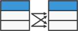 |
The result of the Cross Join will be a table with all possible combinations of your result sets together. This can result in enormous tables and should be used with caution. Cross Joins will likely only be used when your result sets are returning single values. |
If you still need some help understanding join types, check out this awesome article from our Data School that gives visual explanations of SQL join types.
Advanced Data Pipeline
For complex data processing (e.g., multiple joins, quick step repositioning, etc.) try our Advanced Data Pipeline.
Adding a Data Pipeline Step
Click the +Add Transformation or plus (+) button in the pipeline wherever you want to apply a new transformation step to your query results. You can add as many steps as you’d like, in any order. You can also use each step multiple times as needed.
For descriptions and examples of the available Data Pipeline steps, check out our Data Pipeline documentation.
Preview data
Preview your data in the Pipeline at any time to compare the input result set to the output result set of your Data Pipeline Step.
Chart Preview
The Chart Preview section is where you select your chart type and other chart settings.
Chart Settings
Click the Settings button above the Chart Preview to edit available settings. Each chart type offers different customization options. You can find more information about the settings for a specific chart type under the Chart Settings section.