Let’s wrap up this trilogy in the smoothest way possible. By now, you’ve had ample opportunity to read about creating a Bell (Gaussian) Curve, and you’ve read why Pareto Curves are better, more accurate depictions of a statistical view on a subset of data. Let’s finally discuss the built-in visualization that we already have in our Chart Library in Chartio, that you can create.
In this tutorial, I will go through step by step instructions on how to create a box plot visualization, explain the arithmetic of each data point outlined in a box plot, and we will mention a few perfect use cases for a box plot.
What is a Box Plot?
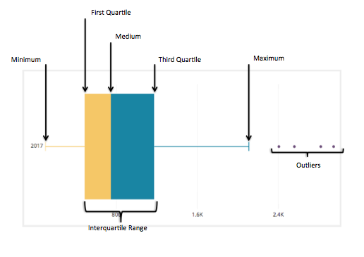
A Box Plot is the visual representation of the statistical five number summary of a given data set.
A Five Number Summary includes:
- Minimum
- First Quartile
- Median (Second Quartile)
- Third Quartile
- Maximum
Mathematician John Tukey first introduced the “Box and Whisker Plot” in 1969 as a visual diagram of the “Five Number Summary” of any given data set. As Hadley Wickham describes, “Box plots use robust summary statistics that are always located at actual data points, are quickly computable (originally by hand), and have no tuning parameters. They are particularly useful for comparing distributions across groups.” Source.
Box and whisker plots have been used steadily since their introduction in 1969 and are varied in both their potential visualizations as well as use cases across many disciplines in statistics and data analysis.
The Chartio version of the Box Plot is close to the original definition and presentation, and is used to take a subset of data and quickly and visually show the five number summary of that data set. Also, in Chartio’s version, a tool tip is provided that shows all of the data points summarized in the visualization.
How to create a box plot
We will demonstrate the creation of a Box Plot so we can compare it to the Bell Curve you created while following the first tutorial.
The goal here is to show how the distribution will be distributed using our visualization built for you as it compares to the more complex to create and less indicative of an actual population Bell Curve.
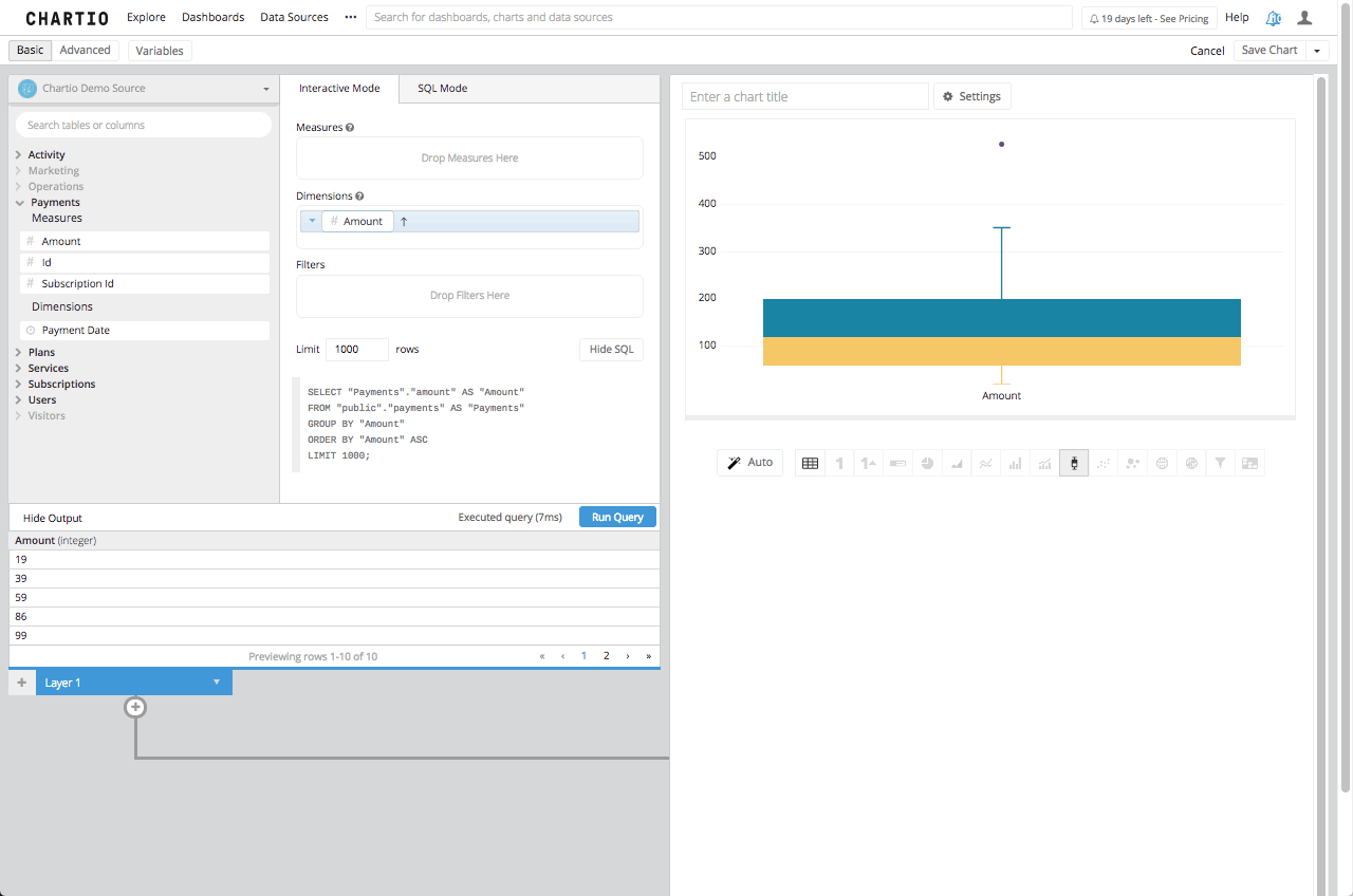
1.) We need to create the same query we did in that tutorial, which in SQL syntax is seen here:
SELECT "Payments"."id" AS "Customer",
         "Payments"."amount" AS "Cost"
  FROM "public"."payments" AS "Payments"
  GROUP BY "Customer",
           "Cost"
  ORDER BY "Customer" ASC,
           "Cost" ASC
As seen previously we need to drag the Cost to the dimensions box to show each customer payment amount to our company in one chart, and that is it. As opposed to how we needed to show the Customer as well to determine the distribution in the Bell Curve we only need each amount in the dimensions box.
2.) Then we need to click on the box plot icon in the Chart Library below the Chart Preview Screen.
As promised, this is far less complicated. Even if you want to add some more dimensionality to it, and see how these amounts are brought in by month, all you would need to do is to add the created date, bucketed by month, to the dimensions box and re-run your query.
What’s in the Box?
Now, that we know how to create a Box Plot we will cover the five number summary, to explain the numbers that are in the tool tip and make up the box plot itself.
First, the Five Number Summary is the Sample Minimum, the lower quartile or first quartile, the median, the upper quartile or third quartile and the sample maximum. Traditionally the box plot should be the Five Number Summary and in a very basic number set Chartio will assign the values in the box plot to the Five Number Summary. This is not the literal number for each of those five numbers, instead it is the closest number in the data set to those numbers.
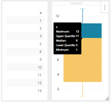
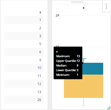
For example in the number set where x = 1, 2, 3, 5, 6, 9, 10, 11, 12, 13
The literal Five Number Summary would be this:
| 13 | MAX |
| 10.75 | Q3 |
| 7.5 | MEDIAN |
| 3.5 | Q1 |
| 1 | MIN |
However, the true Five Number Summary would be the closest values within our dataset to the numbers calculated in the Five Number Summary so our result set will actually be this:
| 13 | MAX |
| 11 | Q3 |
| 9 | MEDIAN |
| 3 | Q1 |
| 1 | MIN |
You can see this presented in Chartio here, with the tooltip visible:
That is pretty straight forward, but it can get complicated when the dataset it a much larger set of numbers, or if the data set range is much larger. What happens then is there is an adjustment to the Five Number Range, and that is to find the upper and lower end of the whiskers. This new limit is calculated using the Interquartile Range or IQR. This number is the distance between the Upper and Lower Quartile, or in our example it would be 8. That being said the new upper whisker is the first number that is less than the Upper Quartile (3Q) + 1.5IQR, in our case it is still 13. With this new facet in our equation the highest value of 26 which is outside 3Q + 1.5IQR is now considered the outlier which Chartio will show as an individual plot point.
The Box Plot is a very useful tool when showing a statistical distribution and is much easier to build in Chartio because we have already included this as an item in our Chart Library.