Normal Distributions and Their Abnormal Occurrence
Posted by on November 17, 2017 Business Intelligence, Data, Education, Data Analytics
Have you ever had one of your customers ask you how they compare with the rest of your customer base? How about your boss? Have they ever asked how one of your customers compare to the rest of your customer base on a specific KPI or other metric? Just relating the customer to the average is one quick way of showing that comparison, and you can do that quite easily in Chartio with a Single Value Indicator Chart.
You may want to show your boss or your customer where they fit among the entire population. There are ways to do this, and one good way of doing that is using a Gaussian Curve and plotting a specific customer against a normally distributed population of the rest of your customers. Gaussian Curves or Bell Curves are a visualization for a data set that has a normal distribution across rank and frequency. You can see how to create one in Chartio by following along our tutorial, How to Create a Bell Curve
Why Gaussian Curves May Not Work
This kind of plot does require your population to be normally distributed, or at the very least requires you to assume the population is normally distributed. If the population is normally distributed we’ll see the results show very nice and neat on a bell curve, and that bell curve won’t require the manipulation of the data we showed you how to do in the tutorial linked above. The fact of the matter is, and this might be hard to hear, normal is rare. Almost no randomly arrayed population of statistics is normally distributed. Shockingly, normal is weird.
Using a scatter plot and a linear scale, let’s take a look at some examples.
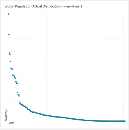
Population of the world by Nation:
How about the upvotes and downvotes of words in Urban Dictionary:
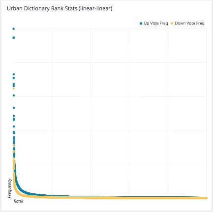
(Source)
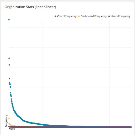
On a very relatable note, the number of charts, dashboards and users each of our customer organizations have in Chartio:
Query Performance:
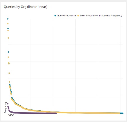
You’ll notice that these stats are not arraying themselves on a pretty bell curve but instead are taking an entirely different shape and that shape is looking common among these statistics. It is starting to look like a curve that is named after an 19th century Italian named Vilfredo Pareto.
Pareto Curves and the 80/20 Rule
Pareto determined, through observation and statistical analysis, that roughly 80% of Italian land was owned by about 20% of the population and 80% of the peas in his garden were contained within 20% of his peapods. This 80/20 principle has become a sort of enigmatic rule and in the charts we outlined above, these natural phenomena seem to follow pretty closely.
Taking a closer look at a specific chart, let’s look at the Global Population of Nations and how this distribution falls on a Gaussian Curve and compare it to how it falls on a Pareto Curve.
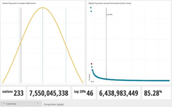
Pareto Curve (right) and Gaussian Curve (left)
When considering the United States, the third most populous nation in the world, you see it falls near the far left axis of the actual distribution chart (notice the red dot indicating our subject), but when shown on a Gaussian Curve, the US (a red line) appears in the third quadrant indicating a lower percentile rank. This is due to the massive population of 2 nations, China and India, skewing the population curve, or being the proverbial curve busters. This type of distribution appears to be more accurately portrayed on a Pareto Curve when comparing the distribution of the top 20% of the nations when ranked in descending order of populations. The top 20%, only 46 nations, account for almost 6.5 Billion people or 85.28% of the whole global population.
It appears as though this 80/20 thing is not so enigmatic after all, but is instead a rule.
You might want to consider plotting the KPI or Metric you are hoping to compare against a population on one of these type of charts. In the Global Population Comparison I did above, I used the steps outlined in the Gaussian Tutorial and then isolated a nation based on the dropdown in the dashboard in a second layer and joined them together on one chart.
If you want to be even more freaked out by the glitch in the matrix that is appearing here, watch this excellent video from VSauce showing how this phenomenon gets even more interesting. Then, find a data set of your own and see if it follows this rule too.
Exceptions Occur
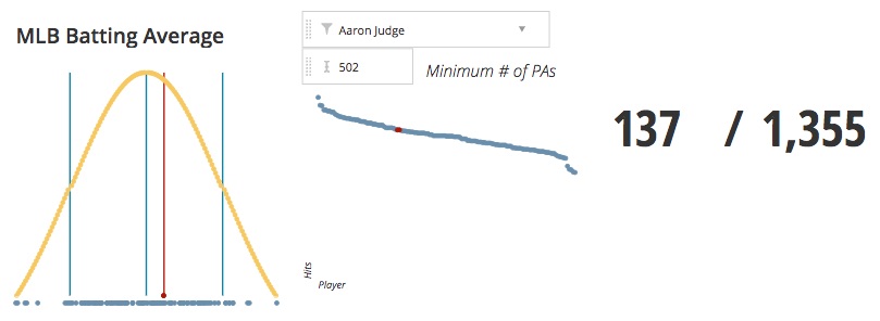
There are exceptions to rules, and there are times in which a Gaussian Curve is useful and can show a real representation of the population in question. For example, when considering Batting Averages of Major League Baseball Players in the 2017 season, the distribution looks normal if you restrict the number of players to the minimum requirements to qualify for the league batting title.
A player must have at least 3.1 Plate Appearances per game in order to qualify, so for a 162 game season that means a player must have gone to bat 502 times. If we restrict the number of plate appearances to a minimum of 502 you will see our population become very close to a normal distribution. You can see this in the cluster of points on the scatterplot below the Gaussian Curve. You will also see that our subject, in this case American League Rookie of the Year Aaron Judge from the New York Yankees (#allrise), appears in roughly the same location on the Gaussian Curve as he does in the linear-linear Pareto Curve plot to the right.
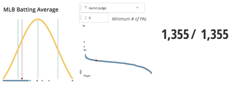
You might notice a problem though. Our population is severely limited to the number of players with more than 502 Plate Appearances, or 137 out of potential total of 1,355. When we adjust the minimum plate appearances to 0 to get the entire population of Major League Hitters, Judge’s position on the Gaussian Curve moves far to the left, while remaining as one of the leaders on the Pareto Curve.
I think we can draw a conclusion here and we can make a recommendation. If your population is going to be limited, grouped, or even cohorted, a Gaussian Curve could be a fine representation of the population. In other words, when your population is limited by a common theme or some other restriction it might normalize, the Gaussian Curve works. But when the population as a whole is considered, it would be hard to imagine an example of a population appearing as Normal.
Do you have an example of one that might be an exception to that? Let me know, get yourself a data set (there are myriad sources out there), build a chart in Chartio and send an image to me, @timmiller716, on Twitter and use the hashtag #bellcurve.