Heat Map Chart Settings
| General | Axis | Color |
| Series | Drilldown | Annotation |
General
“Chart title”, “Title font size”, “Show legend”, “Show tooltips”, and “Round tooltip values” can be found in the General section of our Chart Settings page.
- Enhance contrast
- Increases the contrast between the shades of the Heat Map’s colors
Axis
X Axis
“Title”, “Show labels”, and “Rotate labels” can be found in the Axis section of our Chart Settings page.
- Sort
- Sort the x-values by one of the following options:
- Unsorted
- Ascending: If x-values are strings, they’re sorted in alphabetical order
- Descending: If x-values are strings, they’re sorted in reverse alphabetical order
Y Axis
“Title”, “Show labels”, and “Rotate labels” can be found in the Axis section of our Chart Settings page.
- Sort
- Sorts the y-values by one of the following options:
- Unsorted
- Ascending: If y-values are strings, they’re sorted in reverse alphabetical order (from the origin)
- Descending: If the y-values are string, they’re sorted in alphabetical order (from the origin)
-
Is your Heat Map’s axis not sorting in the correct order? Check out how to sort the Heat Map’s axis in the Pipeline.
Color
“Background color” and “Use custom colors” can be found in the Color section of our Chart Settings page.
- Add End Color
- Available when Use custom colors is selected
-
Click this option to specify a Start and End color for the color gradient. Choose colors with greater contrast to make reading your Heat Map easier.
Series
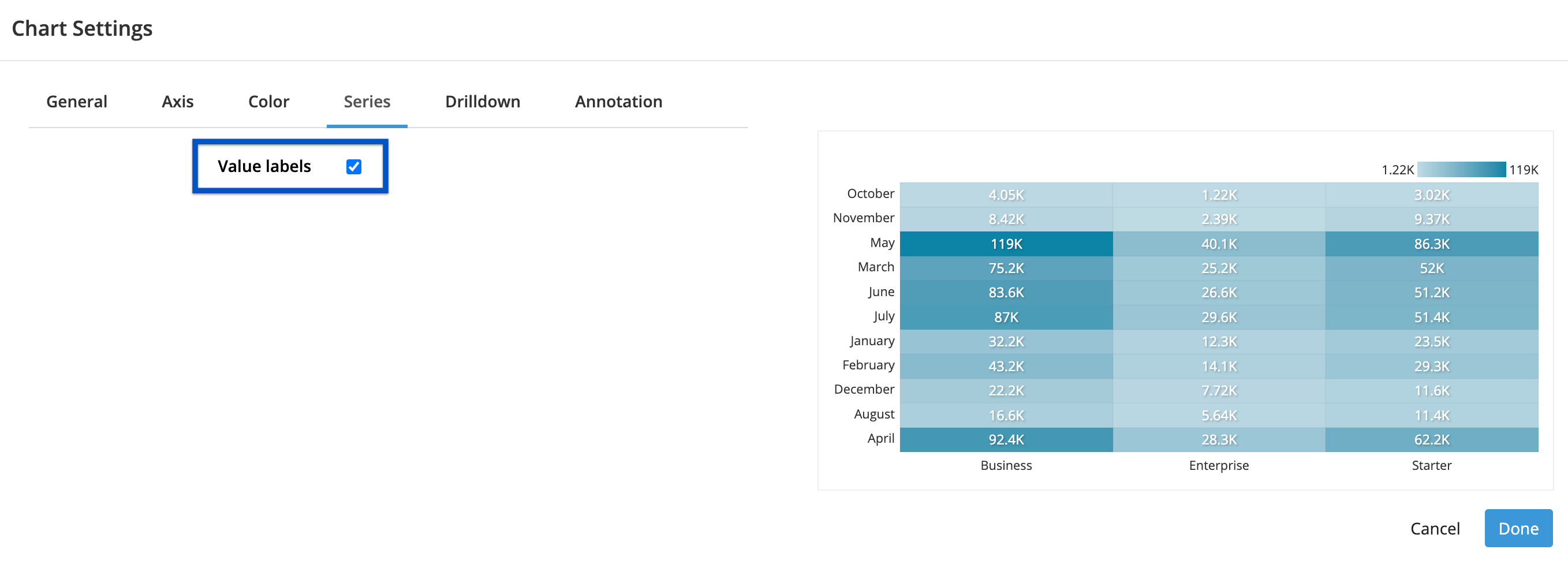
- Value labels
- Shows the values of each cell directly on the chart
-

Drilldown
Check out Drilldowns for more information on this tab.
Annotation
Check out the Annotation section from the Chart Settings page for more details.