Complexity in Dashboard Design
Posted by on February 6, 2011 Opinion, Data Analytics
I was reading over Stephen Few’s Visual Business Intelligence blog (https://www.perceptualedge.com/blog) and came across an interesting article about the perils of information overload in dashboard design. Here’s the quote that grabbed me:
Airline pilots learn to manage a huge amount of information in cockpit displays, with practice, if the displays are well designed. This potential exists in dashboards and is made possible, not primarily by the wonders of technology, but by the effectiveness of the design.
A lot of design, especially around consumer products, assumes the end-user to need constant guidance (and even hand-holding). This state-of-affairs is best summarized in the phrase, “keep it simple, stupid.” I believe, however, we should give our users (especially in business applications) more credit than that. Businesses, like airlines, must cope with a barrage of metrics and variables, have a quick “gestalt” sense of where they stand on any particular dimension, from sales, to revenue to spend and be able to quickly drill down on a particular variable. An executive’s understanding of their business by nature must be complex. And efforts to artificially introduce simplicity (even if it is by following well-meaning design principles) are bound to underestimate the thinking power of a business decision-maker.
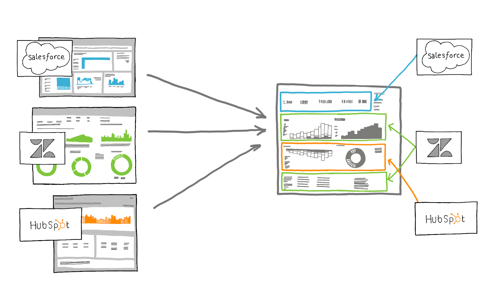
When talking about complexity, especially in the context of business dashboards, we must distinguish two types. A dashboard can be complex in the component charts or the overall effect of how those components interact. A great and informative dashboard might have one widget with a top-line number of website visitors right next to a chart that charts marketing expenditures over the past 6 months, right below a pie chart showing traffic sources, which is next to…you get the point. Each component delivers different information content. Some might call that mishmash of data types poorly designed. The brain, after all, can only switch between different information types so well. I disagree.
The airline pilot looks at a whole host of dials, some which describe his airspeed and velocity and some of which tell him if his landing gear are up or down. The combined or “gestalt” effect of these “metrics” are what gives him the power of decision making. Cockpits are not poorly designed because they carry too much information (and thus are complex). The end user, in this case, the pilot, is smart and trained to interpret them. The same must be expected of the business decision maker.
This is not to say that each component widget or chart or graph should not be stunning and intuitive. It must be, of course. We should not, however, take the calls of simplicity in design to an extreme and forgo really important business information for the sake of a slightly smoother user experience. In other words, user experience involves more than just the smoothness of my interaction. It also rests on what meaning I could draw from my experience. If my dashboard was oversimplified then sure, I could describe my experience as seamless and “un-confusing.” But to what extent does my knowledge about my business suffer?
The critical point about user experience, at least in the case of business apps, is that we should expect our users to practice using our application. In other words, we should design with at least some learning curve in mind. The more credit we give our end-user to master our application, the more complexity (complex information that is critical to the business) we can incorporate. I think the important design point is to make the application attractive enough that your end-users want to get good at using it. Then with just a little practice, they become adept at handling complexity. And since businesses are complex, they walk away with a deeper understanding of their world.
Stephen concludes with an homage to complexity:
Complexity is our friend. The more complexity we learn to manage, the greater our knowledge and abilities become. Complex information is definitely our friend. It’s time we learned to tame it.
Update:
I can’t believe I missed meeting Ken at strata, but here’s what he had to say (quite briefly) on the issue of dashboard complexity.


