How to Create a Web Analytics Dashboard
Posted by on August 10, 2017 Data, Dashboards, Marketing Analytics, Marketing, Data Analytics
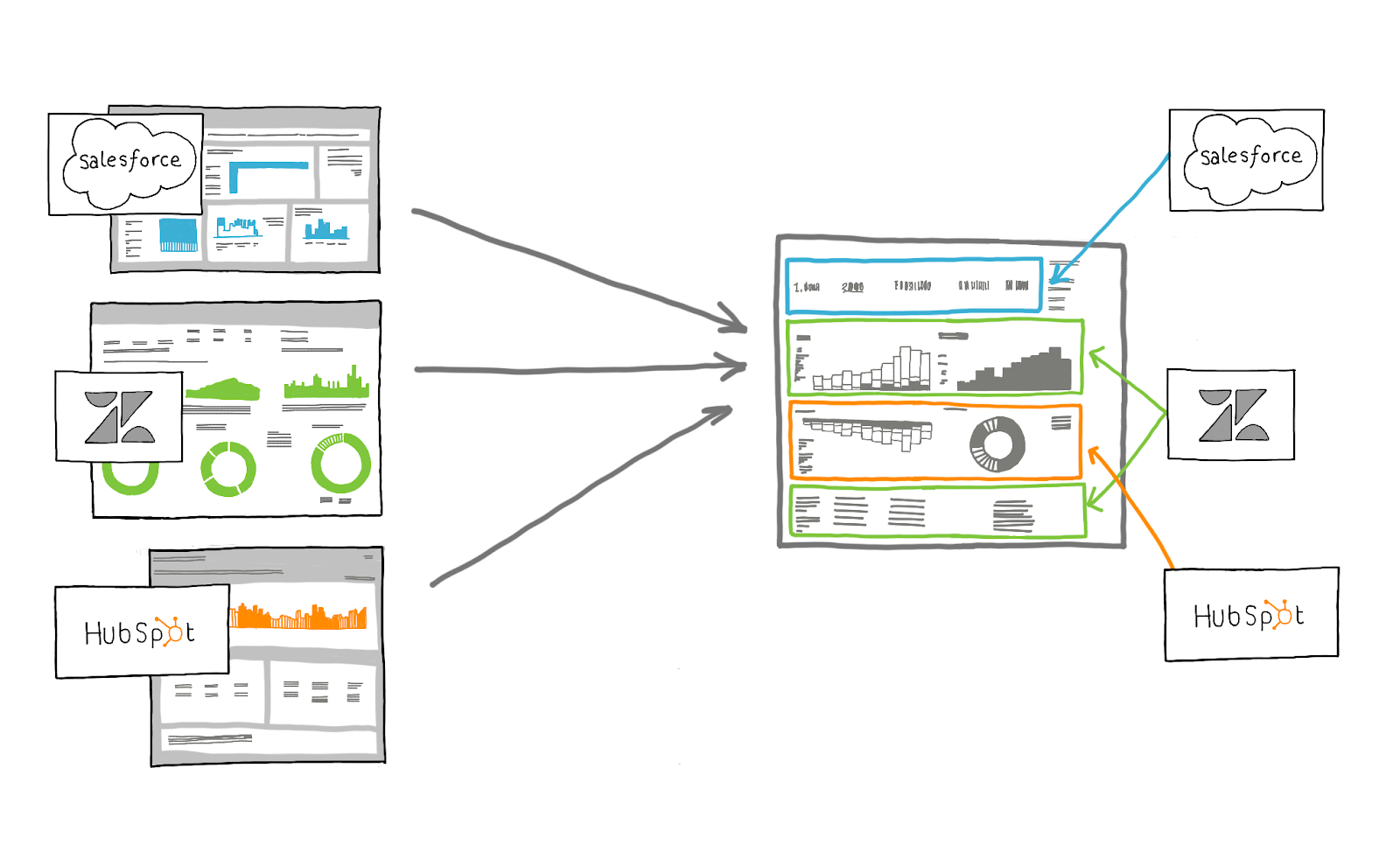
A web analytics dashboard visualizes your web data and monitors your website performance in detail by tracking critical metrics such as time spent on site, unique page visitors, page views, traffic sources and bounce rate. Creating a web analytics dashboards requires blending data from multiple sources including Google Analytics, CRM and Marketing Automation in a data visualization tool.
With 2.5 quintillion bytes of data created every day, that amounts to a lot of web activity. With that, businesses are amassing an ever-growing wealth of data. That in turn means that businesses have to actively monitor web activities in real-time, to make real-time decisions based on what the data says.
Enter: a web analytics dashboard.
Much like analyzing any other type of data, a web analytics dashboard offers visibility into what’s happening on your site, showing you which CTAs are effective and allows for company-wide alignment around the same data, ultimately enabling better decision-making and driving actions.
As a central hub for your prospects and customers, your company’s website is always front and center for your brand and product. The more data collected and analyzed about these interactions, the more effectively your Marketing team can tailor messaging and design the site around the buyer’s behavior.
With pulling all your data together, it allows you to display all the metrics in a clear and concise way.
Creating a Web Analytics Dashboard
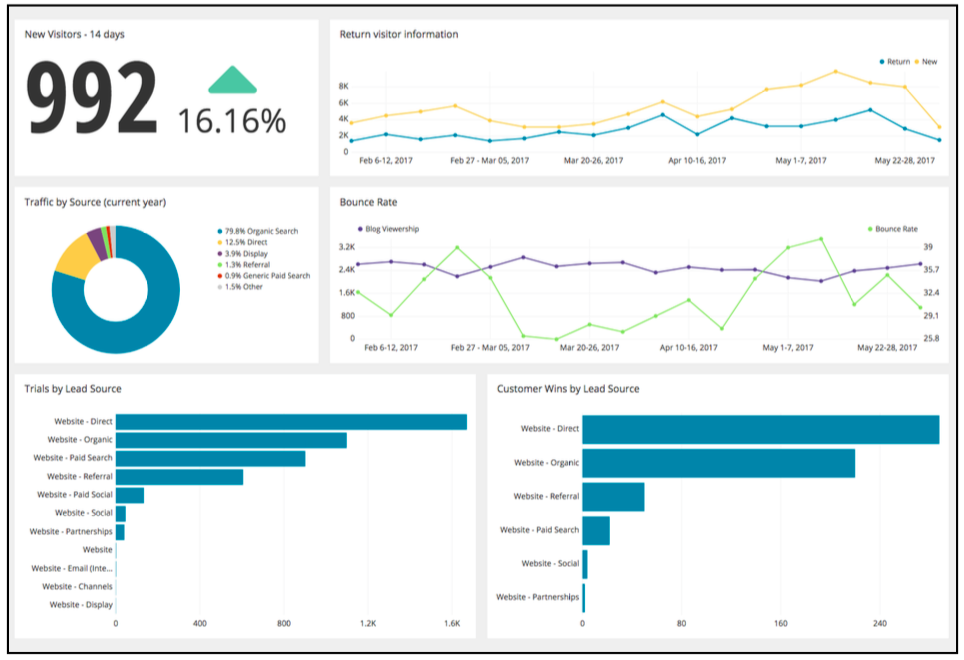
Here’s a visual of an example Web Analytics Dashboard:
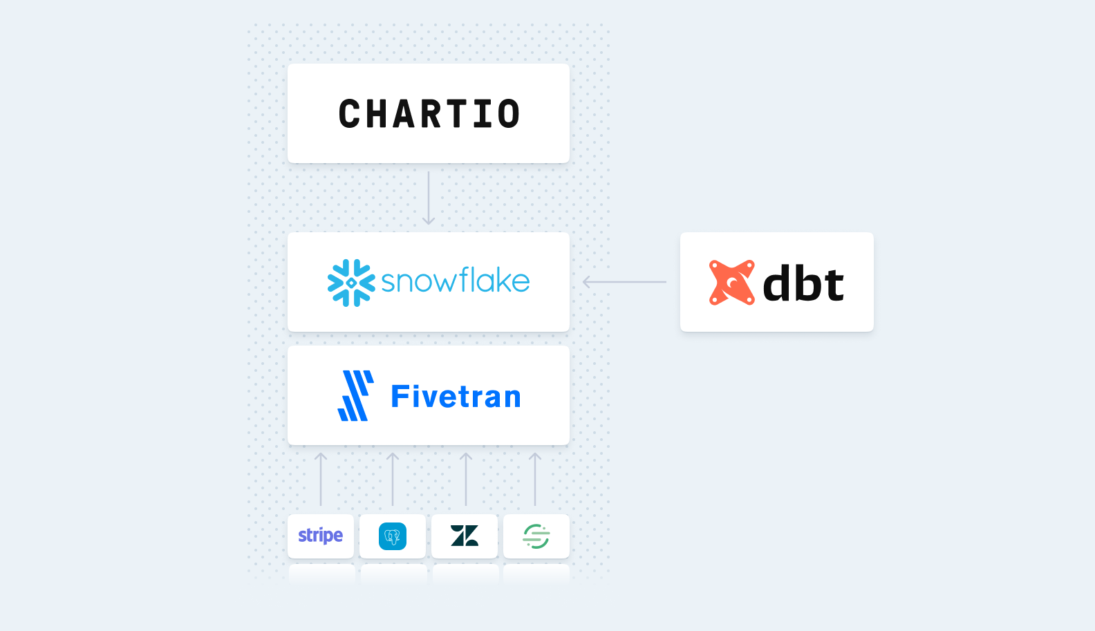
To create a web analytics dashboard in Chartio, follow these steps:
- Identify the metrics and KPIs you want to track in your dashboard
- Determine the appropriate data sources for these metrics such as Google Analytics, Marketing Automation, CRM, Intercom data, etc.
- Connect your data sources to Chartio via direct connections, a data warehouse or ETL tool
- From your organization homepage in Chartio, click the + New Dashboard button to create a new dashboard
- A popup modal will appear and direct you to name your new dashboard
- Click the Add Chart icon on the right to create your first chart
- From the Data Explorer, use the Interactive Mode to quickly start building charts without writing queries, or you can use the SQL mode (to directly write queries) and create individual charts for each metric on your dashboard
- Continue building out your dashboard by using the appropriate chart type for each metric
- Once you’re done, save and share your dashboard with your organization via a scheduled report or shareable link
For the Web Analytics dashboard above, here’s a quick rundown of the metrics and corollary type of chart:
- New Visitors (Single Value Chart): tracks total sessions of new visitors to your site during a selected timeframe and monitors the increase or decrease over time
- Return Visitor Information (Line Chart): the number of sessions over time split between new and returning visitors
- Traffic by Source (Pie Chart): a visualization of the traffic sources by channel
- Bounce Rate (Line Chart): the split difference between visitors to your site and bounce rate (visitors leaving almost immediately)
- Trials by Lead Source (Bar Chart): this metric measures the conversion rate from website visitor to trial sign up, then splits the total number by channel source
- Customer Wins by Lead Source (Bar Chart): this metric measures the conversion rate from trial sign up to paid customer, then splits the total number by channel source
From this dashboard you can drill down into the engagement metrics and further use the data in meaningful ways that will impact your business.
For more insight on how to create insightful dashboards, download our white papers on dashboards: The CMO’s Guide to Dashboards and The Six Dashboards Every Startup Needs.