How to Hack Your Data for Business Insights
Posted by on August 5, 2014 Data, Data Analytics
This is a guest post by Chartio customer Dennis Still. Dennis is the Lead Business Analyst & Data Hacker at thisCLICKS, makers of When I Work, the easiest way to schedule, communicate, and track attendance with hourly employees. Dennis loves helping people figure out tough business questions through the use of data analysis. He is passionate about evangelizing how awesome data analysis, data science, or insights analysis is and you will find him often presenting at conferences, talking/teaching students, tweeting, and blogging. He is all about helping customers succeed in understanding how their data can help their businesses.

I’ve been doing data analysis and business intelligence exploration for quite some time (dare I say it, before it was cool to be a data scientist). Amongst all the things I learned in years of working within different types of data and businesses, the key to any great analysis or insights comes down to what I like to call “exploration testing”.
I live by one simple rule - always keep the scientific method in the forefront of your mind. Don’t get worried when I say scientific method, it is pretty straightforward and the basic elements are:
- Ask a Question
- Do Some Research About Said Question
- Construct Hypothesis
- If you don’t know what this is, it is basically making a guess as to something happening
- For example, you may guess that your customer does X when viewing page 1 of your website. You can test this and calculate results.
- Test Hypothesis
- Analyze Data
- Report Results
Now, in order to test most hypotheses, you need to undergo an initial process of data exploration. One of the cool things about Chartio is that you can actually use it like a data sandbox or playground. This sandbox lets you test and think through how to visualize what you are finding in your data analysis. Let me give you a personal example.
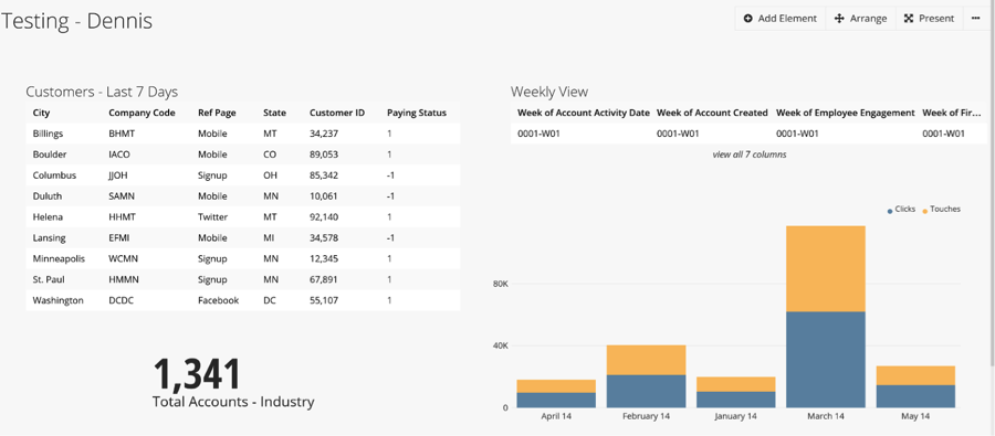
Dennis’ Sandbox: Testing-Dennis
In my daily work, I get to explore, ask questions, test hypotheses, and come up with business intelligence and deeper understanding for our business (internally) and for the small businesses we serve (externally).
One of the first things I did when I joined When I Work was start exploring the data terrain within the company. What was available, how were we calculating or measuring, what KPI’s (Key Performance Indicators) were important to our success? One of the many questions to explore revolved around plan options we offered to our customers.
We have different options for small to medium sized businesses to use in scheduling hourly employees and attendance. We saw phenomenal growth in our business over the past 6 months and wanted to start examining which plans were attracting the most customers, and ultimately, why. In order to see that with our data on the current month, I came up with the following simple query to examine:
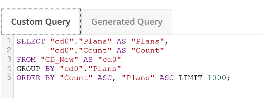
The original results were in a table, and were difficult to quickly understand. After some tweaking of the query, I came up with a simple, but powerful visual to show the growth of plans per month:
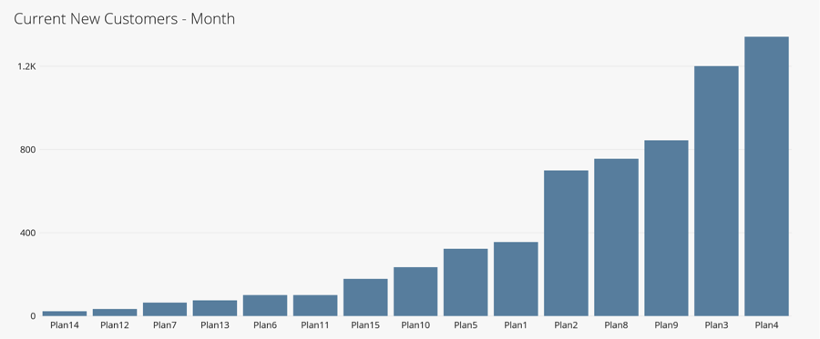
This visual was then placed in one of our more advanced dashboards showing lots of KPI’s and key metrics for our business. We were able to quickly see the insights from just this simple exploration.
- For example, we had heavily invested marketing resources into Plan3 and were seeing the fruits of this labor over time.
- Plan3 was performing almost as well as Plan4 and steadily had increased above the remaining plans.
- The ROI was paying off and we could see it in customer acquisition.
The ability to test and re-test by tweaking SQL queries in Chartio has proved invaluable as I work to understand the overall data structure, metrics, and questions we are trying to address as a business.
By All Means, Go Out and Hack Your Data
As an analyst and analytics leader, I can tell you that the best advice I have to unearth those amazing insights is to bang up against your data and really start to fully understand it or “hack the heck out of it”. Explore the relational connections, build queries and see what they do. Yes, you have to be careful of production live data and other technological limitations. But, you will gain so much more insight by fully understanding the connections between your data. Chartio allows this to happen with visualization tools attached so you can see whether it works or not. It enables you to tell the business story you need to help drive real insights.
It enables you to tell the business story you need to help drive real insights.
Hacking & Using Chartio
Prior to joining When I Work, I had never used Chartio before, so there was a learning curve for me - a very short one. I was able to quickly move from SQL queries that I am used to writing and developing myself to doing the same within Chartio.
Look, the reality of data hacking is that it can be messy. My Chartio sandbox dashboard is messy, unstructured, and really only meant for my analytical eyes to dump ideas and new possible calculations into. If I find that it is helpful and does a great job of testing, then I will move the query and chart options into a fresh dashboard or existing one.
Remember, the key to amazing analysis is the having enough time to do adequate exploration of the data sources and linking that to hypotheses to test. Good luck with your data hacking and exploration testing. Feel free to reach out by email or on Twitter if you have any specific questions or feedback. I love hearing how others use data to drive amazing insights and make scientifically inclined business decisions.