Our BART Ads and The Power of Informed Decision Making
Posted by on December 7, 2017 Data, Education, Chartio
Recently I got to be a star in an advertisement. Honestly, it wasn’t really something I had ever aspired to or expected to achieve in my life, but it was still pretty cool. Seeing how proud my wife was as we walked through that BART station every day when she pointed out my picture was also pretty cool.
Here I am on a BART ad.
But truthfully, the coolest thing was when I heard one of our potential customers use one of the example charts that appeared in the ad to actually glean some useful information from a data visualization.
In all, we created 10 different Ads that lined the entire Montgomery BART platform. One of the charts was the distance to famous San Francisco Landmarks from the Montgomery BART Station. When we were putting together the BART Ads we tried to think of, not only interesting, but also potentially useful data visualizations that might subliminally make our point for us. That point is, data is useful and data visualization is powerful.
We created a Bar/Line Chart that showed how many steps it might take to get to places like the Ferry Building at the Embarcadero, Haight Ashbury, the Painted Ladies, and of course the Golden Gate Bridge.
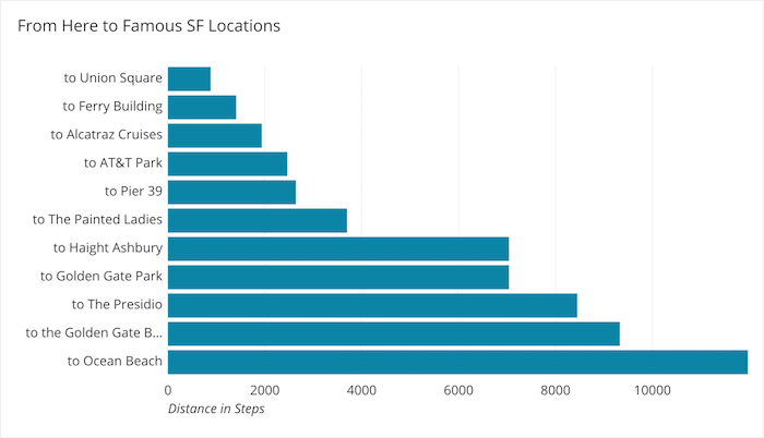
This above chart was pretty easy to make, I just went to Google Maps and plugged in Montgomery BART and the locations I wanted to include than took the estimated distance in miles then multiplied it by 5,280 and then divided that number by an approximate step length to calculate the number of steps it would take to get there. Then we multiplied that distance by a rough estimate of walking time per mile to add the lines on top of the total step bars. All of this was done in Chartio’s Data Pipeline, with Add Column Steps.
Data, In Action
One afternoon, during the month of our Ad Campaign, I was walking through the station and I saw a younger couple planning the rest of their day’s visit to San Francisco using the chart we had created.
I walked a little slower to see if I could eavesdrop on more of their conversation (only as it pertained to the ad, of course) and I heard them say, “Ok, so we should head to the bridge first, it’s farthest and work our way back and go past Haight Ashbury and then Painted Ladies. If we have enough time before dinner and we are not too tired we can stop by the Ferry Building since it’s so close.” That was a bit of a paraphrase but the gist of it is there. This next part an exact quote “Wow, super useful. That’s awesome that they put that there.”
Now, I am 100% sure the viewers of that chart had not likely been in the market for a data visualization solution. I am also fairly certain they weren’t 100% sure who the “they” they were referring to were. What I am 100% certain of, they used data, visualized quite simply, to make decisions on the direction of their day.
Our customers use our tool on a daily basis to visualize data and make decisions to guide the direction of their companies and that makes me feel good about what we do and how I can contribute. Giving our users the ability to make conscious, educated decisions about the direction they are going to steer their company and their employee’s livelihoods is important work and I am proud to be a part of it.