The Evolution of Data Visualization
Posted by on October 19, 2020 Chartio
Data visualization is the graphical representation of data.
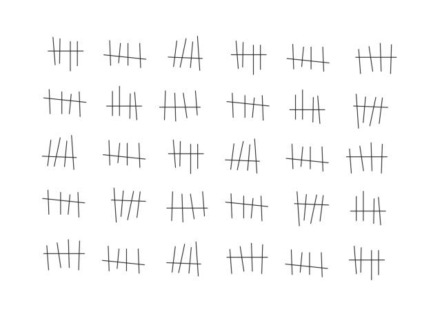
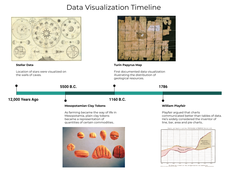
Although we may think of data visualization as a modern innovation, data has been visually recorded since writing was invented. It started as tick marks on tablets and cave walls, as in the image above. Each group of tick marks with a slash represents a set of five, making the total easier to sum up.
But as the amount of data worth recording grew, symbols were needed to represent larger groupings — such as the Roman numerals “C” and “M” to represent 100 and 1,000, respectively. Eventually, more complex data than just raw counts needed to be documented, such as where to find food (maps), when to plant crops (almanacs), and how much tax needed to be collected (aggregations).
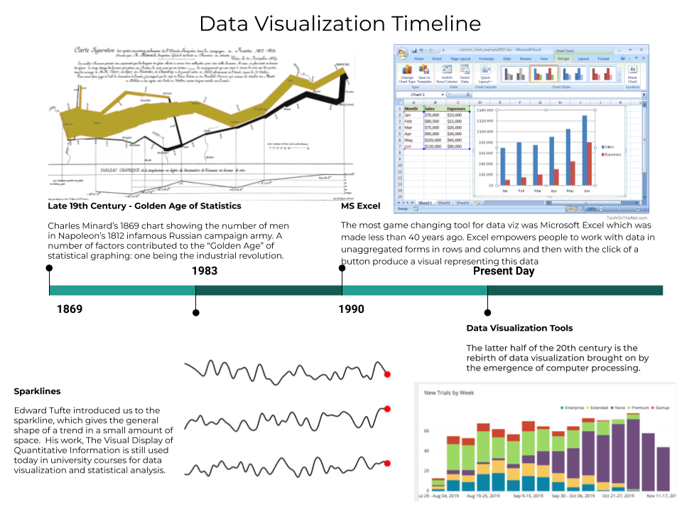
People have been visualizing data for a long time, but their ability to visualize large complex data sets quickly and easily is relatively new. The most game-changing tool for data visualization was Microsoft Excel, which was introduced less than 40 years ago. Excel empowers people to work with data in unaggregated forms in rows and columns and then, with the click of a button, produce a visual representation of this data.
But the amount of data needed to be analyzed has continued to grow, and new tools have been created to handle it.
Here is a timeline of the major data visualization milestones:
There have been many new data visualization tools created since Microsoft Excel. These tools have the ability to handle larger data sets and offer a wider array of chart types. These data visualization tools have evolved from static counts to interactive displays composed of multiple data sources. Data visualization has traditionally been a highly specialized field where practitioners have been cartographers, statisticians, and scientists. These professionals knew their data, and data visualization was their medium to share findings. Now, business professionals who are not as trained and familiar with their company’s data want to do the same thing.
Data visualization is now more focused on use cases
While data visualization tools have grown in power, they have also become more user-friendly. Unfortunately there still remain gaps in people’s ability to use them due to a lack of data literacy. Data literacy is the ability to read, understand, create, and communicate data as information. Many data visualization tools do not provide the context needed to understand the underlying data. Knowing how to best calculate metrics or represent the data requires education.
In an attempt to solve the lack of data literacy among business users, data visualization tools are now evolving again to become more use case-focused.
The four main use cases for new data visualization tools are:
-
BI Reporting. Data visualization tools have given analysts more capabilities to discover and communicate key trends and insights to broader audiences. These findings are primarily delivered in the form of dashboards, where executive audiences are given tools to make decisions for their business. Dashboards have been slowly replacing spreadsheets and pivot reports and provide a varying degree of interactivity to allow users to explore trends in their data. BI reporting has allowed broader audiences to become more familiar with various charts and graphs, making them more “conversational” with data but not necessarily “fluent.”
-
Custom Data Visualization. While traditional tools are designed to accommodate the most common charts, sometimes advanced users want to add more animation, use rare chart types, or otherwise customize the appearance of their data. Developers have leveraged R and Python to push the boundaries of data visualization tools to create complex data models. Some use cases are using these platforms for doing more complicated data blending outside of the data visualization tool, or building advanced statistical models. In a business setting, decision makers would have to be guided through these data models or be given very concise recommendations on how to proceed with their business.
-
Information Visualization. Traditionally, data visualization has been used within companies and universities to support specific lines of inquiry. Now tools have made it easier to share insights publicly. A trend that has been taking place in journalism is the use of data visualization to provide news and insights via data tables, graphs, maps, and infographics. This can allow the public to spend more time investigating a topic in a way that might have been hard to consume over a broadcast. Some tools make it simple to post dashboards publicly, while others make it easy to embed charts within news stories. We can see visualizations like this in the New York Times, which strings graphics together to create stories that help convey complex topics to readers.
-
Exploratory Data Analysis (EDA). EDA is an approach to analyzing data sets to summarize their main characteristics. Gone are the days of prepared data sets; they just take too much time, especially when data is constantly changing. Tools like Chartio provide schema-level access and click-and-drag interfaces to write SQL for you. This allows many more people in the organization to explore data and ask questions. They can begin to spot trends or outliers in the data. Becoming familiar with the data begins to build the user’s data literacy.
Looking to the future, as visualization tools become easier to use, more and more people will become data storytellers. They’ll explore data sets, discover insights, and share takeaways with others as part of their everyday workflows. As they do, they’ll want to create great-looking charts that grab their audiences’ attention and communicate insights persuasively. They’ll want more customization options, so they can tailor their charts to, say, match the look and feel of their company’s brand. And they’ll want a great user experience, with charts that load, render, and scale quickly and reliably.
At Chartio, we’re about to reshape the future of data visualization with our totally new, open-source chart library. Based on the Vega charting language, our new library will let you create beautiful, performant visualizations so you can more effectively tell stories with data. We’d love to show you a sneak peek of our new chart library, and share more details about all you can accomplish with Chartio.
Join Chartio CEO/Founder Dave Fowler and Visualization Engineer Casey Haber for an exclusive webinar on Thursday, November 19th to learn more. Register now.
(This guest post is written by Allen Hillery. Allen is an adjunct professor at Columbia University and a writer at Data Visualization Society.)