After all of the hard and time-consuming effort to identify data sources, extract and clean data, and store them in a form that you can work with, comes the fun part of the data analysis process: actually analyzing your data.
Mining the collected data to extract valuable trends and insights is the ultimate goal of creating a data pipeline. One of the most impactful ways to approach the data analysis process comes with the use of data visualizations. While it might technically be possible to draw insights from tables of statistics, it’s a far simpler task to develop an accurate understanding of the data through the support of visualizations. After all, a picture is worth a thousand words – or in this case, the culmination of thousands or millions of data points.
Visualizations are useful not only for aiding the identification of trends in the data, but also for conveying analysis findings to others. However, there can be major differences in how visualizations can be used depending on their audience. In this article, we will outline the various ways that visualizations can be employed in the search for the signal among the noise in the data.
Visualizations for Exploration
Data visualizations are naturally associated with the initial exploration of data. Visualizations are a great way of seeing a summary of all of your data points, allowing you to quickly understand distributions and relationships. They can provide additional context that lets you verify the conclusions you might want to draw from statistical summaries.
In the initial stage of the data analysis process, exploratory visualizations don’t need to be pretty. It is more important that an analyst is able to form a rapid personal understanding of the data. Exploratory data analysis requires experimenting with different relationships and plot types, viewing the data from multiple angles to build as complete a picture as possible.
Single-variable visualizations
A common starting point when encountering new data is to visualize each feature of interest one by one. This can be done using plot types like bar charts and histograms.
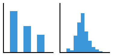
Such single-variable visualizations (univariate visualizations) can be used to understand value distributions, identify if there are any lingering data cleaning issues, and show if there are any caveats to take with statistical summaries. If there are missing data, outliers, skew in the data, or multiple modes, visualizations can make these aspects of the data clear.

While each subplot has the same arithmetic mean, interpretation of the data differs depending on if they are symmetric (left), skewed (center), or have multiple modes (right).
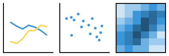
Multivariate visualizations
Visualizations of two or more variables (multivariate visualizations) can help track relationships between the plotted variables. Examples of multivariate plots include line charts, scatterplots, and heat maps.
When performing an exploration, it’s a good idea to build things up step by step. This can reduce the chance of unaccounted interactions popping up from obscuring the true effects in the data and reducing the effectiveness of understanding relationships.
If you want to have three or more variables in a single plot, you end up with multiple pairwise relationships that need to be disentangled. By understanding those pairwise relationships first, as well as testing different ways of plotting variables, it is possible to find the most representative way of demonstrating complex relationships between multiple features.
 In this plot, you can see that the y-position of points in blue are greatly affected by x-value, while the points in yellow are not as greatly affected.
Tracking Through Dashboards
One useful application of visualizations is the dashboard. A dashboard is a collection of statistics and visualizations that all relate to a particular goal or objective. Just as a car’s dashboard provides a summary of a car’s state and the presence of any issues, a business dashboard provides a summary of a company’s state.
Dashboards can sit at multiple levels, from those that depict metrics important to the company as a whole, to those that track values important to teams within an organization. For a dashboard to be useful, it is important it be regularly or automatically updated to reflect the most current state of things.
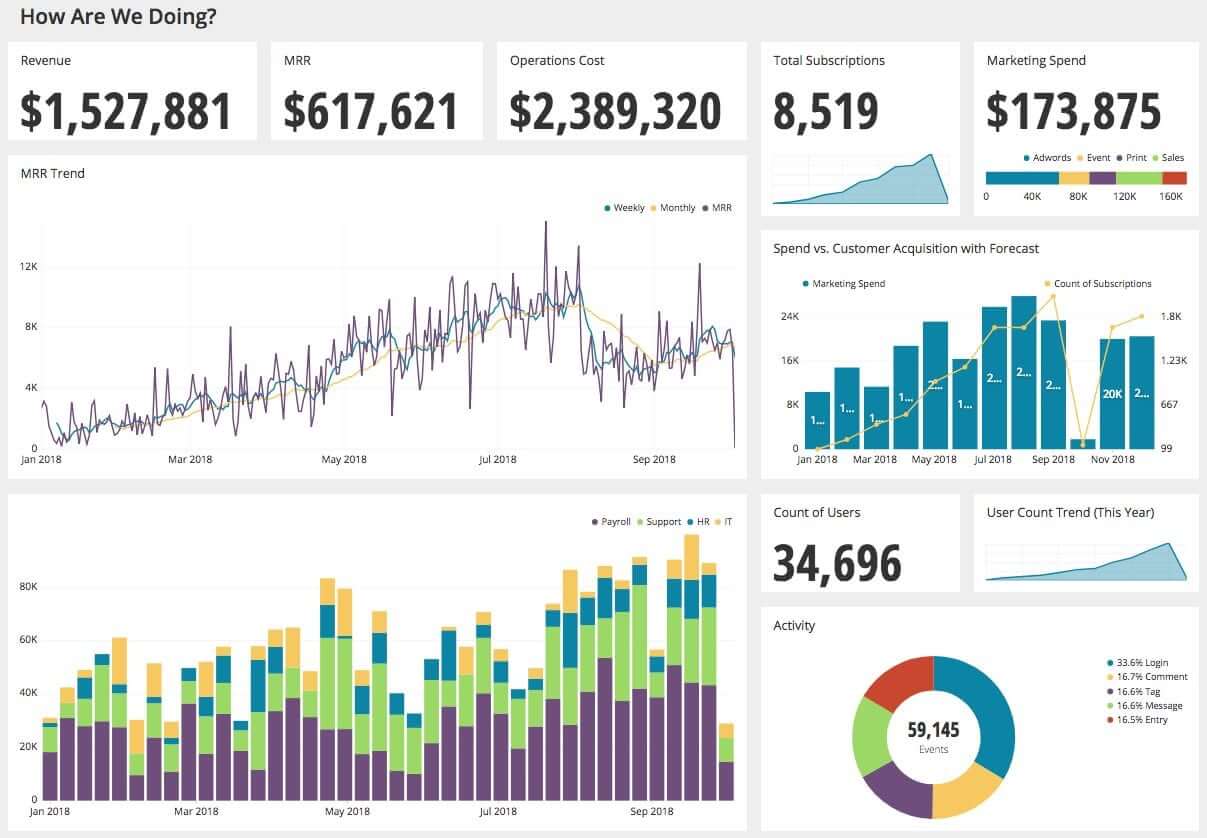 This dashboard tracks company metrics at a high level, including overall revenue and users.
There are certain plot types that become more useful when it comes to the construction of a dashboard, compared to the exploration process. For example, funnel plots can track the number of users that remain at each stage of a website process, such as getting users to perform a checkout on an online shopping site. Meanwhile, bullet charts track just a single metric, but include performance benchmarks against which that metric will be tracked. When selecting what values and figures to include in a dashboard, it’s important to keep in mind its purpose so that the dashboard can quickly communicate the information and main points it is built to convey.
 For a more in-depth dive into how to create effective dashboards, take a look at the How to Design a Dashboard book on The Data School.
Reports and Explanatory Visualizations
Another class of data visualization comes into play when you need to prepare your findings to present to others. When you explore your data, it is okay for your visualizations to be somewhat rough. However, once you’ve gotten a better idea of what is important from the data and need to present that to others, it’s a different matter.
Visualizations that have been tailored to tell a story or convey specific points are known as explanatory visualizations. When you put visualizations in report, your audience will likely have a different level of expertise and familiarity than you, and you may not be around to lead a viewer to the key results you may want to convey. For an external reader or stakeholder, their interest will be in having a report that just tells them the key points of interest. Any plots that you include should be clear and to the point in communicating what they want to know.
Explanatory visualizations also have a place for an internal user that uses a dashboard to continually track their goals. One way of setting up a dashboard is to start with clear explanatory visualizations to present key metrics. Additional visualizations or filtering options can then allow the dashboard user to explore more details in the data if they’ve observed something unusual or just want to better understand a particular metric.
Customizing your visualizations
There are many components that can be manipulated to change how a visualization is received. Perception of a visualization is affected not just the type of plot chosen, but also the order in which variables are plotted, different aesthetic choices like color and symbols, and the range of values plotted on each axis. Plots should be clearly labeled, with annotations and comments as necessary in order to provide context for the plot and to highlight key points. It can be surprisingly easy to mislead and ‘lie with statistics’ with the choices that are made when creating an explanatory visualization.
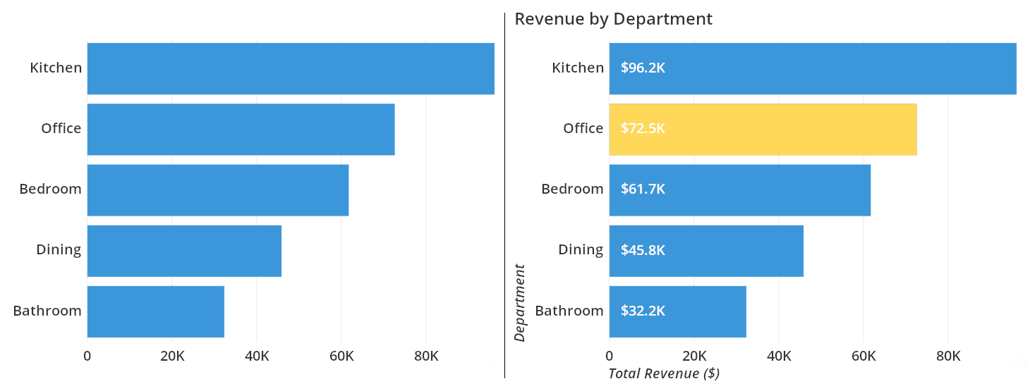 The left plot might be fine for exploration, but adding labels and a title are vital when highlighting particular findings.
As a final note, different tools may need to be employed in order to create explanatory visualizations, compared to the tools built to explore data. For articles published online, it is possible to create interactive visualizations that straddle the line between exploration and explanation. These articles often have a particular message that they wish to convey to a reader (explanation), but interactive elements allow the reader to make deeper, personal connections to the data to make those messages stick even clearer (exploration).
The left plot might be fine for exploration, but adding labels and a title are vital when highlighting particular findings.
As a final note, different tools may need to be employed in order to create explanatory visualizations, compared to the tools built to explore data. For articles published online, it is possible to create interactive visualizations that straddle the line between exploration and explanation. These articles often have a particular message that they wish to convey to a reader (explanation), but interactive elements allow the reader to make deeper, personal connections to the data to make those messages stick even clearer (exploration).
Summary
Visualizations are a versatile and powerful tool for getting insights from your data. There are different purposes for them at different stages of the analysis process. Rough, exploratory plots can be used to build understanding of the data. Useful and informative plots can be arranged along with summary statistics into a dashboard to provide snapshots of the current and historic state of various aspects of a company. When a summary of findings need to be presented to others who may be less familiar with the data, you will want to revise the rough plots into polished, explanatory plots that are built to inform.