4 Ways to Create Disciplined Thinking Around Data
Posted by on August 6, 2020 Chartio
A question that came up at ProductCon was: Why do I need to learn SQL? SQL helps you find things in your company data set. So, sure knowing SQL is a great skill to have, but is it critical?
Last week, I hosted a training session to address this. Short answer, yes, knowing SQL is a powerful skill to have as a Product Manager, but the importance goes beyond simply knowing how to query data – it’s about leveraging your SQL abilities to create disciplined thinking around data.
Here are the 4 key takeaways from the discussion:
1. Understand the difference between Product Analytics and BI Tools
A rising trend in data viz has been to adopt specific product analytics platforms that have a small learning curve such as Amplitude, Gainsight and Heap. I’m a huge fan of these platforms for the following reasons:
Amplitude: Built in Funnel and AB Testing analyses Gainsight: Allows you to easily combine quantitative with qualitative data Heap: Easy to get tracking on every user interaction without code
While these platforms provide valuable benefits to product teams and even other business units such as Marketing and Customer Success, they cannot and should not check the box for business intelligence. Business intelligence allows you to explore your data from multiple sources and different lenses. They also allow you to pull in data from the business, not just product, providing you with the entire story to create your data narrative. Example: You’re trying to answer: x. To do that you need to pull data in from Zendesk, financials from a Google Spreadsheet as well as information from Marketo. Product Analytics platforms aren’t built for that type of analysis.
BI is more flexible for PMs and easier to make a business case around your features because you can connect more data to what your feature might be impacting vs. limiting to feature engagement
2. Data exploration is easier than you think
Let’s talk about SQL. Here’s what every PM should know about SQL:
- SQL is universal at every company
- SQL is the way to access information from your database before attaching any type of tools to it
- SQL can give you answers quickly – within a few hours you can start pulling data in a meaningful way
- SQL is a must-have skill for PMs – it really enables you to ask and answer your own questions
- SQL education is abundant – Chartio puts out a ton of free content on how to learn SQL. We highly recommend our eBook from the Data School on Learning SQL.
- SQL is the most flexible and powerful way to query data, but it’s not good for exploration - but Visual SQL is.
Whoa, Visual SQL? What’s this?
Visual SQL is a visual interface to explore data. As the name suggests, we’ve made SQL visual, to empower users of all backgrounds to explore their data. It’s intuitive for business users, fast for power users, transparent for SQL pros, and flexible for programmers.
To make any business decision, you need data, that’s how you’re going to make your point and build a business case. .
The advantage of Visual SQL is that it actually writes SQL for you. As you click around, Chartio is generating the SQL code behind the scenes – it’s intuitive enough to generate the SQL for all the dialects that you’re connecting. This helps eliminate the learning curve for PMs who are just getting started with SQL.
3. Align on the question you want to answer before you start analyzing the data
We all know making mistakes is a great way to learn. But there is also a way to give yourself a leg up when it comes to really understanding what mistakes to look out for to be better prepared for when you do encounter them. This is especially important when you’re looking into product metrics.
Here are the main analysis mistakes and how to think through them:

Distribution:
Example: As a PM, you may be interested in looking at the average time spent on a page. You may find that people are spending five minutes on average on your page telling you that they seem interested.
Thinking through it: Average and statistics represent a bunch. There’s an underlying distribution behind every stat. So while the average would fall in the middle, if we look at how the data is distributed, I wouldn’t say that accurately describes the distribution.
Summary: Everytime you pull stats (esp. averages) always look at the distribution to see if it accurately represents the distribution.
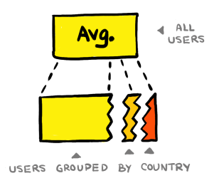 Segmentation:
Example: Playing on our example above, let’s say you’re seeing an average of five minutes spent on your page. What happens if you break that up by grouping/segmentation of data? You start by segmenting by country.
Thinking through it: Let’s say for the United States people spend five minutes on your page, in the United Kingdom people spend one minute on the page and for France, your visitors are spending 10 minutes on the page. All of a sudden we have a much different story about how people are engaging. Just by segmenting the data, we found a more nuanced story behind the stat. These are the details that make analysis much better.
Summary: Segment data to see if the stat and distribution are consistent.
 Trends:
Example: Now let’s say you want to look at that data over time.
Thinking through it: A lot of dashboards will default to month view or quarter view. So you might see some numbers taking off/ dipping down creating an assumption that things are really great or really bad. If you back out the time scale, you might see that this number typically fluctuates this amount. So maybe there is no trend that is really common. People get very excited when they see any number moves and fail to consider how much it has been varying in the past.
Summary: evaluate trends on multiple timeline lengths and keep to what’s relevant, but always back it out a year or two to verify that you feel confident when you’re reporting a new trend. Is it actually deviating from the past performance?
4. Address Cognitive Biases
Cognitive biases are inherent in all of us. A cognitive bias is a systematic pattern of deviation from norm or rationality in judgment. We create our own “subjective reality” from our perception of the input. An individual’s construction of reality, not the objective input, may dictate their behavior in the world or in this case dictate what we think the data is telling us.
Here are 4 common biases PMs should be aware of when exploring and reporting on data:
 Confirmation bias:
What is it: A tendency for people to seek out information that confirms their existing beliefs.
Example: Ex. It’s the end of the quarter and you’ve been working on a feature that you’re eager to look at the impact. You pull some data. You come across some data that looks like you’re feature is making an impact. You put that chart into an executive presentation.
The problem: One metric rarely, if never, tells the whole story. If you keep digging, there may be some conflicting data, and negative data – maybe there’s other positive data too. Point is don’t stop your data analysis when you find something that looks positive about what you’re working on. Look at it from many different angles. If other angles aren’t consequential, just reporting the positive data is fine, but if there’s more nuance to the story, you should present that as well.
Summary: Always look at multiple metrics before drawing conclusions about success/failure of a product feature.
 Selection bias:
What is it: A convenient tendency to select a group of people that isn’t actually representative of your customer base.
Example: You just launched a new feature and you need feedback. You reach out to a trusted group of customers you’ve worked with in the past. All of those customers happened to be at small companies when your GTM motion supports both SMBs and Enterprise companies. All the customers give you a thumbs up. You read this as, the feature is awesome and you ship it.
The problem: Your Enterprise customers flood your support queues. It doesn’t work for them. They have security concerns, etc. You didn’t create a random sample from your entire customer base.
Summary: Make sure your testing group is diverse and a healthy mix of your customer base.
 Self- selection bias:
What is it: The tendency for the group of people who opt in to be evaluated not being representative of the population. Example: In an NPS survey you tend to get mostly extreme responses; 0s, 1s, 9s, and 10s. This is because the people who are willing to respond are either very angry or very excited.
The problem: Most of your users likely fall somewhere in the middle.
Summary: Assume a normal-ish distribution of responses and use the proportion of highly positive to negative responses to skew it one way or the other. Keep in mind that you are likely to get more negative responses than positive ones.
 Survivorship bias:
What is it: Creating an idea of what’s normal based on the data you see
Example: Let’s say you have a trial experience survey, you send it to everybody that converted.
The problem: You’re missing out on every single person who didn’t convert. The fact that they didn’t convert probably means it was poor. Question to ask yourself: Is there data I’m not seeing? Am I basing my conclusion based on a subset of the data that is not representative of the whole data. What is the underlying data and making sure you’re exploring enough of that before making conclusions about your features.

Summary: You got to pre-evaluate to be able to post evaluate. I’m going to explain this one a bit more. Does Chartio make you a better analyst? We’ve seen customers doing a lot of amazing things with it – assumption: wow, Chartio made these people more advanced with their analysis. But applying this kind of thinking to it– is that the case? Or are people who are already good with data using Chartio and it’s just helping highlight the skills that they already have? If we prevaluate and see that ppl were not that skilled, after they were, then we can say something meaningful about Chartio’s impact.
Conclusion
Learning SQL is important because it lets you access data within your company. Setting up a BI tool instead of a product analytics tool will expand what type of business data you will have access to. Once you successfully query this data, the truly hard part begins. Interpreting data correctly is a difficult skill, I hope some of these suggestions about investigating statistics thoroughly and checking your cognitive biases help you find true insights in your data.