All New Charts from Chartio
Posted by on November 17, 2020 Chartio
Dashboards are one of the key ways that information is surfaced and communicated within a company. For them to be effective it is important that the information is as clearly and simply displayed as possible. At Chartio we’re focused on delivering clear, extensive and beautiful visualizations. To enable such creations, we intelligently follow industry best practices.
That’s why, today, we’re proud to unveil a great leap forward: a complete overhaul of our visualization library. We have completely rewritten our charting library from the ground up - and made it way more customizable, smarter, extensible, and we think, beautiful. We’ve exposed all of those options now to you in themes and extended settings.
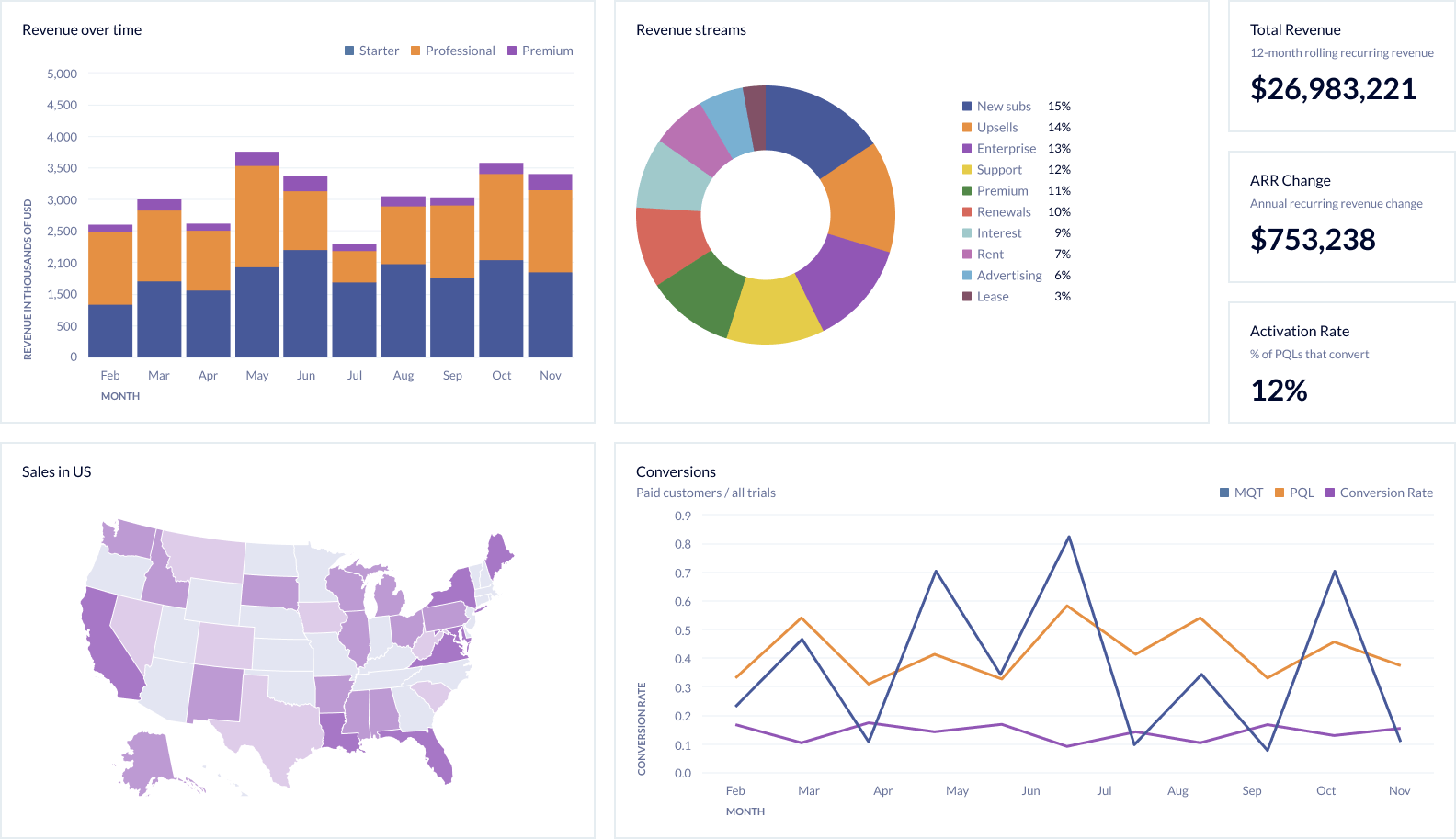
Chartio charts are now based on the modern, open-source Vega and Vega-lite projects. With this new library, Chartio users will immediately notice lots of enhancements, like:
- Updated chart design and new theme options. Our new charts allow for a greater variety of visual options, like fonts, and layout, letting you tailor their appearance to match your company’s brand or their surrounding context.
- More Chart Controls and Customizations. We’re giving you new ways to provide more context to your charts, letting you add new elements like subtitles, gridlines, and tick marks. We also have added more customizations options for line, area, scatterplot, and bubble charts.
- Redesigned legends. To help your audience better understand your visualizations, you can now place legends in a variety of locations above, below, or over your charts, and customize your legends’ contents.
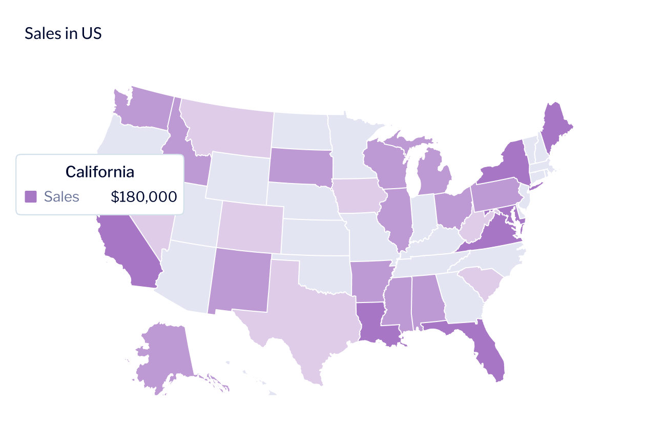
- A major upgrade to maps with new regions. If your data is geographical, you’ll enjoy a ton of improvements to our map options, including more regions (US county, France department, UK country, North America, South America, and Asia).
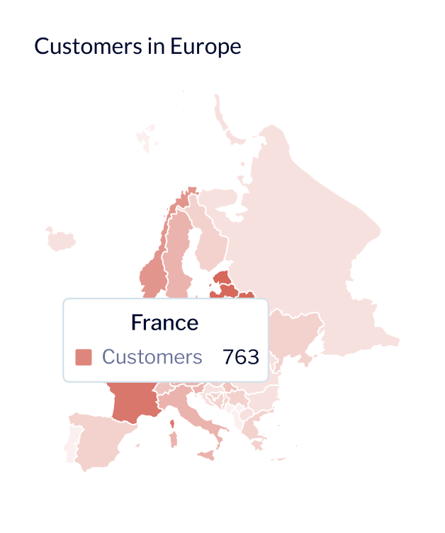
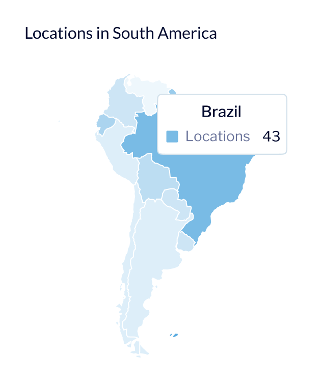
“Dashboards are where the information of a business is gathered and communicated. They’re so critical, and yet historically ugly and static. We want dashboards and reports made with Chartio to be the most beautiful, collaborative, and informative interfaces that have ever been created.,” said CEO Dave Fowler. “I can’t wait to see what people do with it.”
Some Chartio users have already been taking advantage of our new visualization library.
David A. Epstein, Principal, DST Partners says, “Chartio’s new visualization library allows me to easily create intuitive, sophisticated visualizations from my data that are simply beautiful. He continues, “With the streamlined design of Chartio’s new graphics library, I can easily fit all the charts on my dashboards that our clients need to uncover the insights that were hidden in the data.”
Nolan Johnson, Strategy Analyst at Redox states, “I love that Chartio’s new charting engine uses Vega!” He adds, “The Vega ecosystem has in my opinion been the most exciting and robust development in the data viz community in recent years. Chartio’s new visualizations look cleaner, have better defaults, and I can be more expressive with how I represent the data. All of which translates into less time to more effective dashboards.”
Our new visualization library is available to new Chartio customers today, and will be rolling out to all Chartio customers over the next few weeks. If you’d like a live deep dive on what’s new, what’s improved and what’s next, join Dave Fowler and Visualization Engineer, Casey Haber this Thursday, the 19th, for our webinar, More Clear, Extensive, and Beautiful Charts: A New Charting Library from Chartio.
And this is just the start—with our new library in place, we’ll be able to add new visualization types and even more customization options in the weeks and months ahead. Stay tuned.
If you’re not a Chartio customer yet and would like to experience our new visualizations for yourself, start a free trial today.
