Charts Worth Commenting On
Posted by on April 9, 2020 Chartio
There is so much to discuss around data.
“Why did this spike today?”
“I don’t think this is accurate.”
“Is this good or bad, and what should we do about it?”
These important conversations are especially valuable within the context of a great chart or dashboard.
We’ve wanted to add commenting functionality to our charts for a while now. And in recent weeks, as we and a majority of our customers shifted to working remotely, comments became a critical feature we knew we had to move to the front of our roadmap.
Our motivated team made some incredibly quick progress, and today I’m proud to announce that we’re releasing our newest feature, real-time chart and dashboard comments, to help all Chartio users have conversations around their data.
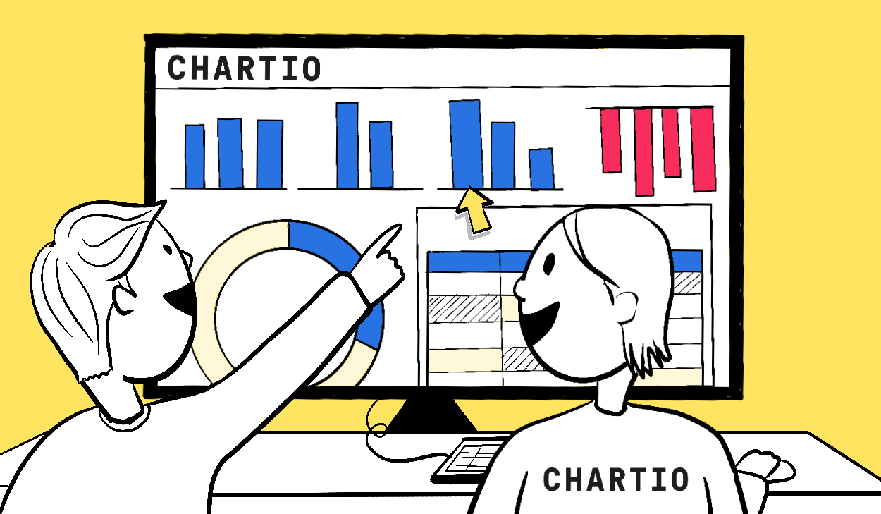
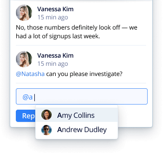
Chart based chats
With comments, Chartio users can discuss data directly on charts. There’s no need to fire off an email or switch to a separate messaging app—comment threads can live right alongside visualizations, giving them context and making it faster and easier to address issues and get alignment.
Chart comments are particularly useful when you want to:
- Discuss data findings. “What caused this spike in PQLs?” “What’s driving MQTs, and what total do we think we’ll hit next month?” Raise issues with your team the moment you spot them, so you can resolve them together more quickly.
- Ask for help. “Can you pull this data for me?” “I need a bar chart on sales per quarter by region.” Alert your teammates when you need assistance building charts or interpreting your data.
- Report discrepancies. “These stats don’t look right.” “Did our sales really double last month?” Let your collaborators know when the numbers don’t align with expectations.
- Give and receive feedback. “Great to see the impact of the launch this quarter.” “Any ideas for getting this conversion rate up?” Comments are a great way to share suggestions so you can take action.
- Talk about the weather. Why would you do this on a chart? I really wouldn’t know—but now, if you want to, you can:
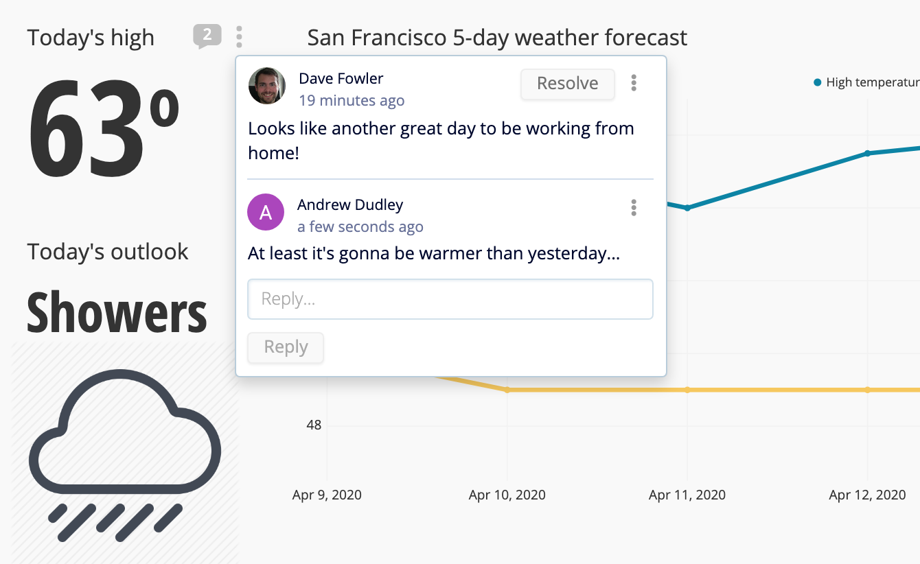
Get notified
Chart comments make it easy to stay up-to-date, even if you’re not logging into Chartio every day. When you @mention teammates or receive a reply to your comment, we send you an email with the comment thread and the visualization or dashboard being discussed.
We’ve also added new settings to let you adjust your notification preferences, and there’ll be a few more updates to follow in our next release.
It’s all real-time
As we were developing comments, the Chartio engineering team decided to set up WebSockets to remove any delays in conversation. This means all comments are realtime and chat-like; if someone else is in the same thread as you, they’ll see your message pop up as soon as you hit submit. No refreshes needed or polling intervals to wait for.
We’ll be using the WebSockets work more going forward to potentially improve dashboard recency, too.
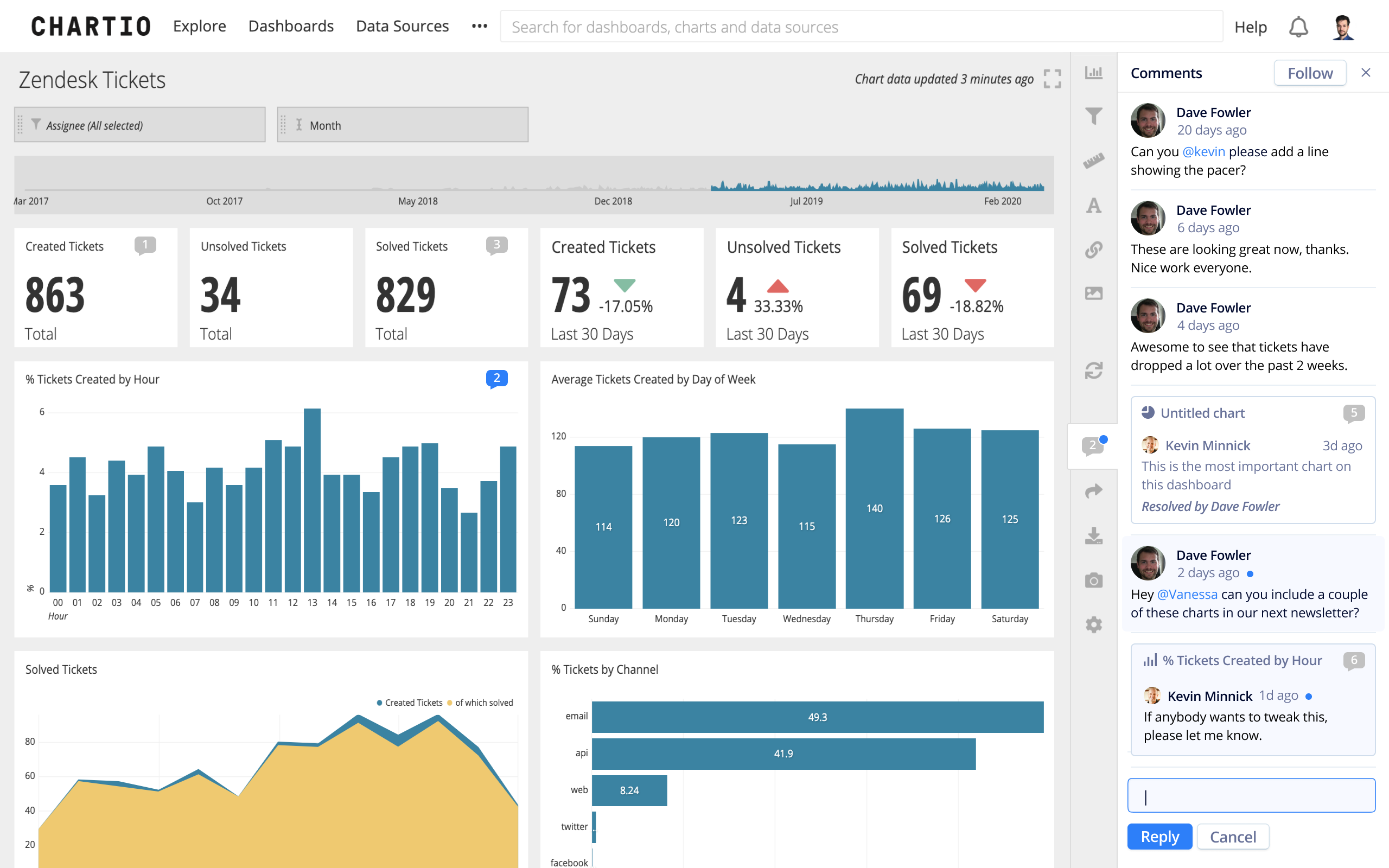
Improved dashboard comments
This team really went above and beyond; they initially set out to create chart comments, but in the process they also greatly cleaned up the functionality and look of our dashboard-level comments.
Before, dashboard comments obscured most of the dashboard, which meant users had to toggle back and forth to get the context of what was being discussed. The design was rough, and no one would be notified when new comments were added. Now, dashboard comments are displayed in a sidebar that you can toggle on and off. They have their own notification emails, notification settings, a clean design, and they work in real-time just like chart comments do.
What’s next
I’ve long known that chart comments would be an awesome feature, but now that I’ve been using it for a week, I realize I significantly underestimated just how great it would be. It really changes the entire feel of Chartio. Chart comments now feel as essential to Chartio as comments do to Google Docs.
The functionality we’ve built is quite complete, but we’re not stopping here. Soon we’ll be adding a few more features around following dashboards, to more easily control the notifications you receive. We’d love to hear your feedback on what would make this functionality even better, and how we can make Chartio increasingly collaborative.
Other recent updates
We had a great response to our recent COVID-19 update, and I heard a lot of stories of teams going remote and looking for ways to help each other. As a result, we’ve got a few other updates and some additional projects in the pipeline.
Free DashPass for all Chartio customers
One of the responses to our update was our customer DoorDash wanting to help spread generosity and support local restaurants during this challenging time. So, they’re offering—from one Chartio customer to all the others—a free DashPass, which means free delivery from DoorDash for the next 2 months.
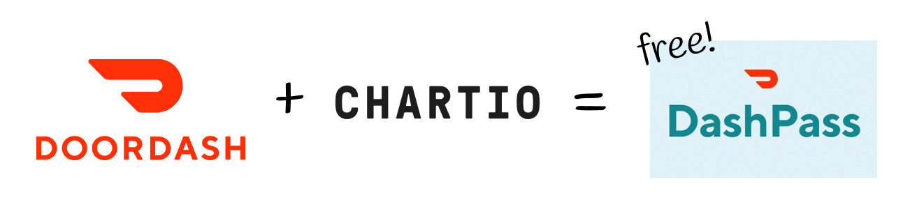
Chartio customers will receive more info about this offer via email. Thank you DoorDash—we’ve all been using you extensively these past few weeks!
Better product embedding
As Jason Lempkin of SaaStr recently shared, one of the most impactful things companies can do right now to mitigate churn is to build dashboards within their product to show their value.
So what’s my # 1 bit of advice for a product feature to build for your existing customers, and to prep for the market rebound? A dashboard. A really good one.
— Jason Lempkin, Founder @ SaaStr
We agree! Fortunately you can build and embed dashboards quickly with Chartio, and we’ve now made embedding even better. We recently soft-launched some new features for improved interactive embedding (talk with us if you want to see), and we’ll have more details to share on features and transparent pricing coming soon.
HowWeFeel.org
A week ago a tremendous effort to track the spread of COVID-19 with volunteer data was launched. It’s called #HowWeFeel, and is backed by Pinterest, Harvard School of Public Health, Feeding America, and many other great institutions. They’ve asked Chartio to help with the data aspects—getting the enormous amounts of helpful data they’re tracking into useful visuals for governments, healthcare workers, and researchers. We’ve got a dedicated team working closely with their organization, and will release more details on that soon. If we can make the app more viral than the virus, we can gather enough data for officials to better monitor and control the spread.
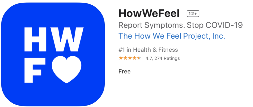
Please do go download the app and spread the word!
With that, I hope all of you are feeling well. At Chartio we’re all feeling generally quite good, are settled into our remote work environments, and are energized by focusing on work that we think can make an impact.