Dashboard Design Best Practices: The Dashboard Layout
Posted by on December 30, 2015 Data Analytics
Now that we have established the purpose of the dashboard in our last blog post Dashboard Design Best Practices: The Dashboard’s Purpose, it’s time to start thinking about how the dashboard’s layout will best serve the audience and provide value. This is the first step toward thinking about how the dashboard looks and how it will function. The following elements start building the foundation for how your dashboard will look:
Designing the Dashboard Layout
The layout of your dashboard should help the audience understand the purpose, and support how the audience will use the dashboard.
Below are some factors to consider when building your dashboard layout.
User Interactivity
How will the dashboard be used? The format of the dashboard should suit its audience in how they are interacting within the dashboard.
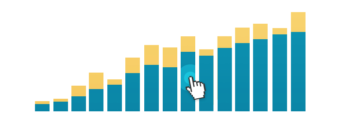
Will the audience need a certain level of detail? Does the dashboard support drill downs? If you are building out drill downs you’ll need to have charts set up that are obviously connected to each other with proper titles, headings, or contextual text. On page drill downs are most easily read from left to right, so you consider a horizontal grid-like structure where your drill downs are present.
Does the audience need the ability to interact with the dashboard and change filter settings? If you are building out dashboard filters, you’ll need to consider their placement. Are these global filters that adjust all the charts on the dashboard? A global filter will be best placed at the top of the dashboard, to clearly indicate the global functionality. If the filter is for an individual chart, you’ll need to consider placement of the filter close to the chart and use proper labeling, so functionality is obvious.
Does the audience need to be able to share and collaborate on the dashboard? Is this dashboard being edited by other teammates? The more people working on the dashboard, the more consideration you should place on creating a clear and simple dashboard that everyone can read. Does the dashboard need to be exported for sharing? Do you need to keep the number of elements to a certain number for the export to be contained to a single page?
Guide the Flow of Eye
No matter which layout you choose, structure your information to draw the eye to the things that matter the most.

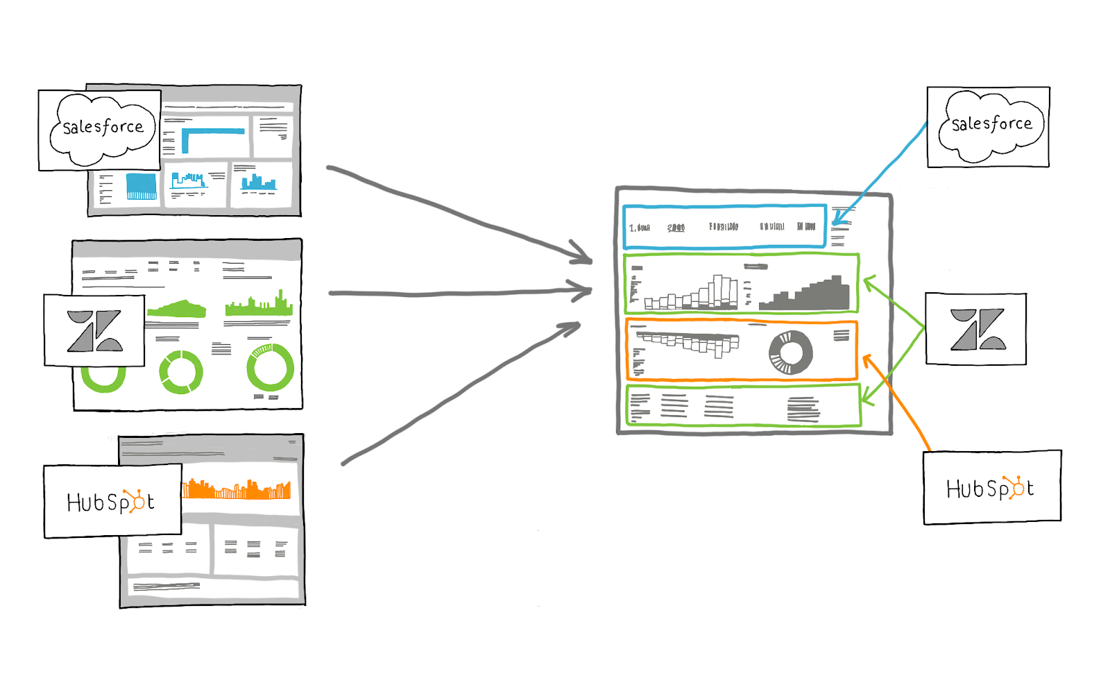
Position the most important information where your audience will look first. People tend to scan a page starting at the top left, read from left to right, and focus on the left side (in Western cultures). The bottom and right side are not as prominent. Don’t be afraid to abandon the stricter, grid-style layout for a more free-form one in order to achieve prominence for important elements and balance for the overall layout.
Keep it Simple
A simple dashboard is easier to read. The information should be understood by your audience at a glance.
To keep things simple, use a single font type, a limited color palette, and limited labels. Keep the dashboard clutter free and avoid putting too many charts in one place. Aim to use as few metrics and elements as possible to not overwhelm the audience.
Design for Ease of Use
Can the users of the dashboard get started right away, or do they need extensive training on how to use it? Can the dashboard be used in a meeting without everyone’s eyes glazing over? Designing the dashboard for ease of use saves time and ensures the dashboard is being used for its intended purpose.
To keep a dashboard easy to use, avoid too many advanced features such as filters and drill downs. Be mindful in labeling so understanding is immediate. If you have a complex chart, use color to guide understanding, and be sure to make it large enough for easy reading.
Coming up next: In my next post we’ll go over best practices for your dashboard’s finishing touches.
