Dashboards vs. Reports: How They’re the Same; How They’re Different
Posted by on October 9, 2018 Dashboards, Data Analytics, Business Intelligence
Companies are collecting oceans of data, and are faced with transforming it into usable information. Most business users focus on two methods of sharing data - the report and the dashboard. While these two terms mean many things to many people, we will outline below what the business intelligence terms mean and how the report and dashboard have similar features but they are not the same thing. Let this post and The Data School Course on “How to Design a Dashboard” be your guide as you choose which to use on your next data analysis project.
What is a Report?
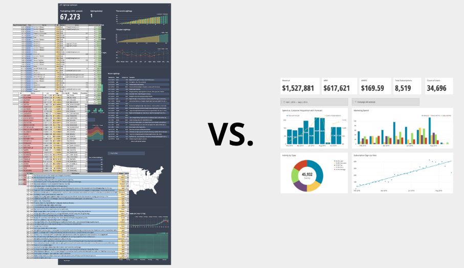
Reports can be a presentation of corresponding charts and other visualizations, or they can be a large set of charts and visualizations that may or may not directly relate. A report is meant to be used to gather detailed intelligence on the operations within an organization, thus a report can be either very broadly covering a wide scope of related information, or narrowly focusing on details of a single item, purpose, or event. All of this information, while presented in a report, is meant to be a snapshot in time.
In a data visualization platform, like Chartio, a report can even be built in the same environment as a dashboard leading to even more confusion about the difference between the report and dashboard. This report might even have the look and feel of a dashboard, in this case you are likely creating a “dashport” of sorts. Reports can also be series of dashboards that may be interrelated to each other and as a whole show more of the information needed to understand the status of things. These groups of dashboards can either be linked directly or grouped in the software’s library, categorization, or organization technology.
What is a Dashboard?
All dashboards should revolve around answering a central question. For example a Chief Executive might simply want to know, at any given time, in up to the minute detail, “How is the business doing?”. The answer to that question is as complex as the organizational structure of the company, but it is probably very simply measured with around 10 metrics or numbers. Those 10 numbers can likely be analyzed in around 10 charts, and many of these numbers can and should be combined into one chart, when the numbers are relatable or are on a similar scale. All these things should be considered when building a dashboard.
The name “dashboard” derives itself from the name of the instrument panel that lives behind your car’s steering wheel.
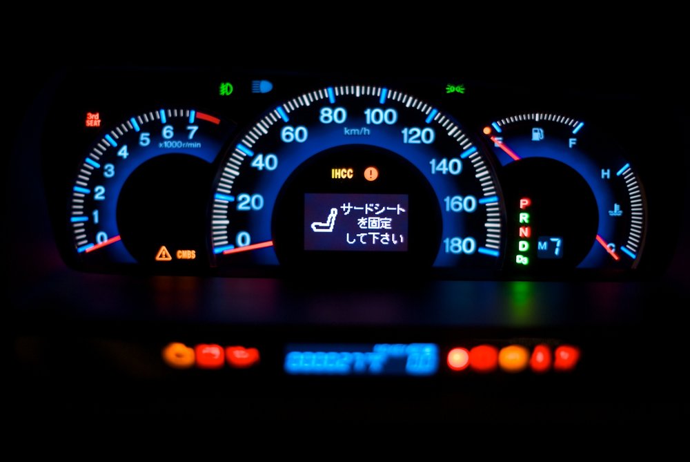
Source: https://commons.wikimedia.org/wiki/File:Dashboard_(2).jpg
Please do not take a picture like this while you are driving your own car.
Imagine driving down the road and having to navigate through your car’s dashboard instrument panel in order to find out how much fuel you have left. Not only is this inherently dangerous because you would be taking your eyes off the road for a considerable amount of time, but you would probably be spending some time eventually speaking to a law enforcement officer.
Similarly, when the oil temperature gets too high you will notice that temperature spike by looking at the oil temperature gauge on your car’s dashboard. Noticing it is too high, you should stop your car and pop the hood, then check the oil level or a number of other factors. What you have effectively done is drilled down from your dashboard of high level information on the current operating status of your car into a subset of the data pertaining to just the oil.
This example may be a bit of an oversimplification but the point can be simple, a dashboard is a visual representation of the most crucial data.
How do Reports and Dashboards differ?
First, a report contains much more detailed information. Where a dashboard might only provide a CEO with information on how the entire company’s sales are progressing, a corresponding report will give the CFO or VP of Sales the ability to see how each sales region, or even sales person is performing and make leadership decisions. Just like responsibility, data will get more granular and more into the minutiae as the organizational hierarchy goes down The C Suite might be interested in the detailed data, but for seeing a snapshot of high level information, the dashboard is the desired mode.
Second, a Report is much longer than a dashboard. Not only in the amount of detail, but also visually. Tables and charts that live within a report can take up many pages of a printed medium, and can even be books or many volumes of books. In the electronic mediums, a report will likely require the reader to scroll through many screens or click from page to page.
This is important because of the first of noted Data Visualization Professor Stephen Few’s common mistakes of Information Dashboard Design, “Exceeding the boundaries of a single screen.”
Few describes it in this way. “My insistence that a dashboard should confine its display to a single screen with no need for scrolling or switching among multiple screens, might seem arbitrary and a bit finicky, but it is based on solid and practical rationale. After studying data visualization and visual perception for a while, we discover that something powerful happens when we see things together, all within eye span. Likewise, something critical is compromised when we lose sight of some data by scrolling or switching to another screen to see other data.”
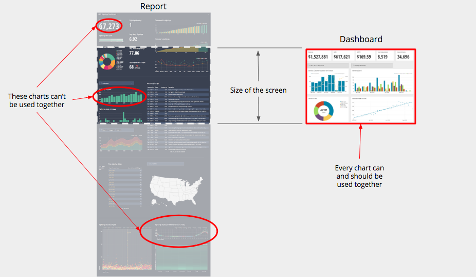
When an individual dashboard has so much information on it that scrolling is required, the power of the dashboard is diminished because the information that lives there is intended to be viewed together. Each piece of information on the dashboard is meant to give the reader the ability to answer part of the central question of the dashboard. These charts combine to answer the question, so if the reader can’t see them together, making them work together is much more difficult.
Lastly, a report will more than likely include written explanations of the data presented. It can also be accompanied by summaries and even recommendations for the future of the business. A dashboard will presume a higher level of understanding of the subject matter by the reader and will not include much explanation, if any at all.
How They’re the Same
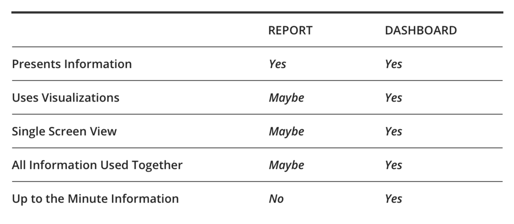
Similarities are relatively few in number. The first, both a report and a dashboard present information. The second, mostly revolves around the content that they have. While charts and tables can appear on both, tables are less likely to appear on dashboards. This isn’t to say that tabular information isn’t important, this is only to stress the idea that the dashboard must be consumable in short order and must contain only pieces of information that work together to answer the central question.
As you can see in the table provided below, certain key aspects of a dashboard might also be involved in the creation of a report but they do not have to. These key aspects must be answered “Yes” in order for it to be a dashboard.
A third information update option, although less often entered into this argument, is the Alert. Alerts can be regularly scheduled inquiries into the data of a company’s operations that will use some predefined parameters to determine whether or not the alert is triggered and to whom it is sent. For example, if a CTO wants to monitor traffic to a particular page within the company’s website to maintain User Experience, they may set a query to be sent to the data source once every minute and if that activity is outside of the predetermined tolerance span, the system will send an email advising the CTO of the current activity spike.
In Conclusion
A report is a more detailed collection of tables, charts, and graphs and it is used for a much more detailed, full analysis while a dashboard is used for monitoring what is going on. The behavior of the pieces that make up dashboards and reports are similar, but their makeup itself is different. A dashboard answers a question in a single view and a report provides information. Put in another way, the report can provide a more detailed view of the information that is presented on a dashboard.
This is more than just a semantics argument, in order for something to be considered a dashboard it should meet some simple requirements. That isn’t to say that utilizing a “dashboarding platform” to create a view of data that leaks beyond a single screen is wrong. The whole point is that when calling something a dashboard, or using a dashboarding platform to its most effective level, certain best practices should be encouraged.
.jpg)