Is Data Rhetorical?
Posted by on August 5, 2011 Expert
The following post is guest written by Nick Diakopoulos, a data viz whiz who graduated from the School of Interactive Computing at the Georgia Institute of Technology in 2009 with a PhD in Computer Science. His interests currently lie at the intersection of human computer interaction (HCI), information visualization, and automatic content analysis with themes from media including journalism, collaborative authorship and annotation, and games. Check out some of his recent projects.
Visualizations are typically used to serve one of two basic purposes. They either help us explore and understand our own data, or they help communicate the meaning of our data to a broader audience. For the first kind, general visualization techniques usually suffice. On the other hand, if our goal is persuasion, then more specific, detailed techniques such as infographics are better.
There’s yet a third class of visualization – a middle ground, termed “narrative visualization.” Often used in journalistic contexts, narrative visualization includes aspects of both the exploratory and persuasive classes. This blending of techniques makes for an interesting domain of study, and it’s here where Jessica Hullman and I began investigating how different rhetorical techniques are employed in visualization.
We were particularly interested in how the chosen visualization technique can affect how that visualization is interpreted - valuable knowledge for designers hoping to influence and mold their audience’s reaction. (Here we defer the sticky ethical question of whether someone should use these techniques, since in general they can be used for both good and ill.)
We carefully analyzed 51 narrative visualizations, and constructed a taxonomy of rhetorical techniques we found being used. We observed rhetorical techniques being employed at four different editorial layers of a visualization: data, visual representation, annotations, and interactivity. Choices at any of these layers can have important implications for how a visualization is ultimately interpreted. For example, choosing to make a visualization interactive can either direct or divert your audience’s attention.
The five main classes of rhetoric we found being used were:
- Information access (including how data is omitted or aggregated)
- Provenance (how data sources are explained and how uncertainty is shown)
- Mapping (the use of visual metaphor)
- Linguistic techniques (such as irony or apostrophe)
- Procedural rhetoric (for example, how default views affect interpretation)
Finally, there’s another, more subtle dimension to visualizations which can influence an audience’s interpretation. While most visualizations concentrate on the denotative level of communication, the most effective visualization communicators also make use of the connotative level. For instance, various cultural codes (e.g. what colors signify), or conventions (e.g. the way line graphs suggest you’re looking at temporal data even when you’re not) can suggest alternate or preferred interpretations. In this context, the maxim “know thy audience” certainly rings true.
While a full explanation of visualization taxonomy and connotative communication is beyond this blog post, you can find a more complete discussion in a pre-print of our forthcoming InfoVis paper (here is more information about InfoVis and VisWeek) At the very least though, I’ll leave you with an example which illustrates some of these concepts.
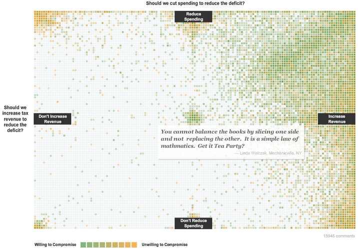
Take for example a recent example from the New York Times (top) where various aspects of the visualization rhetoric framework apply.
Using our rhetorical framework, we can quickly make various observations:
- The choice of labeling on the dimensions of the chart – “reduce spending” vs. “don’t reduce spending” – leaves out another option, “increase spending”.
- The choice of the color green for “willing to compromise” connotes a certain value judgement, i.e. “go” or “move ahead” – at least as read from an American perspective.
- The way individual squares are aggregated to arrive at an overall color is unclear, leading to questions that could be clarified through better use of provenance rhetoric.
- Squares cannot be disaggregated or understood as individual data, making it difficult for users to interpret either the magnitude of the response or the specific data reported in any one square.
Applying the visualization rhetoric framework during the design of this visualization could have suggested other ways to make the interpretation of the visualization clearer.
Ultimately visualization rhetoric is a framework that can be useful for designers hoping to maximize the communicative potential of a visualization. Exploratory visualization platforms (like Tableau or Chartio) might benefit from incorporating visualization rhetoric into their services and allowing their users to take full advantage of the additional layers on top of data that help communicate additional meaning. Those particularly interested in this space should consider participating in an upcoming workshop I am co-organizing on “Telling Stories with Data” at InfoVis 2011 in Providence, RI in late October.