Redesigning Chartio: Explore Our Sleek New Navigation Menu
Posted by on May 12, 2020 Chartio
Two months ago, we launched Visual SQL. More than just a new feature, Visual SQL was an entirely new experience within Chartio. Interactions with form elements were more intuitive, and the design more modern. Every element, button, and font was considered, designed, revised, prototyped, user tested, and then redesigned about five more times.
We obsessed over Visual SQL for a year, making it the best data interface on the market. But, we were also able to take a lot of those learnings and apply them to the entire Chartio experience. For example, one major outcome of building Visual SQL was the creation of a whole design system. This system incorporated both a high level philosophy as well as detailed designs of every element on the page.
As of today, another major component of Chartio has been transformed thanks to this new design system: the navigation menu. While it may seem like a small part of the application to redesign, we intentionally chose the navigation menu because we knew we could make it faster and more intuitive for everyone, impacting every user of Chartio.

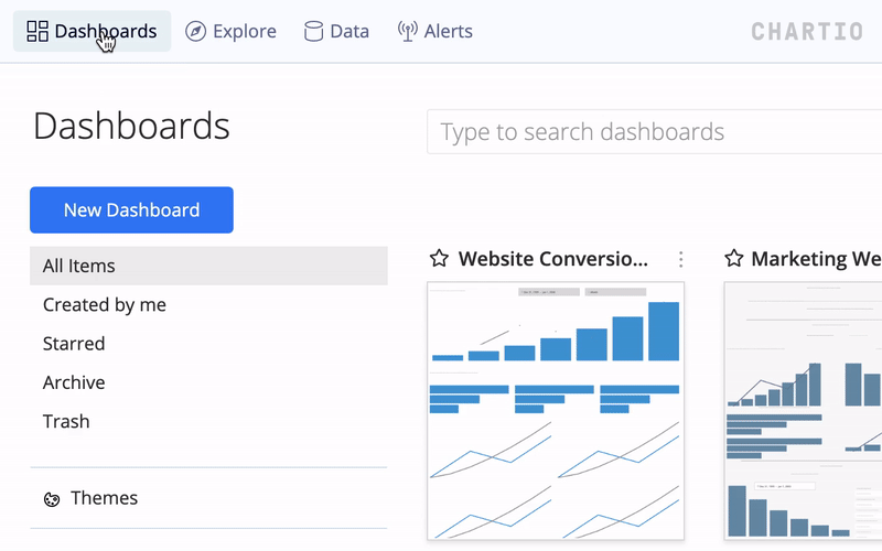
The first thing you’ll notice is that the new nav bar simply looks different. It shares the same design language as Visual SQL, but also introduces new elements as well.
The changes go deeper than just a design refresh though. Functionally, we made changes to improve the overall experience for our customers:
-
“Alerts” is more prominent. Over the past year since we launched alerts, we’ve had more and more customers relying on alerts to get notified of important changes in their data. So, we made them more visible in the nav bar.
-
Administrator settings have been revamped. We frequently heard from customers that it was a struggle to find various settings. Instead of having to navigate through multiple pages to find the right setting, our new “Admin” dropdown has all the settings you need, including links to Users, Integrations (Slack sharing), and Billing.
-
It’s now easier to navigate home. It’s common for the top left navigation link to take you to the homepage of an application. For Chartio, that homepage is the dashboard list. Previously, the top left was a Chartio logo, then a link to “Explore.” We’ve moved things around so that getting back home is as simple as clicking “Dashboards” in the top left of the navigation.
-
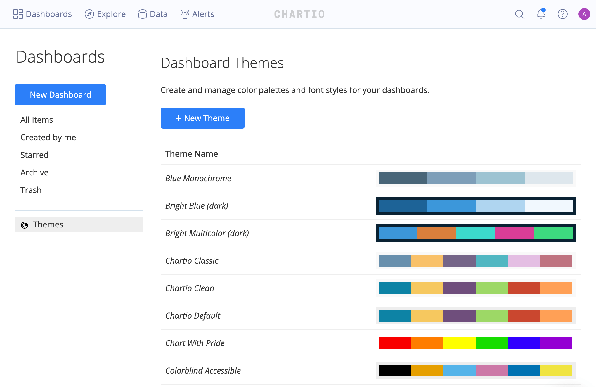
“Themes” have been moved to the dashboard list. Themes are a powerful Chartio feature, enabling companies to customize their Chartio dashboards to match their brand. Previously, the “Themes” section was hidden on a settings page. Now, it’s front and center on the dashboard list, making it easier than ever to customize your dashboards.
The new nav bar is just our latest improvement to help make your Chartio workflow more streamlined and productive. New collaborative features like chart comments, and performance enhancements like our recent Redshift driver upgrade, are designed to improve the Chartio experience and deliver quicker time-to-value for our customers. We’re committed to constantly evolving our product as we strive to make Chartio the fastest, most intuitive data exploration solution on the market.
We hope the new menu makes navigating Chartio easier than ever. It’s also just the tip of the iceberg in terms of rolling out our new design system throughout the application. Stay tuned!