The Best Charts for Our Customers – Why Chartio Chose Vega
Posted by on November 23, 2020 Chartio
Visualizations have taken many twists and turns since Chartio began 10 years ago. Our first library was built using protovis, the precursor to D3. As soon as D3 was launched, we moved to it and built a few different libraries (iterations on top of that). Eventually, we found that the harder parts of making the visualizations was using smart defaults and having them aware of what (and how much) data was going to be shown. Simple things, like preventing axis labels from overlapping, weren’t built into visualization libraries. For these smarts, we moved to Python, and we moved the rendering there with it. A proprietary library, affectionately known as Cordite, built in Python and rendering SVGs has sustained Chartio for the past 6 years.
While Cordite gave us the ultimate flexibility, it came with a big price tag as well — engineering time. Each new chart type and each new feature was built from scratch. This is fine if the number of features and chart types is fairly limited. However, visualizations have a long, long, long tail. The charts our customers build are a reflection of their work, a story they want to tell. And it’s important the story they tell looks amazing. Colors, fonts, axis labels, legends, line style, map selection all matter. The amount of engineering time it took to make each of these features great was too much, so it became clear we needed a different strategy when it came to visualizations. We knew starting over would be a big endeavor, migrating 17 chart types and hundreds of settings. But, we also knew it needed to be done to provide our customers the best possible visualizations.
The decision to build or use existing visualization libraries this time around was very different. The visualization community has evolved, fueling great options that didn’t exist just a few years ago. It didn’t take long for us to decide to move forward with Vega, an extremely well known solution. Most libraries, including Cordite, focus on building chart elements. Vega takes a different approach, focusing on building a grammar of graphics. Vega provides the low level functionality while Vega-Lite focuses on higher-level abstractions built on this grammar. Much like SQL enables the construction of arbitrary queries to retrieve tabular data, Vega and Vega-lite have the flexibility to speak fluently in the language of visualization design. We named this project Nitro, an apt name for the successor to the Cordite.
Nitro was built using Vega, Vega-Lite, and Altair. Vega provides the ingredients, rendering the visualizations, but Vega-Lite and Altair are the recipe. In this analogy Nitro is the chef, putting all these pieces together to provide a simple yet beautiful interface to the underlying visualization libraries.
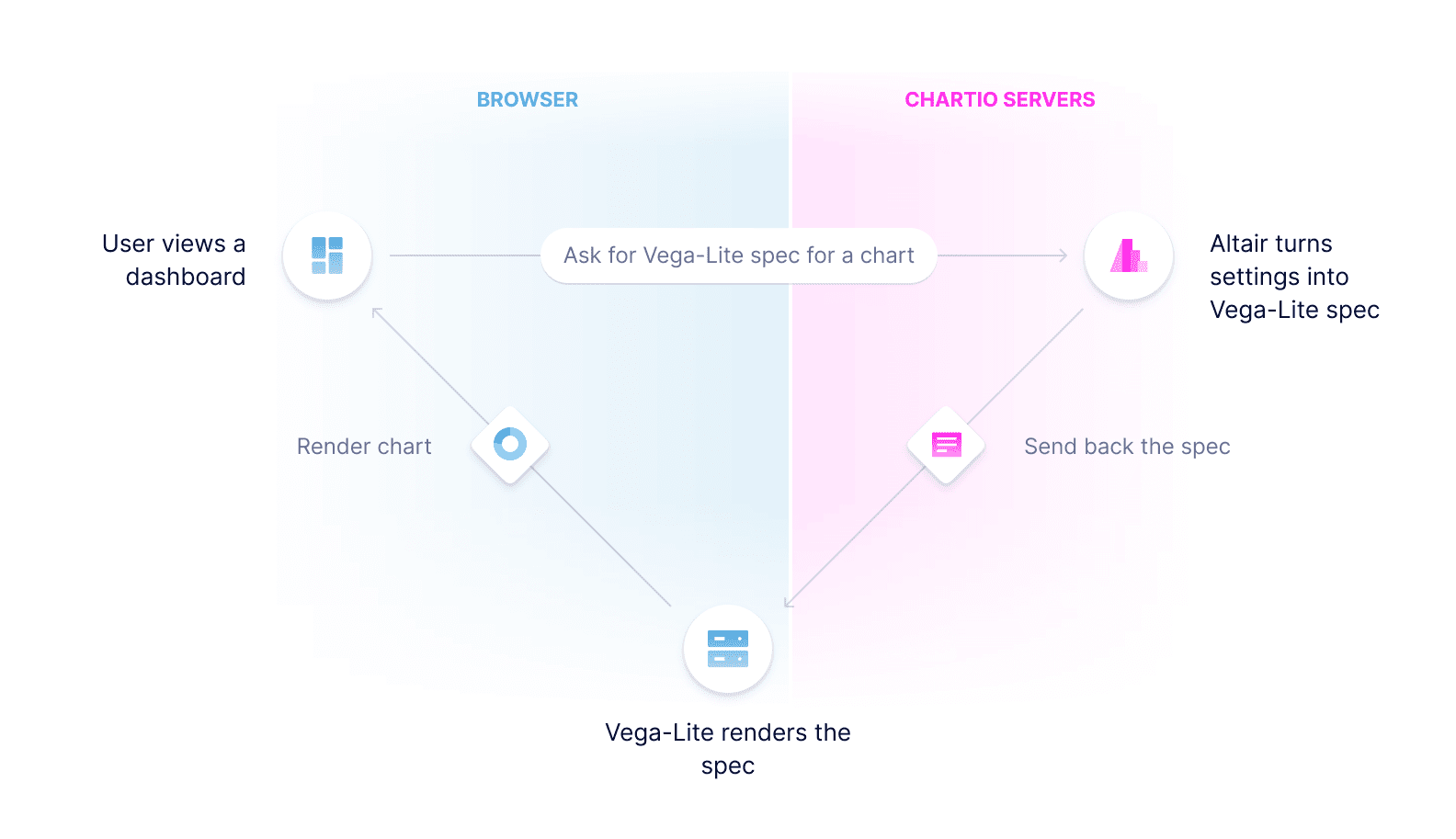
Vega-Lite is written in JavaScript and Altair is Python, but both generate the Vega spec files needed to render charts. Our system doesn’t just need to render visualizations in the browser but also on the backend, to support PDF downloads, scheduled reports, and snapshots. Altair makes that easy by helping to generate Vega spec files in Python.
Like a lot of projects at Chartio, Nitro started as an experiment to see what we could build with a small team of engineers. Using feature flags, we actually launched our first Nitro charts back in March, some of which powered the How We Feel project dashboards. Over the last 6 months, we’ve continually added on to our implementation and expanded the beta to gather feedback. As it became clear we were onto something, we ramped the engineering team and focused on the generally available launch.
What’s exciting for me about the Nitro launch isn’t necessarily all the new features in this initial launch (although there are many). It is all the possibilities the future holds. Research like automatic value labels or recommending animations outline how the Vega community continues to evolve. And because it’s such a faster environment for us to develop in, Vega has elevated the discussion our product team and engineers have from “how long will it take to …” to “let’s experiment with these 3 ideas to see which one is best.”
Each week, new capabilities and experiments are being deployed that make visualizations at Chartio more beautiful, collaborative, and customizable. In addition to our new standard Vega charts, we are already working on a project that will allow custom visualizations, making almost anything possible on a dashboard (email beta@chartio.com if you are interested in learning more). This really is just the beginning.
Our new library is available to all new customers today, so start a free trial to try it for yourself.