The Gap Between Household Incomes and the Cost of a Home
Posted by on January 2, 2018 Data, Opinion, Education, Data Analytics
“Housing prices are skyrocketing!” Heard that one before? Yeah, me too.
Late in 2016 my wife and I decided to try to get into the housing market and see if we could buy a house. At the time, I knew next to nothing about the nationwide housing market and knew even less about it in the San Francisco Bay Area. Being a recent transplant from Ohio, I was not ready for the shock of trying to find affordable housing in San Francisco. The search we went on started to lead me to think about whether or not the median income across the US was following with the cost of housing, with specific interest in the cost of buying a home and not renting one.
So I went to the internet to find data on the cost of housing in the United States broken down by state and then found a source that gave me information on the median household income in those states as well.
I found those sources here:
Then, I uploaded that data as a CSV to Chartio and then created the following Bar Chart. In total it took about three minutes, from not having this data connected to having a visual representation of my information.
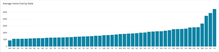
What I saw wasn’t terribly surprising, so I moved on to my second chart.
The second chart I wanted to put together was a visual representation of the Median Household income by state to see them compared against each other. That one appears below:
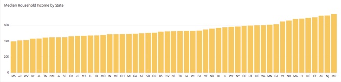
What I saw here did surprise me. The two charts do not have the states in the same order along the x-axis. That was very surprising, so I wanted to see how these looked when arrayed on the same chart.
Simple enough, I recreated the layer from the household income chart as a second layer on the first chart so these two layers can be joined on the state for a more direct comparison. Then for a little visual snazziness, I multiplied the household income bars by -1 so they appears as a negative value and could be portrayed as a counter to the home cost, and would appear on the same column in the visual chart. That third chart looked like this:
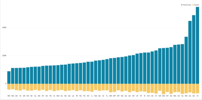
This chart shows the household income varying slightly as it compares to the home cost. This lead my to wonder what these charts might look like when the rank of each metric is compared against each other instead of the direct dollar value.
To do this, I cloned the chart above onto the same dashboard and added in a rank column in the Data Pipeline for each layer.
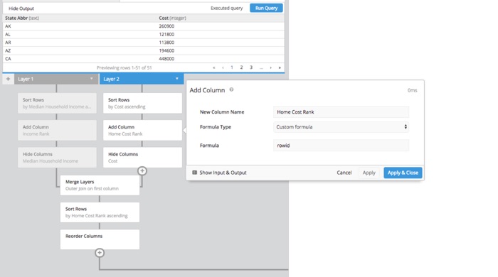
This time I made sure to multiply the row id function for the Household Income layer by -1 to again get it to appear as a negative value directly countering the home cost column.
The chart looks like this:
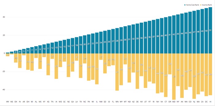
While the costlier states, as far as homes are concerned, find their median household incomes near the top of the list, the ranking does not follow directly. That is a concerning trend as many Americans struggle with finding housing they can afford on the income they currently have.