In Cole Nussbaumer Knaflic’s book about data visualization best practices, Storytelling with Data, she comes right out and says it:
“Pie charts are evil.”
She makes a pretty strong case for why pie charts are scientifically a poor way to visualize data (which we’ll get to later on), but this strong statement raises an interesting initial question. If pie charts are so derided by experts like Knaflic, why are they used so often?
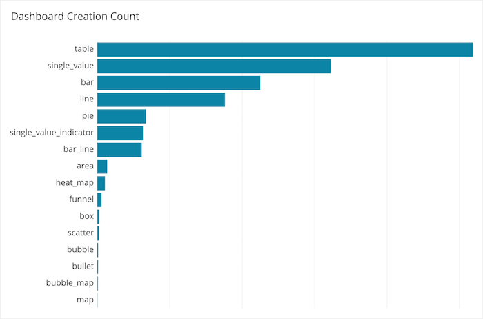
In fact, pie charts are the fifth most commonly created chart in Chartio dashboards.
The answer comes down to what you’re trying to achieve with your data visualization. At its core, the act of visualizing data is an exercise in storytelling — taking disparate data points and turning them into charts that convey a message and drive action.
Storytelling with data is a balance between art and science. This balancing act can lead to specific circumstances where a pie chart is vital to the art of conveying the meaning behind the data, despite the fact that it’s scientifically not necessarily the best way to visualize data. To navigate this balancing act, you need to understand the elements of good data visualization and five of the best practices that’ll help you get there.
What Is Good Data Visualization?
Since 2007, we’ve created and helped others create many, many dashboards filled with great data visualizations. In that time, we’ve been able to identify four characteristics that all great data visualizations share. We call it ACES.
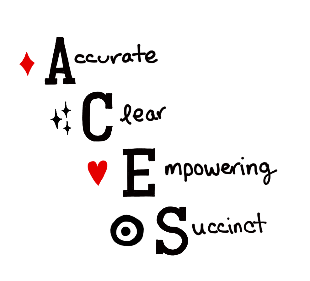
- Accurate: The visualization should accurately represent the data and its trends.
- Clear: Your visualization should be easy to understand.
- Empowering: The reader should know what action to take after viewing your visualization.
- Succinct: Your message shouldn’t take long to resonate.
We go into much more detail at The Data School, in regard to dashboard design. But when it comes to individual charts, we’ve narrowed down our advice into five data visualization best practices that’ll help you tell a story with your data.
5 Data Visualization Best Practices
1. Define “Why”
To keep yourself on track throughout the data visualization process, think about your core motivation behind visualizing your data as a plain-English sentence. This definition of “why” is the seed that will grow into the story you tell with your data.
We bucket motivations behind data visualization into three categories: ad hoc, strategic planning, and decision support.
Ad hoc is for when you need to explore data quickly and roughly in order to find a fast answer or clarify your own thinking. The audience is often you or a knowledgeable teammate. A quick and dirty data visualization is OK here because your definition of “why” might be something along the lines of:
“I wonder if the new form design has impacted conversion rates over the past month.”
Strategic planning is when the data visualization is meant to inform decision-making behind large projects. The audience here is broad, from executives who need to provide approval, to the employees who have to put the plan in action. Strategic planning visualizations often rely on historical data and should be well thought out because they take a central role in both the planning and the process of carrying out that plan. An example of a “why” statement here could be:
“We should rethink our approach to processing support tickets because our response time is slowing down.”
Decision support data visualizations help with ongoing decision-making. The audience is usually composed of business leaders but can also be any employee who has to make data-based decisions. These data visualizations here should be well-thought-out, like strategic planning visualizations, but highly iterative, like ad hoc visualizations. Your “why” statement for a decision support visualization might be:
“We need to monitor clicks by message so we can optimize the messaging of our campaign on the fly.”
The goal of defining “why” is to understand your purpose and your audience from the get-go. Use these definitions to inform all upcoming decisions to ensure that your visualization is clear and will empower your specific audience to take action.
2. Keep It Simple
With your “why” defined, it’s time to start thinking through your options for actually visualizing data. The first thing we caution against is getting too fancy. Remember, you’re striving to be clear and succinct, so try to communicate your story in the simplest way possible.
One example could be a situation where you have two values you want to compare, like revenue and operations cost. At first, you might consider using a bar chart or a line chart (or even a pie chart) because you can use colors and make them visually engaging. In truth, you’re just fine with two single value charts.

Everything you need to know is available in one glance. The central “why” statement is here would likely be, “We need to know if revenue is higher than operations cost.” You understand right away whether that’s true or not.
When it comes to telling the story of why operations cost is $882,006, your visualizations will get a little more detailed, but that doesn’t mean they should be more complex. For instance, you might break down operations cost in a line chart.
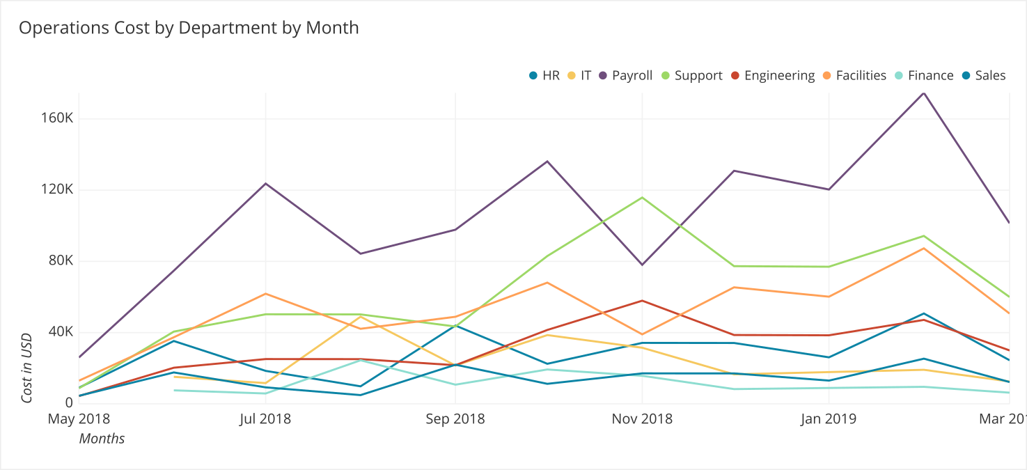
There’s a lot to take in here. When the eye lands on this chart, all you see is a tangled mess of lines, which will take some time to pick apart. This graph is not clear or succinct because there are too many categories.
Generally, you should limit the number of categories you use in a chart to five to seven categories. Here’s the same chart with the same amount of detail, but simplified:
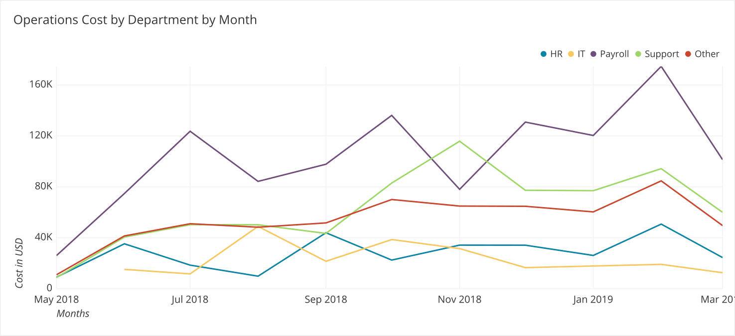
Now, this is a chart you can do something with. The “why” statement for this might be, “We need to understand the breakdown of operations cost.” This chart and the two single value charts above tell a story about how operation costs of individual teams relate to revenue over time.
3. Cluster But Don’t Clutter
Despite your best efforts to keep data visualizations simple, data is often just really complex. You can simplify only so much before the meaning behind the story you’re telling starts to change.
With situations like these, the Gestalt school of psychology comes in handy. Don’t worry — we’re not going to break out a psychology textbook on you. But there is one practical concept Gestalt provides that can greatly improve your data visualizations: the human brain is wired to seek out patterns.
Elijah Meeks, co-founder of Noteable.io and executive director of the Data Visualization Society, has a fantastic breakdown of two of the core Gestalt concepts that can help you turn your data clutter into easily recognizable patterns: similarity and proximity.
Similarity: Objects that appear similar get grouped together. One way to denote similarity is with color. For instance, in the two charts below, one color is assigned to each sales representative. Without having to spend much mental energy, you can understand Lincoln’s role in driving new revenue because all visualizations assigned to him are yellow.
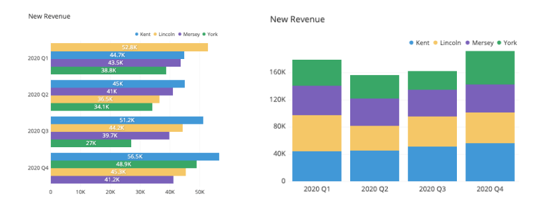
Maintaining this pattern throughout all your visualizations will make it much easier to understand when good things are happening and when issues need to be addressed.
Proximity: objects that are physically close to each other get grouped together. Meeks explains this concept with these visuals:
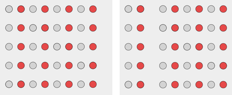
Despite the colors and the order of the columns, the second graphic has two distinct groups: left and right. This is a little abstract, but the important takeaway here is that how you group your data matters and can divide complex and similar sets of data into separate groups.
Applied practically to an actual chart, the Gestalt principles of similarity and complexity mean that you should:
- Use colors to denote similarities within the data.
- Use proximity to cluster data into groups.
With these psychology fundamentals, you can create patterns within your visualizations that are clearer and subconsciously easier to understand.
4. When in Doubt, Use Bar Charts
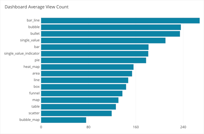
Earlier, we showed the most commonly created charts in Chartio, but when we break down the most commonly viewed charts in Chartio, two types of bar charts are in the top five (bar line chart at number one and regular bar chart at number five).
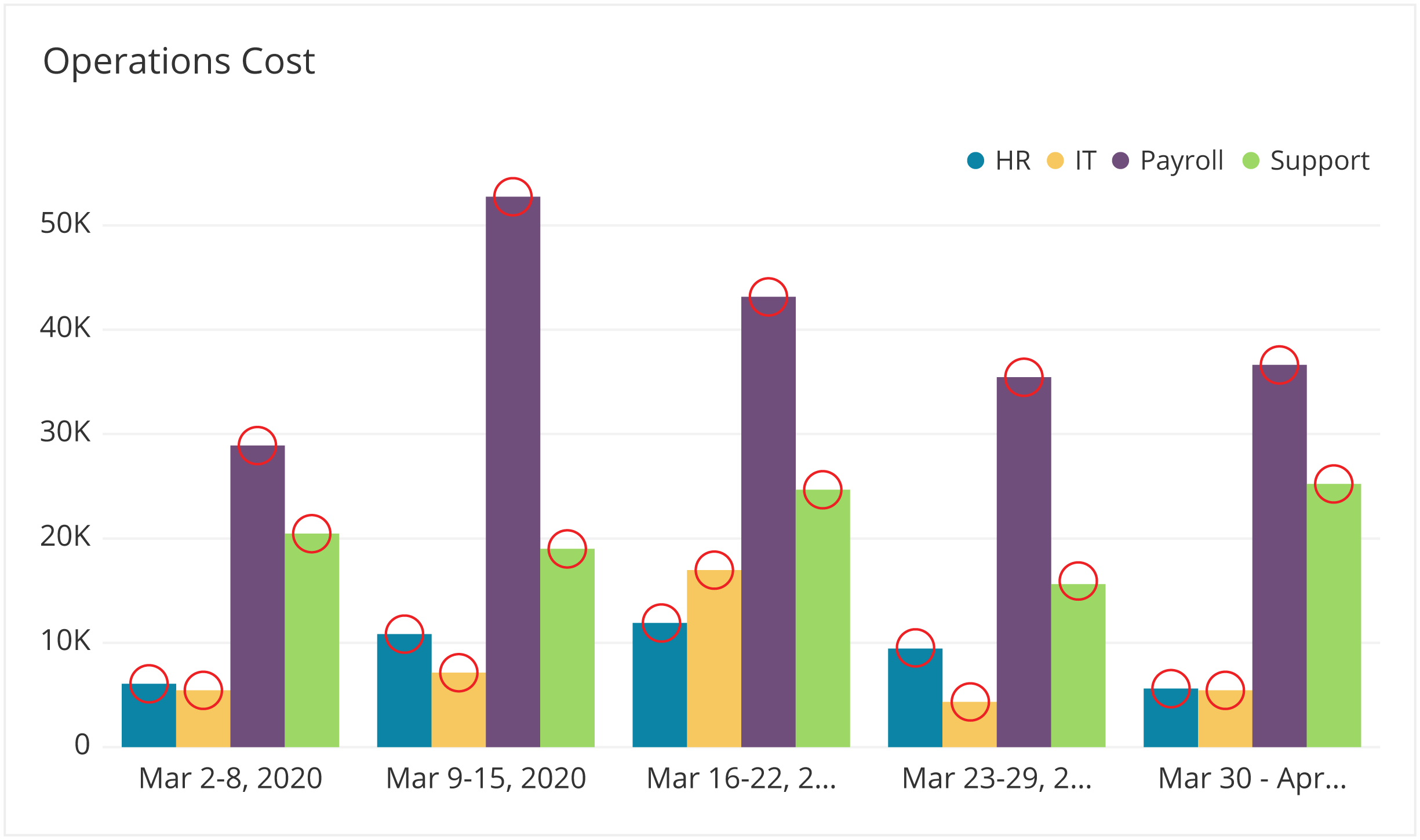
Bar charts rank this high because they simply work well. In Storytelling with Data, Knaflic explains that bar charts are so effective because the human eye compares the end points of each bar. Here’s where the eyes land on a bar chart, denoted in red circles:
Knaflic says that the horizontal bar chart would be her choice for a “single go-to graph for categorical data.” This is what makes them so effective — it’s easy to compare the size of data.
One problem to be aware of: Because the eyes focus on the end points of the bars, they don’t scan the entire bar itself. This means that the human mind’s assumption is that the bars start at zero. So you should always start the y-axis at zero or very clearly note otherwise.
What makes bar charts strong is also what makes other charts weak. In fact, it’s why Knaflic says, “Pie charts are evil.” She says, “The human eye isn’t good at ascribing quantitative value to two-dimensional space. . . . When segments are close in size, it’s difficult (if not impossible) to tell which is bigger.”
Here’s an example:
Without clear labeling, yellow and blue look like they’re just about the same size, right? They’re not. The human eye takes in the shape of each segment, and that’s not a quantitative way of understanding data. Essentially, what you’re seeing when you compare those segments is:
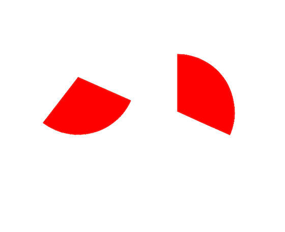
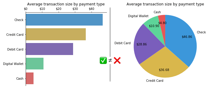
Hard to tell, right? With a bar chart, you’d be able to more accurately compare, without the need for specific labeling. Here’s a direct comparison between a bar chart and a pie chart:
Donut charts are another culprit Knaflic likes to pick on. She also illustrates her point with donut charts, where the arc is what the human eye compares.
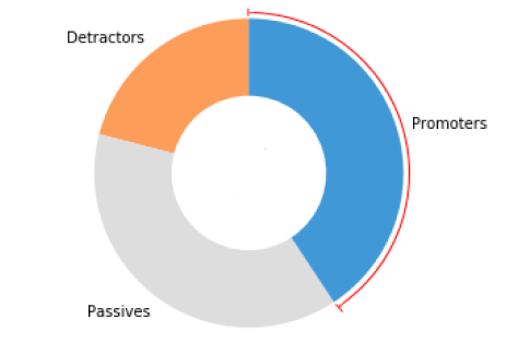
Without the percentages, the segments for Passives and Promoters seem nearly identical, because the eye runs around the circumference of the circle. Again, with a bar chart, the difference between these segments would be easier to spot. Unless you have a very good reason, you should steer away from using pie charts and donut charts.
Using bar charts as your go-to visualization is good practice in keeping your data clear and accurate. That said, there are still valid use cases for pie charts and donut charts when it comes to the story you’re looking to tell.
5. Have a Story to Tell (The X Factor)
Data visualization is the practice of telling a story with your data. To tell a compelling story, your visualization needs to not only convey useful data but also resonate with your audience. And as Nancy Duarte says in Resonate, her book about storytelling in business, “Facts alone fall short.”
To resonate, you need to put your audience first. Prioritize what your audience needs out of the chart over what you want to achieve with it.
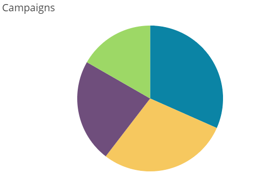
This is where you’ll find use cases for pie charts and donut charts, which you might think of as the “dessert charts.” As we’ve discussed, pie charts are not the best option for displaying quantitative data (e.g. we have X% more ad spend in TV than Facebook).
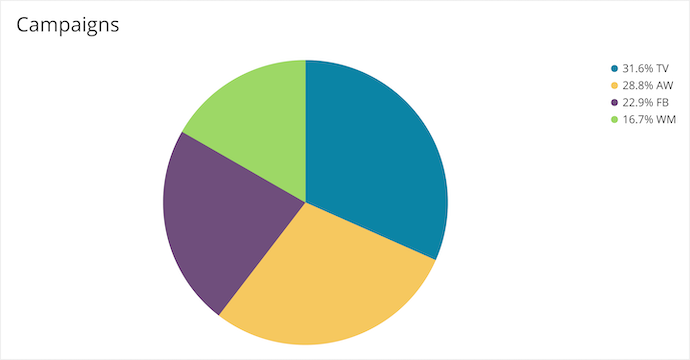
But pie charts are great at some things; even Knaflic recognizes their occasional role as communicating “the concept of there being a whole and, thus, parts of a whole.” Here’s the pie chart above with a good legend.
Now we can tell that blue is, in fact, larger than yellow. But the story isn’t about exact percentages; it’s about understanding parts of a whole. In a glance, you can understand the rough makeup of your advertising campaigns as one unit.
Similarly, taking the donut chart example above with a good legend:
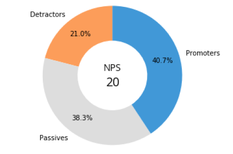
The story here isn’t necessarily the exact percentages; it’s the Net Promoter Score (NPS) as a whole and how each segment plays a part within it. This is a valid and useful story to tell, designed to empower your audience. Remember to keep your audience’s needs at the forefront of your visualization decisions so you don’t miss valuable opportunities that sometimes go against what’s scientifically recommended.
Where to Go From Here
Treat these best practices as a starting point to wrap your head around the practice of building data visualizations. Begin with “why,” keep it simple when you can, lean on Gestalt principles and bar charts, and bend the rules a little when the story you’re telling requires it.
We have many resources for you to dive deeper into data visualization best practices: