The major purpose of dashboards and data visualization is to quickly, easily, and accurately observe trends and indicators that will help you and your company make business decisions.
- Accurately - You need to know that the KPIs you are seeing are numbers you can rely on.
- Easily - You need to have the fewest amount of button or mouse clicks between your eyes and the dashboards that hold these numbers.
- Quickly - You need to see these numbers now.
These business decisions could make or break your place in the industry and it is because of that level of importance the quickness and accuracy of those indicators is at the forefront of our concerns when building a platform that allows you to observe these trends and indicators.
There may also be a set of numbers or KPIs, that once you have established are accurate and you can rely on your queries, you may not even need to know about them until they are below or above a certain threshold. If they do fall outside of a certain pre-defined tolerance band you may need to be alerted to their current status.
Having true alerting functionality, is problematic in a few ways, one of them is major: datasource resources. While we try to be conscious of everyone’s business needs we need to also be sympathetic to datasource resource constraints and cause the smallest amount of impact on those resources as possible to ensure that the first need “Accuracy” is consistently met. With scheduled alerts there would need to be queries constantly sent to your datasource (at the interval you define) and that could prove to be burdensome on your source.
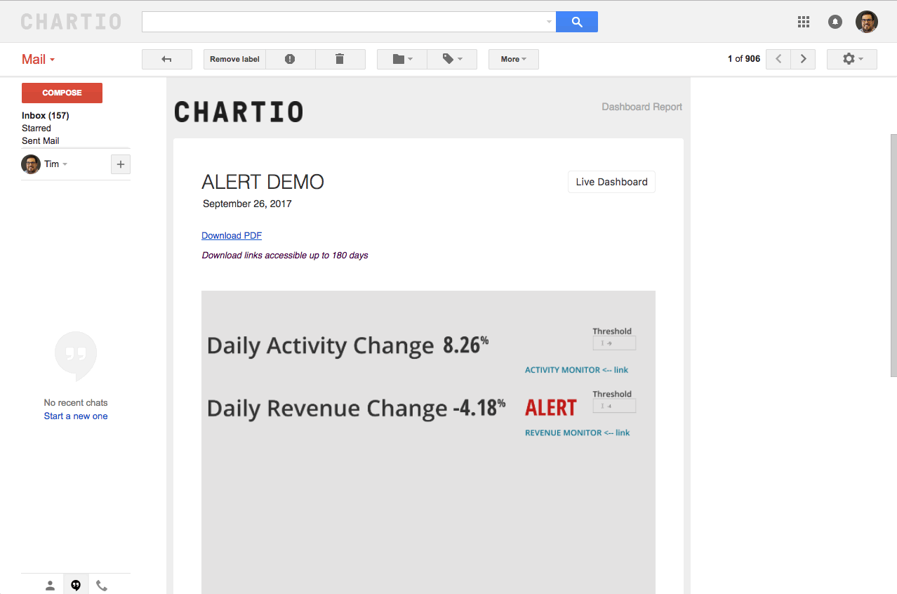
In our example a dashboard can be set up with a two major metrics analyzing current website activity and the total revenue. These two metrics have entire dashboards that show their analysis in greater detail, but the purpose of the alerting dashboard is to draw your attention to the issues that might be coming up. The first step is to build out the detailed dashboard and that is entirely up to you, in the example we made here I took some of the Chartio Demo Data (available to you) and built some visualizations that analyze that data. Those are not the important part of this article, what’s important is the third dashboard that only shows two metrics.
In the third dashboard I have set up one metric that takes the whole company’s website activity for the date span we are interested, in this case the current month to date by day. Then I add a text input that is going to be my threshold for the activity metric. Third, we clone the KPI single value chart and add to it a column that is called threshold that simply adds in the text input as the field for every row in the chart. Then, utilizing a case statement that will print out the word “ALERT” if the value in the metric column is less than or greater than the alert column you’ve created based on your needs. Finally we filter it to today and hide every column but the “ALERT” column. After hiding all the columns you can set the chart’s settings to print out the word “ALERT” in red type so your attention is really piqued when looking at the report in your inbox. Then you replicate these steps for the revenue metric, like revenue for month to date by day.
The last thing you’re going to want to do on the dashboard is to create links using the in app link widget that will send you right to the dashboard you need to see if there is an alert problem in your metric.
Scheduling a report is pretty straight forward too, there is information on that in Chartio’s support docs.
Now, when you receive the emailed report you will see an alert and then you can view the live dashboard and follow the links to the monitor dashboard that shows more detail about the revenue that has been alerted based on the thresholds we set.