In data mining, Exploratory Data Analysis (EDA) is an approach to analyzing datasets to summarize their main characteristics, often with visual methods. EDA is used for seeing what the data can tell us before the modeling task. It is not easy to look at a column of numbers or a whole spreadsheet and determine important characteristics of the data. It may be tedious, boring, and/or overwhelming to derive insights by looking at plain numbers. Exploratory data analysis techniques have been devised as an aid in this situation.
Exploratory data analysis is generally cross-classified in two ways. First, each method is either non-graphical or graphical. And second, each method is either univariate or multivariate (usually just bivariate).
Exploratory Data Analysis with Chartio
We will perform exploratory data analysis on the iris dataset to familiarize ourselves with the EDA process. Let’s look at a few sample data points:
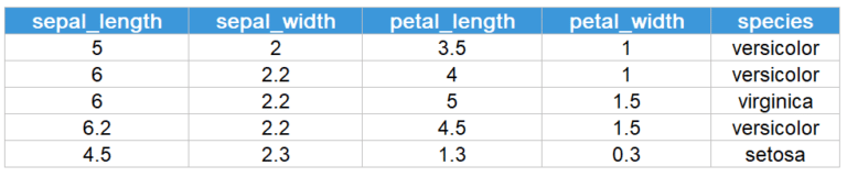
The dataset contains four features – sepal length, sepal width, petal length, and petal width for each the different species (versicolor, virginica, setosa) of the iris flower. In the dataset, there are 50 instances (rows of data) of each species, a total of 150 data points.
Univariate Analysis
Univariate analysis is the simplest form of data analysis, where the data being analyzed consists of only one variable. Since it’s a single variable, it doesn’t deal with causes or relationships. The main purpose of univariate analysis is to describe the data and find patterns that exist within it. Let us look at a few visualizations used for performing univariate analysis.
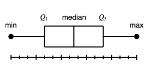
Box Plots
A box and whisker plot – also called a box plot – displays the five-number summary of a set of data. The five-number summary is the minimum, first quartile, median, third quartile, and maximum.
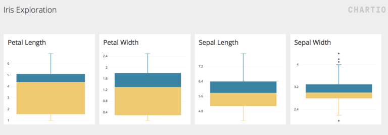
The box plots created in Chartio provide us with the summary of the four numerical features in the dataset. We can observe that the distribution of petal length and width is more spread out, as exhibited by the bigger size of the boxes. Whereas, the sepal length and width is concentrated around it’s median. Moreover, in the sepal width box plot, we can observe a few outliers, as shown by the dots above and below the whisker.
Histogram
A histogram is a plot that lets you discover, and show, the underlying frequency distribution (shape) of a set of continuous data. This allows the inspection of the data for its underlying distribution (e.g. normal distribution), outliers, skewness, etc.
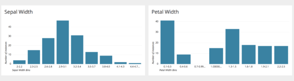
The above plots show the histogram of sepal and petal widths made in Chartio. From the charts it can be observed that the sepal width follows a Gaussian distribution. However, petal width is more skewed towards the right, and the majority of the flower samples have a petal width less than 0.4 cm.
Multivariate analysis
Multivariate data analysis refers to any statistical technique used to analyze data that arises from more than one variable. This models more realistic applications, where each situation, product, or decision involves more than a single variable. Let us look at a few visualizations used for performing multivariate analysis.
Scatter Plot
A scatter plot is a two-dimensional data visualization that uses dots to represent the values obtained for two different variables – one plotted along the x-axis and the other plotted along the y-axis.
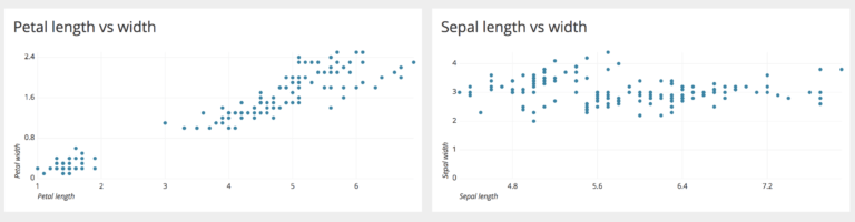
Above are examples of two scatter plots made using Chartio. We can observe that there is a linear relationship between petal length and width. However, with increase in sepal length, the sepal width does not increase proportionally – hence they do not have a linear relationship.
In a scatter plot, if the points are color-coded, an additional variable can be displayed. For example, let us create the petal length vs width chart below by color coding each point based on the flower species.
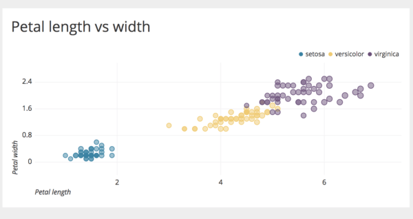
We can observe that ‘setosa’ species has the lowest petal length and width, ‘virginica’ has the highest, and ‘versicolor’ lies between them. By plotting more dimensions, deeper insights can be drawn from the data.
Bar Chart
A bar chart represents categorical data, with rectangular bars having lengths proportional to the values that they represent. For example, we can use the iris dataset to observe the average petal and sepal lengths/widths of all the different species.
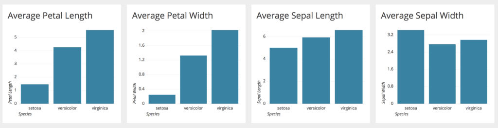
Observing the bar charts, we can conclude that ‘virginica’ has the highest petal length, petal width and sepal length, followed by ‘versicolor’ and ‘setosa’. However, sepal width deviates from this trend where ‘setosa’ is highest followed by ‘virginica’ and ‘versicolor’.
The exploratory data analysis we performed provides us with a good understanding of what the data contains. Once this stage is complete, we can perform more complex modeling tasks such as clustering and classification.
Apart from the charts shown in our EDA example, we can use various other charts depending on the characteristics of our data:
- Line charts to show changes over time
- Pie charts to show the relationship between a part to a whole
- Map charts to visualize location data
Conclusion
EDA is a crucial step to take before diving into machine learning or statistical modeling because it provides the context needed to develop an appropriate model for the problem at hand and to correctly interpret its results. EDA is valuable to the data scientist to make certain that the results they produce are valid, correctly interpreted, and applicable to the desired business contexts.
Resources
- Silicon Valley Data Science – The Value of Exploratory Data Analysis
- Engineering Statistics Handbook – What is EDA?