Software development is moving at a faster pace with larger-scale impact when deploying. In this environment, a Software Engineering dashboard is a great communication tool to track your development process, along with displaying your product performance at a glance. It also fosters engineering best practices of continuous improvements. Let’s dive in to see how to make a great dashboard for a software team.
Metrics important for Software Engineers
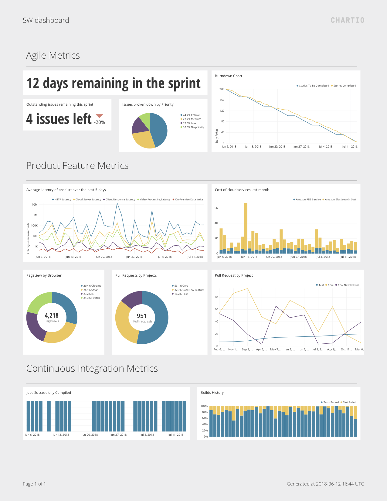
Because there is such a wide variety in how some engineering teams develop their product, there is no be-all-end-all set of metrics that all development teams need to track. On a high-level, anyone in your company can see these metrics to follow the development progress. You would also want to track how the product is doing as well. Here are some specific examples of metrics you might want to track on your dashboard:
Agile metrics, or tracking how much work goes into a feature
These metrics are tracked and measured in your agile management tool such as Jira. They include:
- Days remaining in a sprint
- Issue count/Story points remaining in the sprint
- These will track towards creating a burndown chart, showing how much work is left in a sprint, i.e. work committed vs. work completed.
- Epic/Release burndown and feature creep
- Similar to the previous metric, this is measuring at a longer time duration how much is completed over the release. It can also show how much feature creep (adding a ticket in the middle of a release) occurs in the middle of a release.
- Sprint velocity
- Shows how quickly teams are able to complete the work in a sprint.
- Cumulative flow or kanban state tracking
- Tracks how tasks have been worked on, and shows how each task spends in ‘Requested’, ‘In Progress’, and ‘Done’. Also allows for the identification of bottlenecks at every phase of development.
Feature metrics
Depending on the features that are in question, you could use something like Google Analytics for your feature performances, as well as monitoring tools like Datadog, or even good logging practices for more internal performance numbers. The latter include:
- Web Latency and page load
- Application server load
- Queue depth and latency
- This is applicable when you are using message queues, and its depth can indicate performance bottlenecks
- Page view/app usage breakdown
- Percentage 4xx/5xx/2xx response tracking
- These are the HTTP status codes responses and can indicate bugs or interrupted service
- Longest duration/heaviest load API endpoints
- Number of critical bugs outstanding
Continuous integration and delivery metrics
- Stability of builds
- Test passed statistics of builds
- Allows you to track to see if the builds are improving or regressing
How to make a Software Engineering Dashboard
To make a dashboard, you would need to connect the data sources into your BI tool. For example, this could be Jira for Agile tracking, Google Analytics for product analytics, Github for issue/feature request tracking, and Heroku for deployment analytics.
Here are the steps to connect the Data Sources in a BI tool like Chartio:
Step 1: On the top menu, select Data Sources. Click on the +Add a Data Source button.
Step 2: Select the Data Source you need. Chartio works with many different data sources, which you can check from our partner website. Once you’ve connected your data source, it’s time to create the graphs from these data sources.
Best practices for a Software Engineering Dashboard
Overall, the dashboard should be clear and straightforward in its intent, so choose the right charts to explain your data appropriately. Be clear on who would be using the dashboard, which in this case is full stack software developers. The dashboard should allow you to identify trends of your product and development process, and allows teams to take action from real-time data. Also look out for data biases that your reader might encounter.
Use the right visuals, popular color templates, such as ‘Red, Amber, Green’ which are great for showing the status progress of a task or project. Also, make it clear where to look on the dashboard. Creating sections can emphasize some elements and have other metrics in the background to back it up. Title the charts consistently and make sure acronyms are used appropriately.
Remember, the best dashboards are always being tinkered and tweaked to improve the dashboard. Removing non-essential metrics is as important as adding new metrics that are missing; clarity of focus is important. Have snapshots of your dashboard so you can track both how you’re doing, as well as a collection of your previous dashboard designs.