What Is Churn?
Churn rate is the rate at which users stop paying for a product or service from your company. This is commonly used in SaaS businesses where it is easy to determine the start and end date of a user.
Calculating churn and implementing best practices to minimize it are crucial to improving the health of your business. This metric will also help you analyze past business performance and accurately forecast future revenue.
How to Calculate Churn Rate?
Churn can be computed for many different base metrics. We will cover three main types of churn for SaaS businesses:
- Subscription Churn
- Gross Revenue Churn
- Net Revenue Churn
In each case, churn is computed based on losses in a specific period of time, often monthly or quarterly.
Subscription Churn
Subscription churn is loss based on the number of paying customers you have:

Quarterly subscription churn is a common target for customer success teams.
Example: A company that has 10,000 users at the beginning of January and 1,000 cancellations through the end of March will have a 1,000 / 10,000 = 0.1, or 10% quarterly subscription churn rate.
Gross Revenue Churn
Gross revenue churn is loss based on the amount of revenue you bring in across customers:

To be more precise, the revenue at the beginning of the period should be your recurring revenue for that period. For revenue quit in the period, you should include the customers who stopped paying altogether plus customers who downgraded their subscriptions to a cheaper option.
Net Revenue Churn
Net revenue churn is similar to gross revenue churn but also accounts for increases in the amount you may be getting from existing customers (upsells).

This provides a more accurate view of how the revenue is moving in your business. Note that it does not take into account the amount of revenue gained from new customers. When net revenue churn is near zero or negative, this means that the business is doing well, since revenue would be stable or growing, even in the absence of new customers.
What is a “Normal” Churn Rate?
In this sixteenventures post, author Lincoln Murphy suggests a 5-7% annual revenue churn to be acceptable, or 0.42-0.58% per month. SaaS investor Tomasz Tunguz states that the median SaaS business loses about 10% of its revenue to churn each year, which translates to an average 0.87% monthly churn.
There is no one right number to aim for, but no matter the case, it will be very difficult for a company to grow when churn is high. It is commonly accepted that keeping a current customer is much cheaper than gaining a new one. Regardless of what your current churn rate is, you should watch out for these warning signs:
- Your churn rate has increased over the last quarter or year, or continues to increase every month.
- The dollar value of churning customers is equal or greater than the dollar value of new customers.
Churn is one of the main stoppers of growth, and growth is key to a company’s survival. According to McKinsey researchers, if a software company grows at 20 percent or less, it will have a 92 percent chance of ceasing to exist within a few years.
Best Practices When Measuring Churn
So far, we’ve discussed churn in terms of how many customers or how much revenue you are losing compared to how much you are gaining. However, that is an oversimplification. There are more in depth churn metrics you can use to get a full picture of your company’s health.
Segment Churn Based on Contract Length
Do you offer both month-to-month and annual subscriptions? If so, then segment churn by contract length. Including all contracts together may skew your numbers since some customers might not be able to technically churn for some amount of time. This can make them look better than they actually are and can disguise customer satisfaction problems that will become apparent when your annual contracts jump ship at an alarming rate.
Analyze “Activity Churn”
Active customers rarely stop using your app overnight. There is usually a gradual slowdown in engagement. Don’t just focus on inactive customers. Look for slow-down trends, such as users performing fewer actions on your app or altogether using it less often. Many subscribers will cancel simply because they don’t use the app enough to warrant the expense. Put additional effort into re-engaging this group. Send a reminder email. Personally reach out and ask why their usage has slowed down. What can you do to help make the app more useful?
Look at Customer Support
Customers who have negative customer support interactions will be more likely to churn. You should gather data on how many tickets customers are sending in and how long they end up waiting for a response. This data can help you predict churn and also provides opportunities for your sales team to upsell customers who might need the premium version of your product.
How to Visualize Churn
Data visualization allows you to quickly detect patterns, trends, and outliers in churn, enabling you to make key business decisions that can address negative patterns before they get out of control.
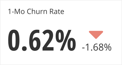
Single Value Charts are great to get a quick understanding of churn over a fixed period. You can add an indicator to signal how much that rate has changed over the previous period.

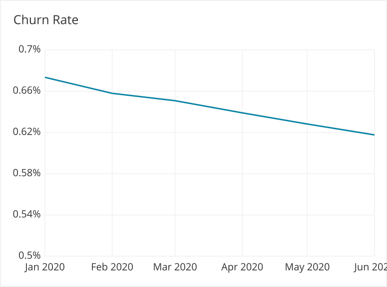
Line charts can be used to show churn over time.

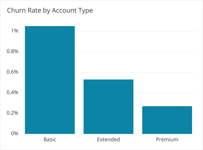
Bar charts are used to show churn by different categories or can be used as an alternative to line charts to show churn over time.

Stacked bar charts allow you to add another dimension to a bar chart, letting you to see in more detail where the churn was coming from. It is also common to see stacked bar charts over time to understand how these categories vary in contributing to churn.
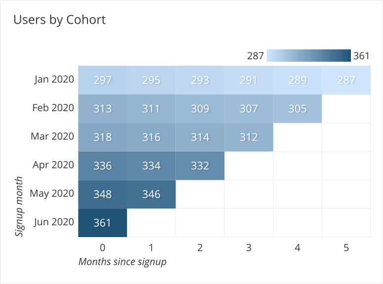
Cohort analysis is an effective way of segmenting customers to calculate key metrics, such as CLV, retention rate, and churn. Cohorts are groups of users that share a certain characteristic, such as when they signed up. A plot of churn by cohort in the form of a heatmap can help you identify when users tend to churn, enabling you to identify problems and hopefully save later customers before they reach that point.

Get the Right Tools
All SaaS company CEOs know the importance of tracking churn. However, they often use the calculation that shows the company in the most positive light, as opposed to the most realistic standing. It is important to look at churn from multiple angles to understand the health of your business. You need to use tools that can bring in user data, revenue data, and customer support data to be able to accurately predict your revenue and churn. Learn more about how to blend multiple data sources in one dashboard with Chartio.