While data analysis often starts with looking at the data as a whole and computing statistics and metrics for overall effects, it is not where analysis ends. When interesting points come up, it is useful to dig deeper into the data to account for observations through the use of additional data features. One of the ways of bringing in these features is through a cohort analysis. In this article, you will learn what cohort analysis is, along with a couple of ways that it can be used and interpreted.
Defining cohort analysis
A cohort is a name for a group defined by a common characteristic; a cohort analysis will analyze collected data across different cohorts on common metrics of interest.
One major characteristic used for cohort analysis is time, for example grouping users together based on the week or month in which they created a signup. By grouping users together on time, you can observe the effect of seasonality or marketing events based on the behaviors of each user group as time passes.
The term ‘cohort analysis’ can also be applied towards other characteristics as well, such as gender (male, female, other) or age range (18-25, 25-34, etc.). This often comes up in a marketing context, where disentangling how different genders or age brackets can be immensely useful for understanding the reasons for observed changes in data as a whole. Cohort-defining characteristics do not need to be inherent to users themselves. For example, a company might create cohorts based on if visitors come from a mobile platform or from desktop and compare the groups’ activity and behaviors.
In each of these cases, the creation of cohorts or segments is useful for breaking the effects observed in the whole down into constituent components. This can allow for a more in-depth understanding of observations: if we find that one cohort has acted differently from the others, this can be a useful sign for future product development or marketing campaigns. In the following two sections, we’ll describe some of the questions that can be addressed by both types of cohort analysis.
Cohorts based on time
As noted above, one common grouping criteria for cohorts is based on how long each user or account has been part of the system. Sometimes, the term cohort analysis is considered synonymous with this time-based cohort definition. Websites can collect data through not just user accounts, but also through event recordings from cookies.
Time-based cohort analysis can be used to answer questions like:
- Are new users qualitatively different from old users in terms of recurring activity?
- Are there general seasonality effects?
- What effect did our recent marketing campaign (advertisement, sale, redesign, etc.) have on obtaining new users?
- What are the general characteristics of users in terms of churn, retention, and lifetime value?
Metrics related to cohorts divided by time are often plotted in a triangular-shaped tabular form:

The example above uses a monthly cohort: each row of the table tracks the activity of one cohort, and each cell indicates the number of users in each cohort that were active in each month. Note that the columns of the table are not of the same units as the rows: rather than being in terms of absolute months, they are in terms of months since the user’s start time.
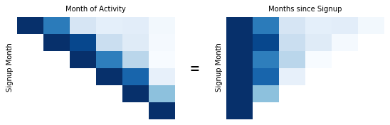
Aligning all users like this gives us a way to easily compare each cohort’s interactions with a website across time. In the example above, you might notice that the retention for the first month on the 2020-11 row is slightly higher than other months.
If you want to look at the month-by-month totals, then these can be read up the diagonals of the table. This can be useful to further discriminate the effects of certain time periods on activity. In the example, the diagonal up from 2021-02 shows a slightly higher activity across all cohorts.
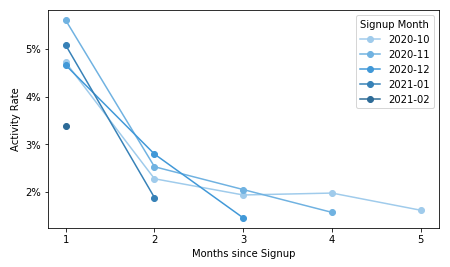
One point to note about the table above is that the cells have been shaded like in a heat map, with higher values corresponding with darker cells. This makes it easier to see at a glance trends in the relative values between rows. It is also common to include the proportion of each cohort active in each cell rather than the absolute amount. One alternative way of plotting the data could have been to plot each cohort on a line chart. However, this type of chart can become difficult to read due to the large number of lines.
The example above used user activity as the tracked metric, but any other metric of interest can be plotted in this type of cohort breakdown. Before closing this section, there are a couple of caveats to note about time-based cohort analysis. First, new cohorts can take a while to mature, especially when cohorts are defined by signup time. If there is something qualitatively different about one cohort compared to the other, it may not be an immediate difference. Secondly, be careful when interpreting statistics drawn from the most recent recording period. If the period’s length is not the same as the others (e.g. three weeks out of a full month), then its metrics might be skewed through missing users that come in later and would otherwise be counted. You might have noticed this in the example, where the last diagonal for 2021-03 had values that were smaller than what might otherwise be expected.
Cohorts based on other characteristics
Cohorts defined on non-temporal characteristics are sometimes called segments. Market segmentation is actually more general than just creation of cohorts based on straight divisions of individual user features. Segments in this general domain can group users based on combinations of features. Machine learning can play a part here, grouping users into complex clusters based on how similar their characteristics and behaviors are.
Here, however, we’ll stick to focus on simple cases where we divide users into groups based on values of a single characteristic. Examples of questions that can be answered with this type of cohort include:
- What demographics are most attracted to visiting and making purchases from your website?
- Do visitors have different usage habits depending on how they access the site?
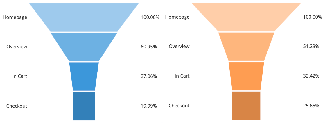
A heat map or table is as good a visualization type here as it was for time-defined cohorts:

As with the previous section, the table has cohorts listed by rows, and user activity since signup reported across columns. Since cohorts are no longer defined by time, the table takes on a rectangular form. In the example table above, you can see that while there’s a strong amount of use for the 25-34 age bracket, there’s also a surprising amount of usage for users in the 55+ category.
One potential issue of setting cohorts by user features that users in a single column of the table may have come in at different times, and thus may have different properties due to that aspect. To resolve this, you might filter the data so that you are only tracking users from a specific time period, or create multiple tables, each one based on a different subset of the data.
Divisions by cohort play well with analysis of user funnels. A user funnel is a way of thinking about how users interact with a website, often found in an e-commerce context. Comparing how users move through the funnel between cohorts can shed light on ways that a website experience can be improved.
This manner of cohort comparison is related to what is done in A/B testing. In an A/B test, we are typically trying to test out a change to a website or webpage. In order to see the effects of this change, we expose half of the users to the original site (group A), and the other half to the modified site (group B) then compare outcomes between groups. The difference between these is that while cohort analysis is typically performed retroactively, observing naturally existing differences between groups, in an A/B test, we deliberately create a key difference between site visitors. Sometimes, the motivation for performing an A/B test can come from observations made in that previously-recorded data split by cohort.
Conclusion
Cohort analysis is a great way of breaking down observations gained from the data as a whole. Cohorts can be defined in many ways, through time-based criteria like user signup date, or demographic information like user age or gender. By separating the data into different groups, it is possible to get better insights into how those observations might have come about: whether a metric is consistent across groups, or if there are differences. When differences are observed, the insights can result in changes that improve a website or product.
For more information on what a cohort analysis can do, check out this article. You can also see additional examples of cohort analysis using MySQL and Google Analytics by following the links in this sentence.