A cohort analysis is a very powerful tool to understand seasonality, customer lifecycle and the long term health of your business. This tutorial will explain how to build a cohort analysis in Google Analytics. Refer to this tutorial for more information on what cohort analyses are and what they’re used for.
How to Build a Cohort Analysis in Google Analytics
Building a cohort analysis in Google Analytics is very straightforward. On the left pane, navigate to Audience - Cohort Analysis. Your cohort analysis will look similar to this:
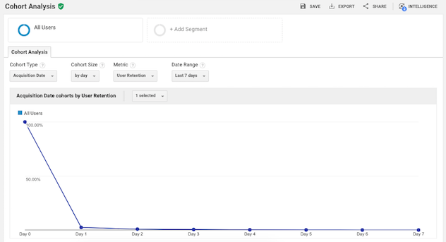
At the top, there are selections you can make to configure your report. Next, you have the guts of the analysis: a line chart that plots the aggregate performance of your cohorts over time, followed by a cohort chart. Cohort charts can be tricky to read if you’re new to them - check out this tutorial for help.
Let’s dive into the cohort analysis.
Configuring your Cohort Analysis
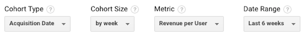
Google Analytics allows you to select the following settings:
-
Cohort Type: defines how you want to group your users. As of this writing (Feb 2018), the only cohort definition that Google Analytics supports is grouping by acquisition date. Hopefully they will enable additional cohort definitions in the near future
-
Cohort Size: sets the size of the time period of your cohort. You can group the acquisition date into a daily, weekly or monthly view
-
Metric: selects the measurement that you’re interested in plotting. The default is user retention, which measures what percent of the users in each cohort came to your site in a given week
-
Date Range: defines how far back to start your analysis. The date range allowed depends on the cohort size you defined. You can look back up to 30 days, 12 weeks or 3 months.
Reading the Google Analytics Cohort Analysis
The best way to understand the analysis is with examples. We’re using the Google Analytics demo account which is of a Google property. If you want to follow along, you can sign up for the demo account, but note that since the cohort view only goes back 90 days, you won’t be able to view the same dates as these examples.
Example 1
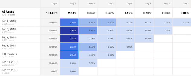
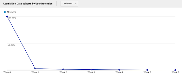
Let’s look at user retention of our weekly acquisition cohorts for the last 6 weeks.

First we see a pretty typical user retention graph, where everyone (100%) in our cohorts visits our site on week 0 (since the definition of our acquisition cohort is that they visited our site) and we have a dramatic drop on week 1 (3.49%) with a slow decay thereafter.
This tells us that very few of our visitors come back to our site after their first visit. But this is the aggregate - what if there are times when retention is better than others? Let’s look at the cohort chart.
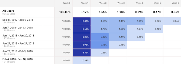
The top line of the chart gives the aggregate numbers, which are the ones that were plotted in the line graph. Next are each of the cohorts. We see, for instance, that the cohort from the week of Dec 31 had a user retention of 3.4% on week 1. That is, 3.4% of all users acquired the week of Dec 31 visited the site the week on Jan 7.
Note that the most recent week for each cohort seems excessively low. For example, for the most recent cohort, it shows that only 0.88% of the users came back one week after they were acquired even though other cohorts have had more than 4 times that retention rate in their first week. This is artificially low because I happen to be looking at the data on a Tuesday - the users haven’t had a full week yet to return. For most metrics, unless you’re looking at the very end of a time period, you should usually ignore the performance of the rightmost value of each cohort since it represents a partial period.
Ignoring the most recent values for each cohort, overall they seem to have been behaving pretty similarly. However, we can see that the second week retention has been steadily increasing over our cohorts (started at 1.58% for the Dec 31 cohort and is up to 2.18% for the last cohort with full data, Jan 21). Perhaps we’ve been actively encouraging more users to return - through email campaigns or product features. However that bump in the second week hasn’t impacted retention into the third week. We could monitor for longer to see if the trend plays out or if it’s just normal variation or seasonality. But let’s see whether that bump in users visiting our site results in higher revenue in the next example.
Example 2
Let’s change the configuration to look at revenue per user for the same cohorts.
Let’s skip down to the cohort chart to check on our question from the previous example. We saw that user retention rate on week 2 was on the rise, and we’re curious to see whether that bump in users coming back to our site results in higher revenue.
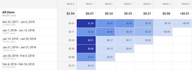
Unfortunately we see quite the opposite. Surprisingly, we have a decreasing trend in revenue per user during a cohort’s second week (from $0.47 for the Dec 31 cohort to $0.15 for the Jan 21 cohort). Perhaps the tactics that we used to drive visits to our site have focused on high engagement but low monetization opportunities. Or perhaps the users we acquired in Jan 14 and Jan 21 are more engaged but less willing to spend than others.
It’s also possible that there aren’t a lot of users in the weekly cohorts and what we see as a trend is actually just noise. If you’ve been monitoring your cohorts for a while, you’ll have a better sense for whether a metric is noisy or not and develop an intuition for when to investigate deeper and when to wait for more data to validate a trend.
When you want to investigate further, Google Analytics provides tools for that as well. The next section will show you how you can drill into specific cohorts.
Deep Dive into a Cohort
While Google Analytics makes it very easy to deep dive into a particular cohort, it’s actually quite complicated to compare it against the correct baseline.
For example, as a continuation of the previous examples, let’s say that we want to investigate more about those users in the Jan 14th cohort. After two weeks, more of those users came back to our site than expected but they spent less money.
You can follow along with the video below. Let’s return to the weekly user retention cohort, scroll to the cohort chart and click in the cell of the Jan 14 cohort who visited 2 weeks after they were acquired. Google Analytics will automatically offer to create a segment of that set of users. We’ll name it “Jan 14 Cohort”. This is now a segment like any other kind of Google Analytics segment (more on segments here) and you can look at any other Google Analytics report for this set of users. For example, we can see whether the channels these users came to the site from were different in some way by going to the Acquisition - Overview report. Since we care about the behavior in the second week of the cohort, we set the date range to be Jan 28-Feb 3.
We can see that there does seem to be a pretty big difference, where the Jan 14 cohort is much more skewed towards the Referrals channel as compared to all other users.
But this is a very unfair comparison. We’re looking at users who are 2 weeks old to the site and came back and comparing them to all other users combined, regardless of how old they are. In fact, if you scroll a little further down on that same Acquisition Overview report, you see this stark difference:
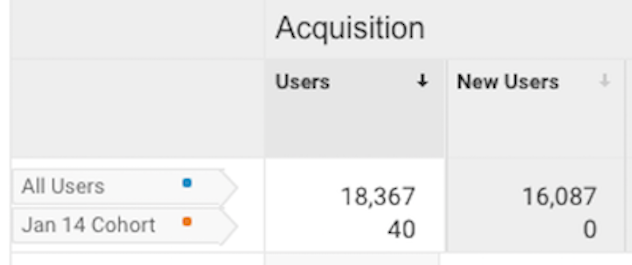
Almost 90% of users in the “All Users” segment are new users (16,087 of 18,367). It is expected that the behavior of users brand new to the site are different than of users who are coming back 2 weeks after their first encounter, so this comparison doesn’t really help us understand what was different about the Jan 14 Cohort in its second week.
It’s very important to be careful when comparing segments. A better comparison would be to select another weekly segment to compare against - perhaps the Dec 31 cohort - and look at that cohort in its second week (in this case, Jan 14-20). You may want to download the values and trends you see for one segment and its corresponding date range, then repeat the process for the other cohort in its time range and compare the cohorts in a different tool like Excel, outside of the Google Analytics interface.
While Google Analytics provides a lot of great data, the interface for cohort analyses is relatively new and can be quite cumbersome for comparing deep dives into cohorts. However, what you can learn and act on from these analyses will make the pain worthwhile. Just be sure to think about the relative size and impact of the cohorts you’re investigating before investing a lot of time. It’s easy to go down a rabbit hole of Google Analytics reports only to realize you’re only looking at a very small fraction of your users.
Conclusion
Cohort analyses are very powerful and can give you a much deeper understanding of your users, seasonality and your long term business health. Google Analytics provides a very easy way to look at overall cohort performance, but it can be tricky when diving deeper into a cohort. It’s important to always think through what cohort you’re looking at by considering the size of the cohort and what an appropriate comparison would be.