You’re on the edge of your seat with excitement – it’s launch day for the new product feature that your team has been working so hard on for months. You can’t wait to see all of your efforts have finally paid off.
How can you tell whether a new feature is adding to your product’s usefulness, detracting from it, or doing nothing at all? How can you gain insight into the way that your customers feel about the feature? In order to answer these questions, you’ll need to examine feature usage from several different angles.
What is Feature Usage?
Feature usage is a category of engagement metrics that focuses on user behavior towards a particular product feature, as opposed to the overall product itself. Feature usage can encompass a fairly wide range of measurements, including:
- Total number of feature users
- Percentage of feature users out of the total number of product users
- Number of unique feature users over a set time frame (daily, weekly, or monthly)
- Average feature usage per user a time frame
- Average time elapsed between feature usages per user
In addition, there are a number of related metrics that can provide insight into which of your consumers are using the feature, how they are using it, how often, when, where, and why.
How to calculate Feature Usage
Even though there are many different ways to look at feature usage, the big question is how can you calculate feature usage so that you are left with clear, actionable insights. First, let’s discuss a couple of common mistakes made with regards to feature usage metrics.
Common misuses
-
Focusing only on total number of feature users. While this metric may seem very appealing on a surface level, it is not only inherently misleading, but taken by itself is generally not very helpful. For example, the number of users for a walking app’s music streaming feature may jump from 5,000 to 6,000 in a month, an increase of 20%. But what if the total number of users for the app as a whole increased by 80% in the same time frame? Why is there such a gap between overall app usage and user adoption of the music streaming feature? Are most current consumers still utilizing this feature? As you can see, focusing solely on this metric leaves many questions unanswered.
-
Measuring everything related to feature usage without a clear objective. Even the most helpful feature usage metrics will be unhelpful without clearly delineated research goals. It is important to start out with a question or two that you want your metrics to answer. For instance: “Which consumer segment does this feature appeal to? What is this feature’s impact on overall customer retention? Is this feature successfully filling the need for which it was designed?” Asking these questions will help you figure out which feature usage metrics will be most worthwhile to track.
Now that you have an idea of what pitfalls to avoid, let’s talk about how to calculate feature usage.
Helpful metrics
Here’s a brief, step-by-step overview of one workflow that will allow you to effectively calculate feature usage:
-
Calculate total number of uses per day. This can serve as a baseline metric for further research. If we continue with the music streaming feature example mentioned above, then the total number of uses for that feature would be 6,000 per day by the end of the measurement period.
-
Determine the total number of unique users. This is an important measurement, since it gives you further insight into how many actual customers are using your feature, as well as their general usage behavior. For our music streaming example, let’s say that out of those 6,000 uses per day, 3,000 come from unique users. Doing some quick math, that means that, on average, each user employs that feature about 2 times every day. (We’re giving an example of daily usage here, but you can also apply this metric to weekly or monthly measurements.)
-
Percentage of feature users out of product users. Now it starts getting interesting. How widespread is feature usage among all of your product’s users? If 2,000 consumers use the walking app every day, and 200 of those users employ the music streaming feature, that comes out to 10% of unique users that actively utilize the feature.

- Average uses per day. This metric gives you insight into the frequency of daily feature usage among your consumers. As mentioned above, each unique user that employs the music streaming feature does so an average of 2 times per day.

How to interpret Feature Usage
Now you’ve got the “bare bones” outline of how your consumers are utilizing your feature. Still, you will likely need to dig a little bit deeper in order to uncover some truly actionable insights. For instance, let’s say that you’re the head analyst for our walking app’s music streaming feature. As such, you may want to investigate the following areas:
-
How is the feature being used? For instance, what type of music are your consumers streaming? Jazz, classical, death metal?
-
What is the usage context? One of the most penetrating insights that you may be able to uncover involves what users of the feature do just before they activate the feature. In other words, what is the context of their usage? For example, are your users activating the music streaming feature as they exercise, when they take breaks, or as a standalone activity? Such data collection can provide vital guidance on which actions to take moving forward.
-
Create a cohort to analyze typical user behavior. When you group feature users together as a distinct segment, you’ll be able to identify trends in a number of areas. For instance, you’ll be able to spot correlations between feature usage and retention, engagement, and conversion rates.
With regards to the last point, it’s important to recognize that correlation does not always equal causation. Even though your feature just launched and now retention and engagement are going up does not mean your feature caused this. It could be that the cohort already includes your product’s most devoted users and those metrics for them were heading up anyways. The adoption of your new feature might simply be a result of pre-existing brand loyalty.
Nevertheless, exploring the above-mentioned areas of feature usage, along with your base metrics, can create a fairly clear portrait of the typical feature user. Perhaps your average user for the music streaming feature:
- Listens to music as he or she walks
- Enjoys classic rock and hip-hop
- Uses the music streaming feature twice a day (once in the morning and once in the evening)
- Is 40% more likely to keep your app than users that don’t utilize music streaming
How to visualize Feature Usage
Generally speaking, the ability to visualize individual aspects of feature usage does not require a lot of complicated graphs or charts. Three options that will help you to effectively visualize your data points are:
- Line charts can provide solid visual markers for total number of uses, number of unique users, percentage of users from the total number of customers, and uses per month.
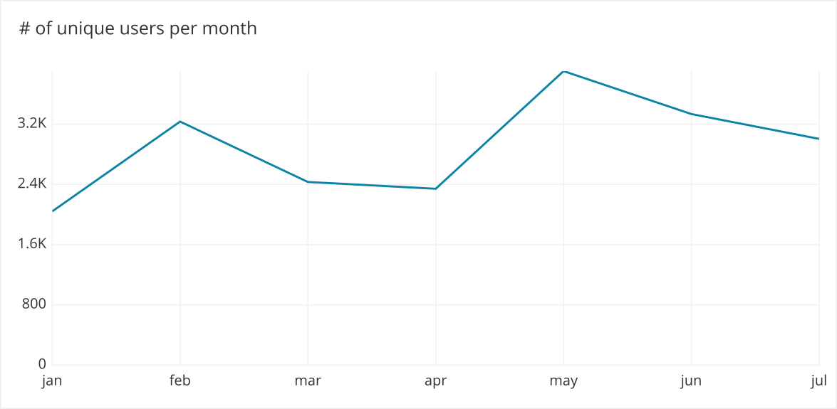
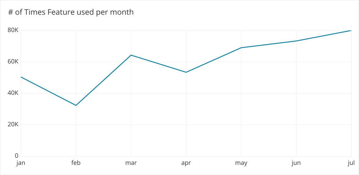
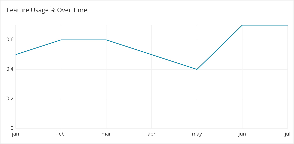
- Bar charts offer exceptional visualization properties for comparing and contrasting feature users with feature non-users. This is especially helpful when examining retention, conversion, and engagement ratios.
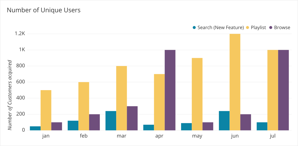
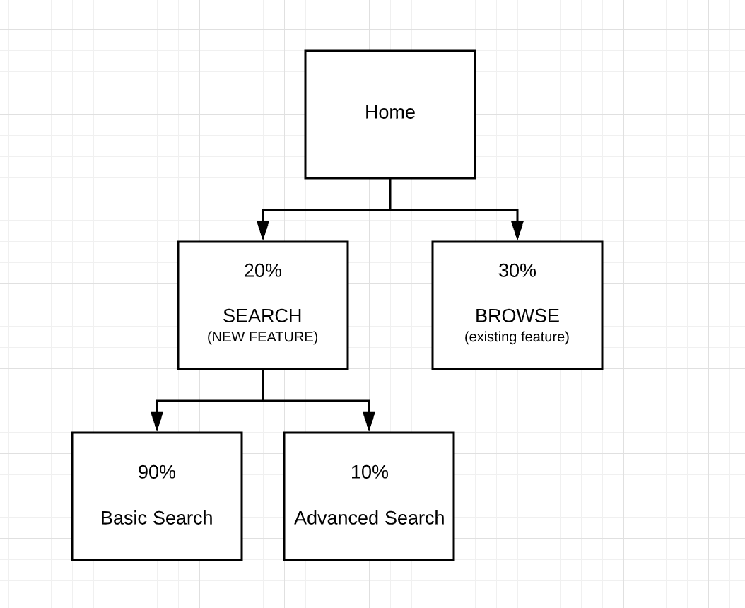
- Flow charts can help you to break down the context of feature usage, as well as pinpoint which aspects of your feature are most popular, and which ones are hardly used at all.
Proxy metrics
While it is hard to find a good substitute for clear, quantitative data in feature usage analysis, qualitative data can serve as a proxy of sorts. It can also provide additional insights into typical use cases, as well as customer concerns or frustrations with a feature’s current functionality.
Some qualitative data gathering methods could include:
- Customer surveys
- Focus interviews
- Focus group sessions
- Analysis of customer reviews
- Analysis of posted comments (on social media or other online forums)
How to Act on Feature Usage Data
There are many ways to turn the insights yielded from feature usage analysis into effective actions. For instance, developers that pinpoint frequently occurring precursors to feature usage can design built-in prompts at those strategic junctures (e.g., a pop-up prompt that asks: “Would you like to listen to some music?” every time a user activates the walking app and begins moving). Some companies may decide to incentivize feature usage among their consumers, while others may focus on fine-tuning their current users’ experiences.
Summary
In summary, it is vital for app developers and other companies to compile feature usage metrics with clear objectives in mind. Features from data-informed companies can be powerful drivers for increased retention, conversion, and engagement rates.
Of course, before any of this can happen you need to have the correct measurement tools in place. Many businesses find that Cloud-based analytics software offers huge advantages in gathering, deciphering, and interpreting feature usage data. For instance, Chartio’s data analytics software offers a robust, customizable, and scalable solution to the data collection issue. If you’d like to explore our capabilities further, or are interested in trying out our feature usage calculation tools, reach out to us today for more information.