What is Net Promoter Score?
Net Promoter Score, or NPS, is a measurement of recommendation for your brand’s product or service on a scale between -100 to 100. Positive and higher scores indicate a positive affect for the product or service, while negative and lower scores indicate negative affect.
NPS is the standard product KPI (key performance indicator) to measure for your business. The Net Promoter Score was created by Fred Reichheld in 2003 as a new way to gauge the recommendation of a company or its offerings by its customers and employees. Over time, the methodology has been refined and adopted by thousands of companies all over the world as a staple benchmark in the customer experience life cycle.
How to calculate Net Promoter Score
Following a customer interaction (e.g. product purchase), a survey is issued to that customer, and the customer responds with how likely they would recommend the product or service, on a scale from 0-10. A customer who responds with a score of 0-6 is labeled a Detractor, a score of 7-8 is Passive, and a score of 9-10 is a Promoter. Promoters are highly likely to recommend your product or service, while Detractors are likely to recommend against your product or service’s usage.

To calculate Net Promoter Score, simply take the percentage of Promoters (scores 9-10) and subtract the percentage of Detractors (scores 0-6). Passive responses do not count either way.
Net Promoter Scores are typically displayed as an integer instead of a percentage. If all responders are Detractors, our score is a minimum of -100; if all responders are Promoters, our score is a maximum of 100. When we have the same amount of Detractors and Promoters, the NPS is a baseline value of 0.
Calculation example
Chartio sends out NPS survey emails to 100 customers, where the customer is asked how willing they are to recommend Chartio based on a 0-10 score.

All of the surveys come back with the following distribution of responses:
- 45 customers rate their willingness to recommend as a 9-10.
- 30 customers rate their willingness to recommend as a 7-8.
- 25 customers rate their willingness to recommend as a 0-6.
From the above scores, we can quickly determine that at least 25% of our customers didn’t have an optimal visit, but 45% had a good experience. We can then calculate the Net Promoter Score:
100 * (45% - 25%) = 20
In this case, our Net Promoter Score is 20. There are more promoters than detractors but how good is this score? You should consult industry standards to get perspective.
What is a good Net Promoter Score?
The higher your score the better. Of course, an NPS below 0 is a bad score since it suggests more people are actively spreading bad sentiment about your business than good. In general, if you are between 0-30 you are doing OK, if you are above 30 that is good, and if you are over 70 then you are doing extremely well.
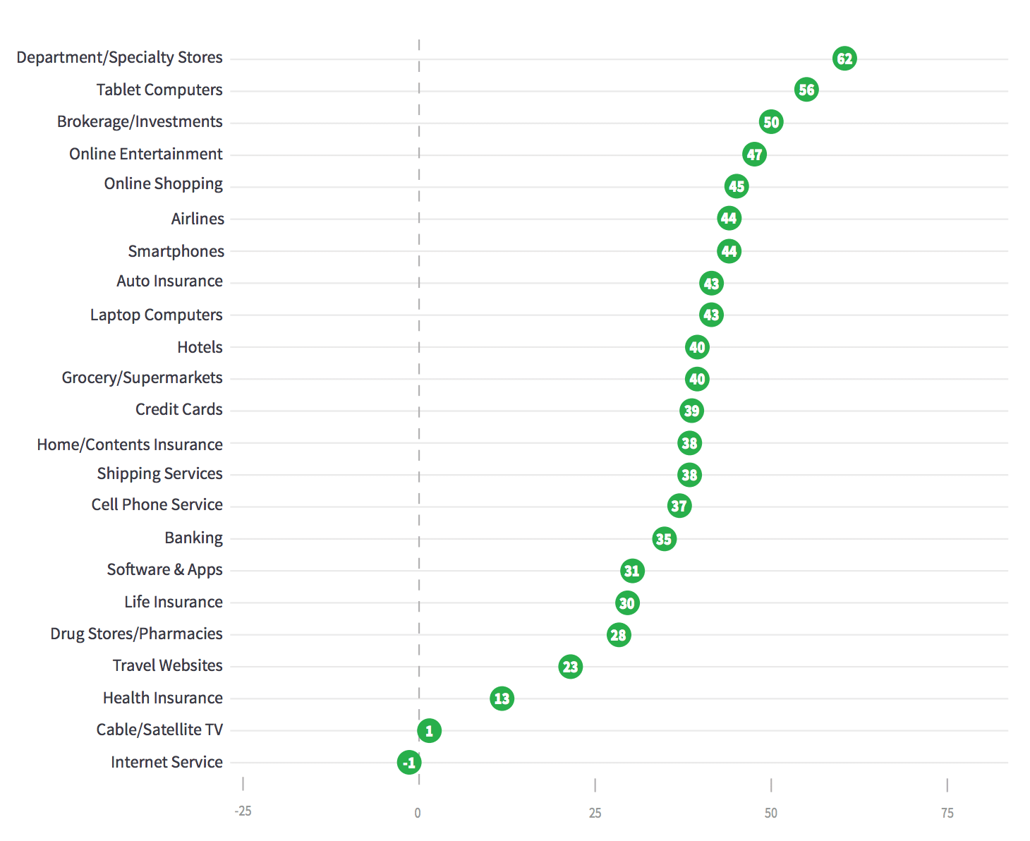
NPS does vary by industry so it is a good idea to benchmark your performance against the average. Most industry averages are between 30 and 50.
Best practices for using Net Promoter Score
Here are a few best practices that can be implemented in the customer satisfaction discovery process.
-
Allow at least 48-72 hours of time from the point of customer acquisition (product purchase, service completion, etc.) before deploying a survey to allow ample time for product engagement. This time will vary depending on product or service complexity, otherwise the NPS might be skewed by first impressions.
-
Follow up with NPS Detractors within 24 hours of their response. While finding out your Net Promoter Score is insightful, be sure to follow with a question to ask why the customer feels this way. The sooner you can figure out why a customer feels negatively or had a bad experience, the faster you can adjust your business’s experience offering. It is a good idea to bake this into the survey where you collect the NPS score.
-
Collect customer contact data. You should implement a form of customer contact collection for proper customer follow-up. Ideally, you’ll have the customer’s email, phone number, or perhaps a way to deploy directly to the customer via an in-app prompt. However, depending on industry, you may have a ‘blind’ purchase, such as at a restaurant or car wash. In this case, one idea is to have the ability to participate in a survey directly marked on the customer receipt.
Visualizing Net Promoter Score
There are many different ways to visualize Net Promoter Scores, and your choice should depend on the specific aspects of your NPS that you want to emphasize. Let’s explore the most common and most effective ways to visualize NPS:
- Single value charts can clearly summarize a NPS Score. You could also use these to show counts or percentages of Promoters, Passives, and Detractors.

- Stacked bar charts are popular because they visualize the three groups that compose NPS. The group breakdown can be shown as total or percentage. However, it can be hard to determine the NPS and differentiate between groups if they are close in size.

- Line charts can display NPS over time to expose overall trends. However, a line chart does not capture which groups within the NPS score are affecting the changes.

- Bar + line charts can combine the previous two visualizations. It shows how this data has changed over time in more depth. We can ignore the Passives and we can effectively show how the percentage of Promoters and Detractors are affecting NPS.

Alternatively, we can create the plot with a 100% stacked bar chart to make it clear how passives affect the NPS score as well:

- Pie charts are sometimes used but not recommended. While you might tell if NPS is positive or negative by comparing the promoter slice to the detractor slice, it is harder than the stacked bar chart to tell where the final NPS is. It is not a traditional composition use case so be careful using this chart type.

The Importance of Visualizing NPS
Visualizing Net Promoter Score lets you see the composition of the final score. This is important because the distribution of detractors, passives, and promoters can be wildly different and produce the same score. For instance getting a NPS of 5 is very different when it’s based off of a {10-75-15} split vs. a {40-15-45} split! One has way more promoters and detractors than the other. Seeing this split gives you a more holistic viewpoint into your customer’s recommendation preferences and brand or product advocacy.
You can look into this even deeper and look at the distribution of numbers inside the buckets. Let’s examine the two sets of splits again that both have an NPS of 5.
First let’s look at how the 10% Detractors, 75% Passives, and 15% Promoters are distributed:

We have a lot of people on the bubble here, about to become passive or promoters. Our product might be doing very well, but we just need to understand the 6s and 8s a bit more to move them up.
Now let’s look at how 40% Detractors 15% Passives and 45% Promoters is distributed:

Here, we have people on the bubble going the opposite direction. Promoters are barely not passives and passives are barely not detractors. In addition, our detractors really hate the product. This would mean we might need to rethink large amounts of our offering or who we are targeting.
Common ways to segment NPS
Viewing the overall NPS score is a good measure for how well the company, product, or service is liked overall but it can hide important insights in the data. You should always segment your data in different ways to see if groups differ from the overall statistic.
The most common ways to segment NPS include:
- company size
- country
- user persona
These can expose for which groups your product is working great for and which ones it isn’t. Without breaking down NPS by groups, you might think that everyone is having the same experience with your product. Let’s look at a quick example of segmenting by company size.

Here we can see we are doing pretty well for small companies but not so well for medium to large size companies.
Common misuses
Ignoring customer life cycle
NPS is a good customer experience indicator, but sometimes this data can be skewed depending on which phase of the customer satisfaction discovery cycle it is deployed. For best results, separate NPS data by collection point.
For example, let’s pretend that you’re at a web design company. There are several points of data collection where you can gather NPS data, such as initial customer contact with the inbound sales team, an interaction with the technical support team, or even the final delivery of the completed website.
Asking for a customer’s recommendation to others at the point of interaction with technical support, for instance, allows you to measure the effectiveness of that department’s customer satisfaction. However, this data does not mean that your customer is satisfied with the design of a website because that will be at a different collection point.
Another common problem is whether the recipient of a survey is an active user or not. If you send out surveys based on accessing your website, you might not tell if someone was a new user or if they are an existing user who has not logged in. Referring back to collection points, this data shouldn’t be mixed with other points as it wouldn’t give an accurate representation of each category individually.
NPS-overloading customers to death
While gathering NPS data is helpful for you and your business, it is not directly useful for your customers. Be wary of overloading your customers with requests for feedback that don’t benefit them or they may start giving you lower scores to complain about being over-surveyed.
Variations on Net Promoter Score
According to Bain & Company, there are three main variations of the Net Promoter Score.
- Competitive benchmark - This is gained by surveying all target customers, including those of your competitors. This allows a direct comparison to your competitors’ customer satisfaction scores.
- Relationship - This is where you reach out directly to your own customers at various stages of the customer experience life cycle, such as after their initial purchase and at 30-60-90-day follow-ups.
- Experience - This is transaction-based, so after a purchase or interaction asking for an NPS score from a customer. In our above example, this would be after contacting the technical support team
Proxy metrics for Net Promoter Score
When you don’t have NPS survey data available, you can use other qualitative and quantitative to measure customer satisfaction:
- Time to value
- Renewal rates
- Negative churn
You can also look at existing customer metrics to measure customer experience such as seat expansion, resource expansion, and completed up-sales and cross-sales. As an example, seat expansion, adding more users to an existing SaaS subscription, would indicate that the software solution is working for the customer and their needs of use are growing.
Related Product KPIs
Two other important scoring systems that complement Net Promoter Score are the Customer Satisfaction Score, or CSAT, and Customer Effort Score, or CES. NPS gauges the likelihood of recommendation, while CSAT measures customer satisfaction through a combination of survey questions about their experience.
CES, however, measures the amount of effort a customer has to put forth to interact with a company, its products and services, and support. People rate it from strongly disagree to strongly agree on the following question “[your company] made it easy for me to handle my issue”.
NPS focuses on long-term growth while CSAT focuses on short-term experience. CES is complementary to both because it can relate to product design or service usability and can directly affect both NPS and CSAT.
Tools for measuring Net Promoter Score
There are several different ways to collect the actual survey data for your Net Promoter Score. Here are a few great tools to get you started.
Survey Monkey is a great tool for quickly creating and deploying NPS surveys to your customers. Simply log onto the platform, create your survey, and then share the link via the web, email, and even SMS.
Ask Nicely is another exceptional tool trusted by over 10,000 leading companies for collecting crucial CX (customer experience) data. This is an excellent option for those wishing to integrate their NPS data collection with SalesForce.
Lastly, Retently can help you to collect NPS with its robust survey campaign features. You can target specific audiences, schedule survey deployment in advance, and create powerful workflows based on an “if an event happens, then perform action” logic.
These are tools built to collect NPS, however you can build your own survey with Google Forms or as custom forms inside your application as well.
Be sure that whatever tool you use allows you to bring that information into your Business Intelligence tool so that you can combine it with your other customer data to look at NPS by different segments. You can use SQL and your BI tool to create custom visualizations to explore the data in many different ways.
Criticisms of NPS
NPS has had its fair share of criticisms, with many critics claiming that it doesn’t paint a true picture of why a customer is not giving their recommendation. This criticism can be remedied by asking the follow-up question, “Why did you choose this rating?” or by following up and interviewing customers.
Nevertheless, it’s a simple beneficial metric that can help you understand how well your product is resonating with customers. By taking a little more time to go into the details of what exact ratings your users gave and segmenting NPS by different user features, you can make the most of this satisfaction statistic.