If your table is in a crosstab format and you are looking to get it into a flat tabular format, Chartio has a Data Pipeline step that can help you accomplish this task.
After querying the columns you want in the Chart Builder, our crosstab style table appears.
We have in this example the Student ID# of a number of students in our school and the test results from 3 different aptitude tests 1 A, 1 B, and 1 C.
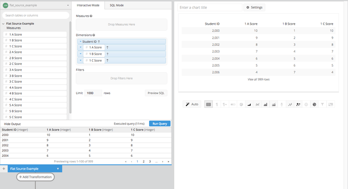
What we are after in this case is to count the number of times each score appears in each aptitude test.
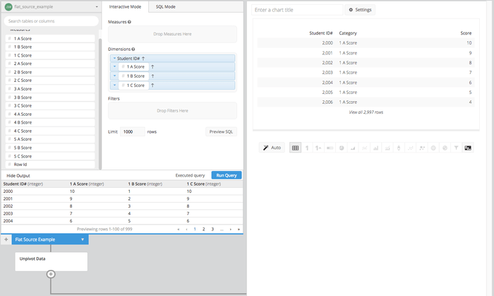
- After we get the crosstab style table, we can use 1 Data Pipeline step to unpivot the table into a tabular format.
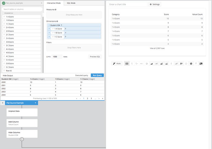
- Then we can just add a column that replicates the “Score” column, and the purpose for that is to use a group step to count all returns of each score. Then we need to hide the Student ID# column.
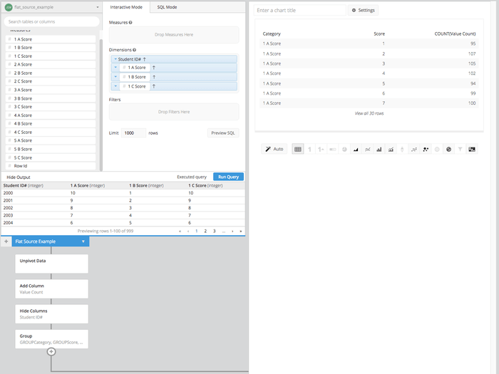
- Here is where we will use the group Data Pipeline step to get the count of each potential score for each of the three tests. Selecting GROUP as the grouping options for the first two columns, we can select COUNT for the score replica column.
- Now we can use a re-order step and a pivot step to get the count of each score, under a column header that represents each test.
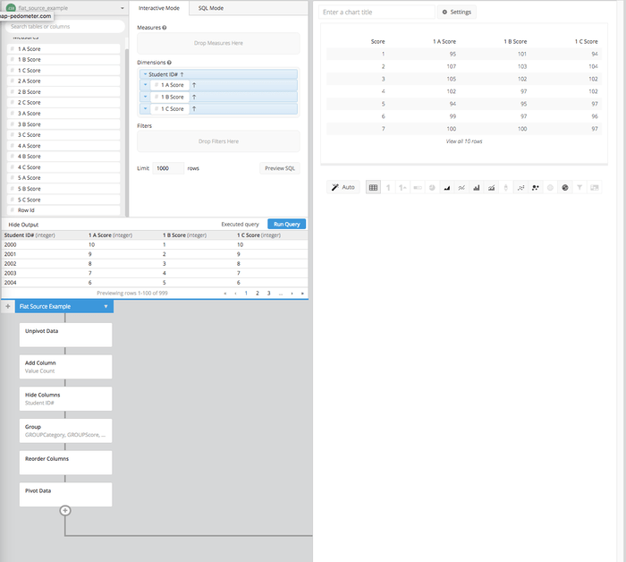
- We can now visualize this table as a stacked bar chart to show how each test’s scores were distributed.
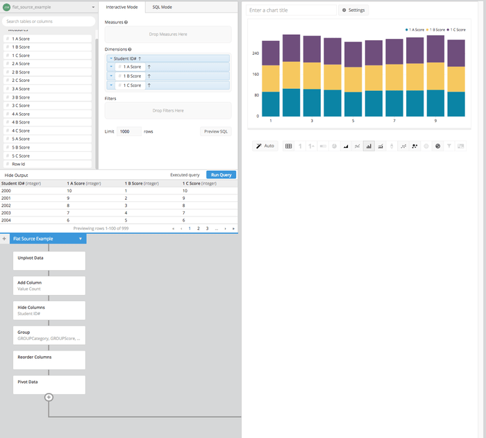
This workaround will help you easily flatten a crosstab table instead of having to write a monotonous query with numerous UNIONs. This will give you the ability to visualize these crosstab tables quickly and get to the insights your decision makers are looking to reach.