Best Practice: Keep shorter dashboards
Posted by on March 28, 2017 Best Practice, Dashboards, Education, Data Analytics
I visited a customer recently who had the longest dashboards I had ever seen. They didn’t delete charts and kept just one dashboard for each department in the company. Each had hundreds of visualizations and seemingly scrolled on forever.
Their request to me was for scrolling to be faster and the page to handle the tens of thousands of data points per page a bit better.
I explained that because we render our visualizations on the backend, we’re already showing a minimal amount of data points on the page. Anything else trying to show that much data probably would have froze the browser.
Instead, we went over the benefits of keeping more organized, smaller dashboards:
-
You only run the queries you’re interested in. If you have 200 charts on a dashboard, you’re going to run all of those queries every time you want to refresh any of them.
-
That not only saves your database, but the dashboard will load faster.
-
It’s easier to search for and find the information when it’s on its own dashboard. Scrolling is a terrible way to find the section you want.
-
You can see it all from the thumbnail view.
-
Smaller dashboards encourage you to edit more, as opposed to a growing sprawl of information.
So to avoid the long scroll of just one incredibly long dashboard, take the alternative approach and split it up as a linked tree of dashboards.
In Chartio, dashboards can be linked together with straight up Links or Drill Downs on visualizations. So your information will still be easy to find and linked together. It’s just not all appended in one spot.
Phase 1: Links
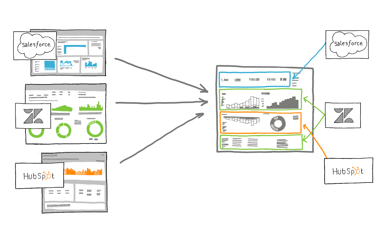
The quickest way to link your new hierarchy of dashboards together is using Chartio’s URL Text Elements. In Chartio, it’s really easy to add links to a page. It’s easier to have one top level dashboard for a subject and link out to the other important components, which would now be proper dashboards themselves. For example you may start off with an executive level dashboard like the following.
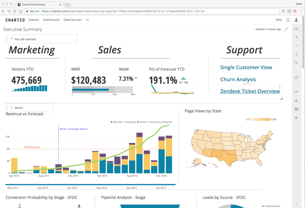
From the above example, under Support there are three links to different support topics/dashboards. With these links it’s easy to organize and find your other important dashboards from your main one.
If you’re moving your charts from one long dashboard to many shorter dashboards, be sure to utilize the helpful Group Move feature.
Phase 2: The charts are links
But links are kind of ugly and not that cool. What’s better is using the charts as links. With our Drilldown functionality you can wire up your visualizations to take you to other dashboards when clicked.
In the following example, there is a high level visualization of customer satisfaction. To drill into more information on satisfaction (there’s a whole dashboard dedicated to just that topic) all you have to do is click it.
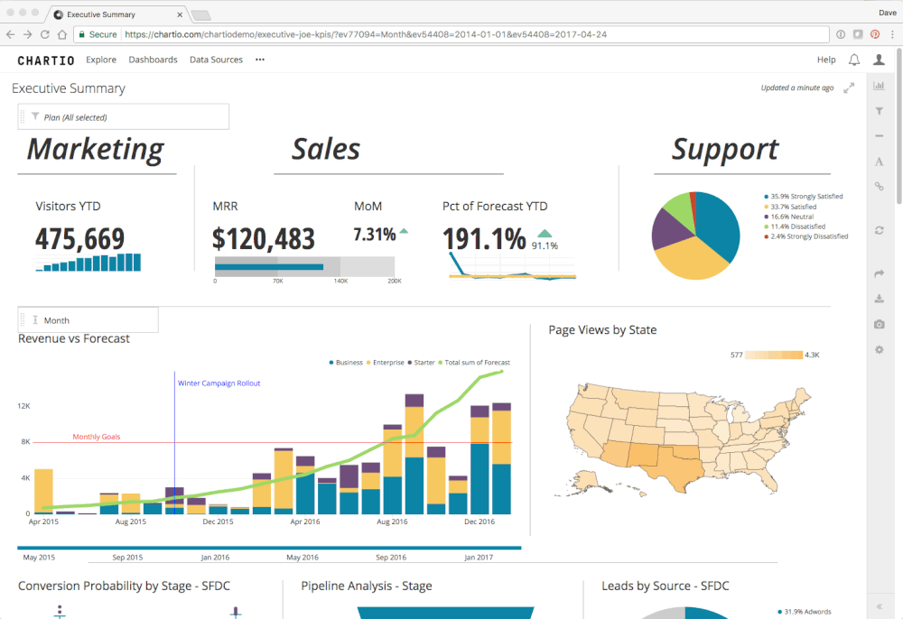
These are great for drilling into specific topics or even getting down to the raw data. You can use a drill down to wire each of these to another dashboard that would be drilled into that specific account, showing all of its details.
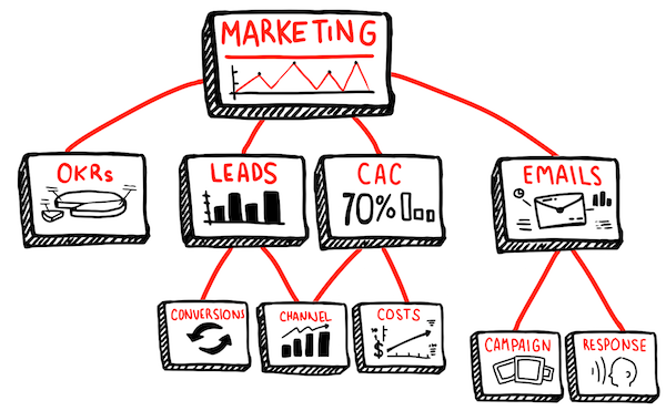
Organization: Categories and Subcategories
Now that you’ve broken one dashboard into many, be sure to take advantage of Chartio’s Categories and Subcategories features. So instead of having a dashboard called “Marketing” and it containing everything and anything having to do with Marketing, consider having a Marketing category and even a few sub categories (Channels, Funnel, OKRs, Hubspot, etc).
Conclusion
Using linked groups of smaller dashboards has a number of advantages over keeping long scrolling lists. As you find yourself scrolling way down to the bottom to add yet another visual, stop and think about whether multiple topics are covered and whether your dashboard could be broken up into multiple dashboards.