Udemy is Mastering the Shift to On-Demand Data Platforms
Posted by on August 13, 2018 Case Study, Data Governance, Product,
In the last five years, we’ve seen a big change in the way companies are using data. It’s a shift from information silos, where data is stuck within disparate applications, to a world of on-demand data services. In that new world, everyone has access to the insights they need, based on a common data set.
An old world of data silos
In the old world of information silos, each business unit uses its own set of visual query tools and apps to collect and track their KPIs.
The Marketing Team uses Google Analytics. Product uses Mixpanel. Sales uses Salesforce. Customer Support uses Zendesk. Finance uses Stripe. And so forth. Each app and the data it collects may be transformational for the team that’s using it.
But asking questions across the business is close to impossible. The data required to provide the answer is stuck in different formats across different systems. It’s a slow-moving world of spreadsheets and csv dumps where analysts act as “human middleware”.
A new world of on-demand data services
Compare that with the new world of on-demand data services. Analysts and data scientists have access to huge volumes of raw, event-level data that is clean, complete and correct - and ready for correlation.
A product like Chartio allows analysts and line-of-business leaders to join and transform this raw data in any possible way to get the answers they’re looking for. There are no limits to capture insights across customers, products and services.
They can productize their insights and create, automate and share models, visualizations and reports. By doing so, they’re expanding the use of data to everyone within a company. And with machine learning and artificial intelligence, the next generation of data consumers is already here.
Growing faster in a new world
Visual query and even-tracking tools in the “old world” were a key driver for democratizing access to data. Their main benefit is that they are easy to learn by most people.
But ease-of-use comes at the cost of fewer use cases. They provide prescriptive KPIs. And the data silos they create can impede growth. With a mix of different tracking vendors, asking for a specific metric can produce a different answer depending on who you ask and what tool they might be using. That causes loss of confidence in data and slows down decision-making.
That’s why fast-growing companies in the “new world” have changed the way they architect their data infrastructure. Their need is flexibility to cover many different use cases and experiments - with consistency across data sets and metrics.
The new paradigm is a data-lake-centric architecture, with three major components:
-
A flat data store like Amazon S3 to store raw, event-level data (this is the component that’s commonly referred to as the “data lake”)
-
A query engine like Amazon Redshift Spectrum, Amazon Athena or Presto to query data directly in the flat data store
-
A data warehouse like Amazon Redshift for more complex aggregations, joins and scheduled batch jobs
On top of these three components there is a visualization layer like Chartio’s product to explore data, write queries and schedule transformations.
As part of a data lake architecture, the visualization layer delivers the ease-of-use of previous tracking tools. But with a much wider, more flexible range of use cases - and a consistent set of custom, more granular KPIs across all business units.
Consider the case of Udemy, the world’s largest online learning marketplace. The Marketing team at Udemy is driving growth via a data infrastructure that allows the marketing team to get smarter about measuring attribution. They moved from a standard “last click” attribution model to a multi-touch system, including customer touchpoints much earlier in the conversion process.
The drivers of adoption
The benefits of the new world are clear. Better data leads to more informed decision making which leads to faster growth.
But using data for decision making is nothing new. So what are the driving forces of this new world, and why is this happening now? Turns out the shift is fueled by three trends that are working together.
1. Cloud economics
Cloud, mobile and IoT apps have caused a tidal wave in data. In the past, it was necessary to aggregate data to save on storage spend - and that comes at the cost of losing fidelity.
Decreases in the cost for storage have made it viable to store event-level, non-lossy data and keep the fidelity it offers. Consider the pricing of Amazon S3. At launch in March 2006, the price to store 1TB of data in S3 was $150 / month. Fast forward to 2018, and S3 pricing for 1TB can be as low as $10 / month. At that price point, it makes sense to store data in its raw format.
2. Data pipelines
Raw data can be “dirty”, e.g. it’s inaccurate, incomplete or inconsistent. Consider how to identify a customer - is this done by email, name, or some unique ID? Will every record have that identifier, and what happens if not? When combining two data sources, which identifier do I use?
Things get even more complex as data volume and the number of data sources grow. Before data is ready for analysis, a lot of automated cleaning, transforming and enriching needs to happen. That’s where the concept of “data pipelines” comes in. A more traditional term is “ETL” - extract, transform and load.
In the past 5 years, we’ve seen an explosion in the number of (open source) tools and technologies designed to ease the collection, storage and processing of data. There’s no more one single tool by a single vendor that does it all. Instead, it’s a number of tools operating together, each tool specializing in one task. Data is flowing through that system, and hence the analogy to a data “pipeline”.
3. Data teams
As the complexity to process data has gone up, we’ve witnessed a “division of labor”. It’s the separation of data-related tasks along with the specialization to fulfill those tasks.
In a world of aggregated, slow-moving data, a single skilled “business intelligence (BI) analyst” was able to handle the full range of data-related tasks. They often reported into a BI team.
Not so much anymore in a world of data pipelines. Today, we’re seeing stand-alone data teams that are responsible for building and running a data platform. Within a data team, we’re seeing three distinct roles:
-
Data engineer: defines data architecture and builds data pipelines
-
Data scientist: writes models and algorithms
-
Data analysts: prepares dashboards, visualizations and develops KPIs
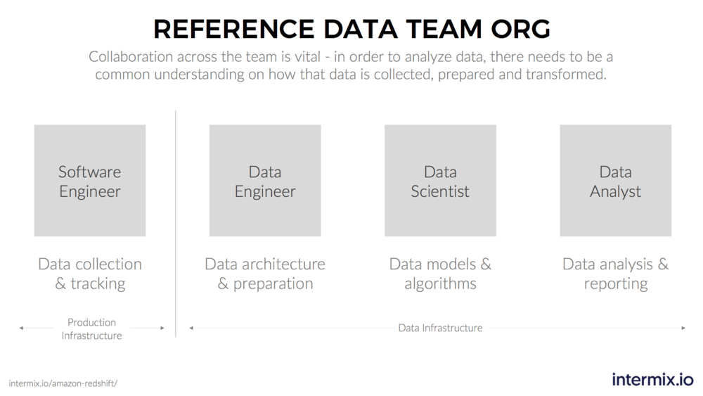
Udemy has talked about their journey to create more specialized roles on their data team. Much like during the industrial revolution, specialization and the “division of labor” allows data teams to standardize and move faster.
For example, in software engineering we distinguish between roles like front-end engineering, back-end engineering, and site reliability engineering. In the future, we can expect the same for data teams: more specialization, with more narrow break-down of tasks.
Data Growing Pains
Together these trends can create growing pains for data teams. There is pressure across the data lake stack.
-
From “the bottom”, more sources and raw data are available than ever before.
-
From “the top”, more users want access to more data in more combinations.
-
in “the middle”, you have more complex workflows and transformations running.
That pressure can lead to downtimes, slow dashboards, and general frustration by users about dealing with data when things don’t work as expected. The specialization within a data team can lead to a disconnect when it comes to figuring out where data is stuck. Each team member is looking looking at one specific step of this stack. They may not be aware of the jobs others are running, let alone the dashboards dozens of analysts may be creating.
For data teams to deal with that pressure, they need to establish new procedures and tooling that allows onboarding new data sources, scaling a user base, and supporting reproducible data flows. They need to be able to trace the workloads (i.e. queries) their data apps, pipelines and users generate.
The shift to a data lake architecture has created a new need to monitor data flows. In the world of software, engineering teams use “APM tools” to monitor their software apps. In the world of on-demand data services, teams need a way to monitor their data apps, i.e. an “APM for Data”.
Chartio + intermix.io = Data Nirvana
Consider again the case of Udemy. As part of their data lake, Udemy uses Amazon Redshift. On top of Redshift, Chartio provides hundreds of users access to data via self-service dashboards. To monitor their Amazon Redshift cluster and data apps like Chartio, Udemy uses intermix.io.
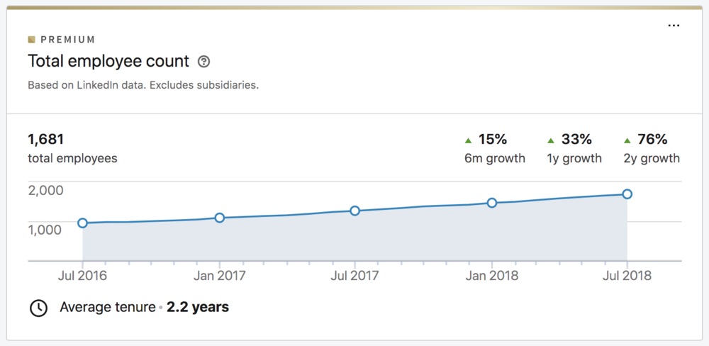
For Udemy it’s critical that employees, instructors and students have access to data - a key driver of growth for the business. And Udemy has clocked stellar growth. According to LinkedIn, Udemy’s headcount growth has gone up from 950 to 1,700 employees and instructors in the past two years.
The data team realized early on that as headcount goes up, so would the number of dashboard users. The workloads created by hundreds of dashboards could cause too much load for the Redshift cluster. Unless the cluster is properly optimized, things can slow down. Finding the cause of a bottleneck can be like looking for the proverbial needle in the haystack, a distraction for the data team.
Udemy avoids slow downs and bottlenecks by using an automatic integration between Chartio and intermix.io. The integration allows to track every single dashboard, every chart, and the user that created it - and understand how they impact Amazon Redshift performance.
The integration is an easy way for data teams to give their analysts the freedom to create new dashboards, and have peace of mind that their Redshift cluster is always configured the right way. In Udemy’s case, the integration is a catalyst for the data team to support continued business and headcount growth for the company.
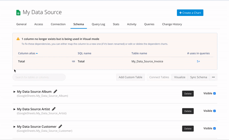
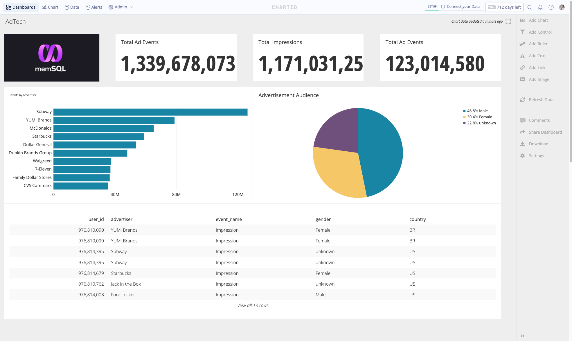
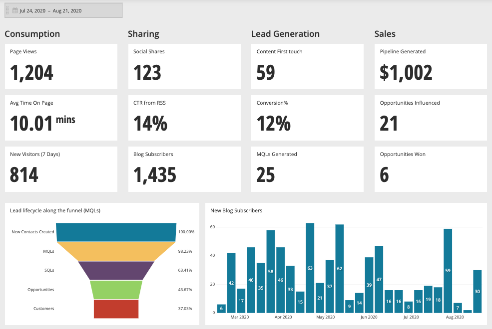
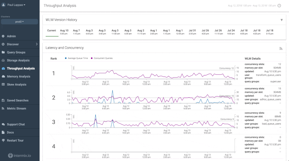
There’s no complex implementation required - we made it work “automagically” with Chartio’s new query annotation format and an intermix.io feature called “app tracing”. You can see an example in the screenshot below - each Chartio query and the user behind it is clearly visible.
So if you’re using Chartio and Amazon Redshift, and you’re looking to improve the performance you are getting out of your data warehouse cluster - give your Chartio customer success team a shout. intermix.io is giving every Chartio customer an extended free trial, including hands-on tuning advice for your Chartio dashboards and Redshift cluster!