How to Choose Metrics for Your Sales Dashboard
Posted by on August 30, 2017 Sales, Data, Dashboards, Data Analytics
The average human attention span is 8.25 seconds. While the battle to get the attention of prospects and customers continues to carry on, there’s another battle afoot—the internal one for business dashboards.
While dashboards have become a standard of doing business, somewhere along the way, dashboards simply got messy. Things have gotten so out of hand that it seems as though people have been inundated with too much information.
A disorganized or messy dashboard is the negative cost of having too much data compiled into one place. All the metrics, all the time, in every permutation possible. We’ve written about keeping shorter dashboards before, but it’s always great to be reminded about dashboard best practices.
What Gets Measured Gets Done
We’ve all heard the above saying. And, it’s true. As companies make hundreds of decisions a day, you simply cannot afford to make decisions solely on intuition alone. You need to measure everything. And dashboards are the way to measure performance insights, key results and growth indicators.
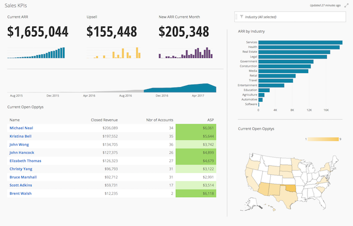
Before we all rush en masse and create dashboards, let’s first figure out what exactly needs to get measured. We’re going to use a Sales KPI dashboard as our main example, which you can see below.
So, before simply measuring everything under the sun, here a few things to avoid when choosing metrics for your dashboard:
1. Choose cohesive and relevant metrics for a single dashboard
If you’re creating a Sales dashboard, you don’t need every single sales metric represented on the dashboard. A streamlined dashboard showing revenue, a sales leaderboard and pipeline is sufficient to get the gist of it all. Remember, there is such as thing as data fatigue (and our attention span is only 8.25 seconds, that’s 0.75 seconds less than a goldfish).
2. Visuals and Design Matter
While you have a plain table chart showing opportunities in relation to their geographic location, consider making graphs more visual. Instead, use a map chart to show geographical location. Humans react to visuals and are more likely to remember them, so when applicable, leverage the best visual for the metric.
On a similar note, remember to use a single font type, a limited color palette and limited labels on your dashboard. Second, be consistent in chart sizing and putting similar chart types together on a dashboard. This ensures a clutter-free dashboard that strives for clarity.
3. Put High-Value Metrics First
For Sales, it’s a numbers game. So, when thinking about the metrics on this dashboard - you want to think about the Sales story. A high-level Sales dashboard is an overview on performance. With that, a few tips:
- Position the most mission-critical metrics in the top left (such as Annual Recurring Revenue)
- Have a hierarchy from most mission-critical metrics to granular (but if you find yourself getting too granular, keeping shorter dashboards and linking them together instead)
Metrics for Your Sales Dashboard
Measuring metrics that no one understands won’t help in uncovering meaningful insights or grow your business. Here’s a sample of sales metrics that matter the most:
- Annual Recurring Revenue (ARR): The amount of money that comes in every year for the duration of a customer’s annual contract
- Dollar Amount from Upsells: The dollar amount attributed to upsells (an existing customer paying for more users/seats)
- New ARR from Current Month: This metric is the current amount of ARR from the calendar month
- Sales Leaderboard: Much like a sports leaderboard, a Sales Leaderboard displays a rep’s activities and results in relation to one another
- ARR by Industry: The Annual Recurring Revenue broken down by industry, so you can make accurate predictions about lead assignment
- Current Open Opportunities by Geography: A geographical map of all open opportunities within the sales pipeline and gives you a better understanding of territories
While the above is just a small percentage of metrics that you can track, it’s a starting point in getting the full picture of what’s happening in Sales.
–
For more content on how to leverage data and dashboards to inform your Sales team, read our Sales content library.